Showing posts with label QtJambi. Show all posts
Showing posts with label QtJambi. Show all posts
The Nibbles Clone in QtJambi
Nibbles
In this part of the QtJambi programming tutorial, we will create a Nibbles game clone.Nibbles is an older classic video game. It was first created in late 70s. Later it was brought to PCs. In this game the player controls a snake. The objective is to eat as many apples as possible. Each time the snake eats an apple, its body grows. The snake must avoid the walls and its own body.
Development
The size of each of the joints of a snake is 10px. The snake is controlled with the cursor keys. Initially, the snake has three joints. The game starts immediately. When the game is finished, we display "Game Over" message in the center of the window.Board.java
package com.zetcode;First we will define some globals used in our game.
import com.trolltech.qt.core.QBasicTimer;
import com.trolltech.qt.core.QPoint;
import com.trolltech.qt.core.QTimerEvent;
import com.trolltech.qt.core.Qt;
import com.trolltech.qt.gui.QColor;
import com.trolltech.qt.gui.QFont;
import com.trolltech.qt.gui.QFontMetrics;
import com.trolltech.qt.gui.QFrame;
import com.trolltech.qt.gui.QImage;
import com.trolltech.qt.gui.QKeyEvent;
import com.trolltech.qt.gui.QPaintEvent;
import com.trolltech.qt.gui.QPainter;
public class Board extends QFrame {
private final int WIDTH = 300;
private final int HEIGHT = 300;
private final int DOT_SIZE = 10;
private final int ALL_DOTS = 900;
private final int RAND_POS = 29;
private final int DELAY = 140;
private int x[] = new int[ALL_DOTS];
private int y[] = new int[ALL_DOTS];
private int dots;
private int apple_x;
private int apple_y;
private boolean left = false;
private boolean right = true;
private boolean up = false;
private boolean down = false;
private boolean inGame = true;
private QBasicTimer timer;
private QImage ball;
private QImage apple;
private QImage head;
public Board() {
setStyleSheet("QWidget { background-color: black }");
setFocusPolicy(Qt.FocusPolicy.StrongFocus);
ball = new QImage("dot.png");
apple = new QImage("apple.png");
head = new QImage("head.png");
initGame();
}
private void initGame() {
dots = 3;
for (int z = 0; z < dots; z++) {
x[z] = 50 - z*10;
y[z] = 50;
}
locateApple();
timer = new QBasicTimer();
timer.start(DELAY, this);
}
@Override
public void paintEvent(QPaintEvent event) {
super.paintEvent(event);
QPainter painter = new QPainter();
painter.begin(this);
if (inGame) {
    drawObjects(painter);
} else {
    gameOver(painter);
}
painter.end();
}
private void drawObjects(QPainter painter) {

    painter.drawImage(apple_x, apple_y, apple);

    for (int z = 0; z < dots; z++) {
        if (z == 0)
            painter.drawImage(x[z], y[z], head);
        else painter.drawImage(x[z], y[z], ball);
    }
}
private void gameOver(QPainter painter) {
String msg = "Game Over";
QFont small = new QFont("Helvetica", 12,
QFont.Weight.Bold.value());
QFontMetrics metr = new QFontMetrics(small);
int textWidth = metr.width(msg);
int h = height();
int w = width();
painter.setPen(QColor.white);
painter.setFont(small);
painter.translate(new QPoint(w/2, h/2));
painter.drawText(-textWidth/2, 0, msg);
}
private void checkApple() {

    if ((x[0] == apple_x) && (y[0] == apple_y)) {
        dots++;
        locateApple();
    }
}
private void move() {
for (int z = dots; z > 0; z--) {
    x[z] = x[(z - 1)];
    y[z] = y[(z - 1)];
}
if (left) {
    x[0] -= DOT_SIZE;
}
if (right) {
x[0] += DOT_SIZE;
}
if (up) {
y[0] -= DOT_SIZE;
}
if (down) {
y[0] += DOT_SIZE;
}
}
private void checkCollision() {
for (int z = dots; z > 0; z--) {

    if ((z > 4) && (x[0] == x[z]) && (y[0] == y[z])) {
        inGame = false;
    }
}
if (y[0] > HEIGHT) {
    inGame = false;
}
if (y[0] < 0) {
inGame = false;
}
if (x[0] > WIDTH) {
inGame = false;
}
if (x[0] < 0) {
inGame = false;
}
}
private void locateApple() {
int r = (int) (Math.random() * RAND_POS);
apple_x = ((r * DOT_SIZE));
r = (int) (Math.random() * RAND_POS);
apple_y = ((r * DOT_SIZE));
}
@Override
protected void timerEvent(QTimerEvent event) {
if (inGame) {
    checkApple();
    checkCollision();
    move();
} else {
    timer.stop();
}
repaint();
}
@Override
public void keyPressEvent(QKeyEvent event)
{
int key = event.key();
if (key == Qt.Key.Key_Left.value() && !right) {
    left = true;
    up = false;
    down = false;
}
if ((key == Qt.Key.Key_Right.value()) && !left) {
right = true;
up = false;
down = false;
}
if ((key == Qt.Key.Key_Up.value()) && !down) {
up = true;
right = false;
left = false;
}
if ((key == Qt.Key.Key_Down.value()) && !up) {
down = true;
right = false;
left = false;
}
}
}
The WIDTH and HEIGHT constants determine the size of the Board. The DOT_SIZE is the size of the apple and the dot of the snake. The ALL_DOTS constant defines the maximum number of possible dots on the Board. The RAND_POS constant is used to calculate a random position of an apple. The DELAY constant determines the speed of the game.
private int x[] = new int[ALL_DOTS];These two arrays store x, y coordinates of all possible joints of a snake.
private int y[] = new int[ALL_DOTS];
The initGame() method initializes variables, loads images and starts a timeout function.
if (inGame) {
drawObjects(painter);
} else {
gameOver(painter);
}
Inside the paintEvent() method, we check the inGame variable. If it is true, we draw our objects. The apple and the snake joints. Otherwise we display "Game over" text. private void drawObjects(QPainter painter) {
painter.drawImage(apple_x, apple_y, apple);
for (int z = 0; z < dots; z++) {
if (z == 0)
painter.drawImage(x[z], y[z], head);
else painter.drawImage(x[z], y[z], ball);
}
}
The drawObjects() method draws the apple and the joints of the snake. The first joint of a snake is its head, which is represented by a red circle. private void checkApple() {
if ((x[0] == apple_x) && (y[0] == apple_y)) {
dots++;
locateApple();
}
}
The checkApple() method checks, if the snake has hit the apple object. If so, we add another snake joint and call the locateApple() method, which randomly places a new apple object. In the move() method we have the key algorithm of the game. To understand it, look at how the snake is moving. You control the head of the snake. You can change its direction with the cursor keys. The rest of the joints move one position up the chain. The second joint moves where the first was, the third joint where the second was etc.
for (int z = dots; z > 0; z--) {
x[z] = x[(z - 1)];
y[z] = y[(z - 1)];
}
This code moves the joints up the chain. if (left) {
x[0] -= DOT_SIZE;
}
Move the head to the left. In the checkCollision() method, we determine if the snake has hit itself or one of the walls.
for (int z = dots; z > 0; z--) {
if ((z > 4) && (x[0] == x[z]) && (y[0] == y[z])) {
inGame = false;
}
}
Finish the game, if the snake hits one of its joints with the head. if (y[0] > HEIGHT) {
inGame = false;
}
Finish the game, if the snake hits the bottom of the Board. The locateApple() method locates an apple randomly on the board.
int r = (int) (Math.random() * RAND_POS);We get a random number from 0 to RAND_POS - 1.
apple_x = ((r * DOT_SIZE));These line set the x, y coordinates of the apple object.
...
apple_y = ((r * DOT_SIZE));
if (inGame) {
checkApple();
checkCollision();
move();
} else {
timer.stop();
}
Every 140 ms, the timerEvent() method is called. If we are in the game, we call three methods, that build the logic of the game. Otherwise we stop the timer. In the onKeyPressEvent() method of the Board class, we determine the keys that were pressed.
if (key == Qt.Key.Key_Left.value() && !right) {
left = true;
up = false;
down = false;
}
If we hit the left cursor key, we set left variable to true. This variable is used in the move()method to change coordinates of the snake object. Notice also, that when the snake is heading to the right, we cannot turn immediately to the left. Nibbles.java
package com.zetcode;In this class, we set up the Nibbles game.
import com.trolltech.qt.gui.QApplication;
import com.trolltech.qt.gui.QMainWindow;
/**
* ZetCode QtJambi tutorial
*
* In this program, we create
* a Nibbles game clone.
*
* @author jan bodnar
* website zetcode.com
* last modified April 2009
*/
public class Nibbles extends QMainWindow {
public Nibbles() {
setWindowTitle("Nibbles");
resize(310, 310);
setCentralWidget(new Board());
move(300, 300);
show();
}
public static void main(String[] args) {
QApplication.initialize(args);
new Nibbles();
QApplication.exec();
}
}
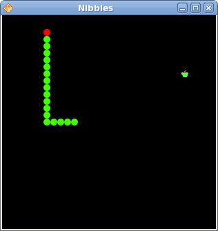
Figure: Nibbles
This was the Nibbles computer game programmed with the QtJambi library. Custom widget in QtJambi
Custom widget in QtJambi
In this part of the QtJambi programming tutorial, we will create a custom widget.Toolkits usually provide only the most common widgets like buttons, text widgets, sliders etc. No toolkit can provide all possible widgets. Programmers must create such widgets by themselves. They do it by using the drawing tools provided by the toolkit. There are two possibilities. A programmer can modify or enhance an existing widget. Or he can create a custom widget from scratch.
The Burning widget
In the next example, we will create a custom burning widget. This widget can be seen in applications like Nero or K3B. The widget will be created from scratch.Burning.java
package com.zetcode;In this file, we create the Burning widget.
import com.trolltech.qt.core.QPointF;
import com.trolltech.qt.core.QRectF;
import com.trolltech.qt.gui.QBrush;
import com.trolltech.qt.gui.QColor;
import com.trolltech.qt.gui.QFont;
import com.trolltech.qt.gui.QFontMetrics;
import com.trolltech.qt.gui.QLineF;
import com.trolltech.qt.gui.QPaintEvent;
import com.trolltech.qt.gui.QPainter;
import com.trolltech.qt.gui.QWidget;
public class Burning extends QWidget {
private final int PANEL_HEIGHT = 30;
private final int DISTANCE = 19;
private final int LINE_WIDTH = 5;
private final int DIVISIONS = 10;
private final float FULL_CAPACITY = 700f;
private final float MAX_CAPACITY = 750f;
private final QColor redColor = new QColor(255, 175, 175);
private final QColor yellowColor = new QColor(255, 255, 184);
private QWidget parent;
private String num[] = {
    "75", "150", "225", "300",
    "375", "450", "525", "600",
    "675"
};
public Burning(QWidget parent) {
super(parent);
this.parent = parent;
setMinimumHeight(PANEL_HEIGHT);
}
@Override
protected void paintEvent(QPaintEvent event) {

    QPainter painter = new QPainter(this);

    drawWidget(painter);
    painter.end();
}
protected void drawWidget(QPainter painter) {
JambiApp burn = (JambiApp) parent;
float width = size().width();
float slid_width = burn.getCurrentWidth();
float step = width / DIVISIONS;
float till = (width / MAX_CAPACITY) * slid_width;
float full = (width / MAX_CAPACITY) * FULL_CAPACITY;
if (slid_width > FULL_CAPACITY) {
painter.setPen(yellowColor);
painter.setBrush(yellowColor);
painter.drawRect(new QRectF(0, 0, full, PANEL_HEIGHT));
painter.setPen(redColor);
painter.setBrush(redColor);
painter.drawRect(new QRectF(full+1, 0, till-full, PANEL_HEIGHT));
} else {
if (slid_width > 0) {
painter.setPen(yellowColor);
painter.setBrush(yellowColor);
painter.drawRect(new QRectF(0, 0, till, PANEL_HEIGHT));
}
}
painter.setPen(new QColor(90, 90, 90));
painter.setBrush(QBrush.NoBrush);
painter.drawRect(0, 0, size().width()-1, PANEL_HEIGHT-1);
QFont newFont = font();
newFont.setPointSize(7);
painter.setFont(newFont);
for (int i = 1; i <= num.length; i++) {
painter.drawLine(new QLineF(i*step, 1, i*step, LINE_WIDTH));
QFontMetrics metrics = new QFontMetrics(newFont);
int w = metrics.width(num[i-1]);
painter.drawText(new QPointF(i*step-w/2, DISTANCE), num[i-1]);
}
}
}
public class Burning extends QWidget {
The custom widget is based on the QWidget widget. private final int PANEL_HEIGHT = 30;These are important constants. The PANEL_HEIGHT defines the height for the custom widget. The DISTANCE is the distance of the numbers on the scale from the top of their parent border. The LINE_WIDTH is the vertical line width. The DIVISIONS is the number of parts of the scale. The FULL_CAPACITY is the capacity of the media. After it is reached, overburning happens. This is visualized by a red color. The MAX_CAPACITY is the maximum capacity of a medium.
private final int DISTANCE = 19;
private final int LINE_WIDTH = 5;
private final int DIVISIONS = 10;
private final float FULL_CAPACITY = 700f;
private final float MAX_CAPACITY = 750f;
private String num[] = {
"75", "150", "225", "300",
"375", "450", "525", "600",
"675"
};
We use these numbers to build the scale of the Burning widget. @OverrideThe drawing of the custom widget is delegated to the drawWidget() method.
protected void paintEvent(QPaintEvent event) {
QPainter painter = new QPainter(this);
drawWidget(painter);
painter.end();
}
JambiApp burn = (JambiApp) parent;We retrieve the reference to the parent widget.
float slid_width = burn.getCurrentWidth();We use it to get the currently selected slider value.
float width = size().width();We get the width of the widget. The width of the custom widget is dynamic. It can be resized by a user.
float till = (width / MAX_CAPACITY) * slid_width;We use the width variable to do the transformations. Between the values of the scale and the custom widget's measures. Note that we use floating point values. We get greater precision in drawing.
float full = (width / MAX_CAPACITY) * FULL_CAPACITY;
painter.setPen(redColor);These three lines draw the red rectangle, indicating the overburning.
painter.setBrush(redColor);
painter.drawRect(new QRectF(full+1, 0, till-full, PANEL_HEIGHT));
painter.drawRect(0, 0, size().width()-1, PANEL_HEIGHT-1);This is the perimeter of the widget. The outside rectangle.
painter.drawLine(new QLineF(i*step, 1, i*step, LINE_WIDTH));Here we draw the small vertical lines.
int w = metrics.width(num[i-1]);Here we draw the numbers of the scale. To precisely position the numbers, we must get the width of the string.
painter.drawText(new QPointF(i*step-w/2, 19), num[i-1]);
This is the main file. Here we create the slider widget and use our custom widget.
JambiApp.java
package com.zetcode;

import com.trolltech.qt.core.Qt;
import com.trolltech.qt.gui.QApplication;
import com.trolltech.qt.gui.QFrame;
import com.trolltech.qt.gui.QHBoxLayout;
import com.trolltech.qt.gui.QSlider;
import com.trolltech.qt.gui.QVBoxLayout;
import com.trolltech.qt.gui.QWidget;

/**
 * ZetCode QtJambi tutorial
 *
 * In this program, we create
 * a custom widget
 *
 * @author jan bodnar
 * website zetcode.com
 * last modified March 2009
 */

public class JambiApp extends QFrame {

    private final int MAX_CAPACITY = 750;

    QSlider slider;
    QWidget widget;
    int cur_width;

    public JambiApp() {
        setWindowTitle("The Burning Widget");

        initUI();

        resize(370, 200);
        move(300, 300);
        show();
    }

    private void initUI() {

       slider = new QSlider(Qt.Orientation.Horizontal , this);
       slider.setMaximum(MAX_CAPACITY);
       slider.setGeometry(50, 50, 130, 30);

       slider.valueChanged.connect(this, "valueChanged(int)");

       QVBoxLayout vbox = new QVBoxLayout(this);
       QHBoxLayout hbox = new QHBoxLayout();

       vbox.addStretch(1);

       widget = new Burning(this);
       hbox.addWidget(widget, 0);

       vbox.addLayout(hbox);

       setLayout(vbox);
    }

    public void valueChanged(int val) {
        cur_width = val;
        widget.repaint();
    }

    public int getCurrentWidth() {
      return cur_width;
    }


    public static void main(String[] args) {
        QApplication.initialize(args);
        new JambiApp();
        QApplication.exec();
    }
}
widget = new Burning(this);We create the instance of the Burning widget and add it to the horizontal box.
hbox.addWidget(widget, 0);
public void valueChanged(int val) {
    cur_width = val;
    widget.repaint();
}
When the value of the slider changes, we store it inside the cur_width variable and repaint the custom widget. public int getCurrentWidth() {
return cur_width;
}
This method is called by the custom widget to get the actual slider value. 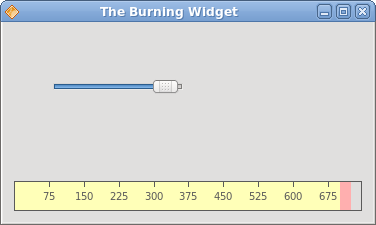
Figure: The Burning widget
In this part of the QtJambi tutorial, we have demonstrated how to create a custom widget. Painting in QtJambi
Painting in QtJambi
In this part of the QtJambi programming tutorial we will do some painting.When do we need to paint? There are situations, when we need to create a widget from scratch. In such a case, we need to do painting. Or we want to create charts, special ornaments, effects or widget enhancements.
The QPainter class is instrumental when we do some painting in the QtJambi library. Paint events are received in the paintEvent() method. To do custom painting, we must reimplement this method.
Patterns
In QtJambi, there are various patterns, that we can use to fill the interiors of shapes.package com.zetcode;In the code example, we will draw nine rectangles and fill them with different brush patterns.
import com.trolltech.qt.core.Qt;
import com.trolltech.qt.gui.QApplication;
import com.trolltech.qt.gui.QPaintEvent;
import com.trolltech.qt.gui.QPainter;
import com.trolltech.qt.gui.QPen;
import com.trolltech.qt.gui.QWidget;
/**
* ZetCode QtJambi tutorial
*
* This program draws nine rectangles.
* The interiors are filled with
* different built-in patterns.
*
* @author jan bodnar
* website zetcode.com
* last modified March 2009
*/
public class JambiApp extends QWidget {
public JambiApp() {
setWindowTitle("Patterns");
resize(350, 280);
move(400, 300);
show();
}
@Override
protected void paintEvent(QPaintEvent event) {

    QPainter painter = new QPainter(this);
    drawPatterns(painter);
}
private void drawPatterns(QPainter painter) {
painter.setPen(QPen.NoPen);
painter.setBrush(Qt.BrushStyle.HorPattern);
painter.drawRect(10, 15, 90, 60);
painter.setBrush(Qt.BrushStyle.VerPattern);
painter.drawRect(130, 15, 90, 60);
painter.setBrush(Qt.BrushStyle.CrossPattern);
painter.drawRect(250, 15, 90, 60);
painter.setBrush(Qt.BrushStyle.Dense7Pattern);
painter.drawRect(10, 105, 90, 60);
painter.setBrush(Qt.BrushStyle.Dense6Pattern);
painter.drawRect(130, 105, 90, 60);
painter.setBrush(Qt.BrushStyle.Dense5Pattern);
painter.drawRect(250, 105, 90, 60);
painter.setBrush(Qt.BrushStyle.BDiagPattern);
painter.drawRect(10, 195, 90, 60);
painter.setBrush(Qt.BrushStyle.FDiagPattern);
painter.drawRect(130, 195, 90, 60);
painter.setBrush(Qt.BrushStyle.DiagCrossPattern);
painter.drawRect(250, 195, 90, 60);
painter.end();
}
public static void main(String[] args) {
QApplication.initialize(args);
new JambiApp();
QApplication.exec();
}
}
@OverrideWhen the window area needs to be redrawn, the paintEvent() method is called. This happens, when we resize the window, maximize it or minimize it etc. Inside this method, we create the QPainter object. This object is used to do all painting in QtJambi. The painting itself is delegated to the drawPatterns() method.
protected void paintEvent(QPaintEvent event) {
QPainter painter = new QPainter(this);
drawPatterns(painter);
}
painter.setPen(QPen.NoPen);The pen object is used to draw outlines of the shapes. In our example we will not use a pen.
painter.setBrush(Qt.BrushStyle.HorPattern);We set a horizontal pattern as a brush.
painter.drawRect(10, 15, 90, 60);We draw a rectangle, with the current pen and brush. The first two parameters of the method are the x, y coordinates. The last two parameters are the width and height of the rectangle.
painter.end();Ends painting. Any resources used while painting are released. According to the documentation, this call is not necessary in QtJambi. The resources are freed by the destructor.
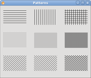
Figure: Patterns
Shapes
The QtJambi painting API can draw various shapes. The following programming code example will show some of them.package com.zetcode;In this code example, we draw nine different shapes on the window. A complex path, a pie, a chord, a rounded rectangle, a polygon, a rectangle, a character based shape, a circle and an ellipse.
import com.trolltech.qt.core.QPoint;
import com.trolltech.qt.core.QPointF;
import com.trolltech.qt.gui.QApplication;
import com.trolltech.qt.gui.QBrush;
import com.trolltech.qt.gui.QColor;
import com.trolltech.qt.gui.QFont;
import com.trolltech.qt.gui.QPaintEvent;
import com.trolltech.qt.gui.QPainter;
import com.trolltech.qt.gui.QPainterPath;
import com.trolltech.qt.gui.QPen;
import com.trolltech.qt.gui.QPolygon;
import com.trolltech.qt.gui.QWidget;
import java.util.ArrayList;
import java.util.List;
/**
* ZetCode QtJambi tutorial
*
* This program draws basic shapes
* available in QtJambi
*
* @author jan bodnar
* website zetcode.com
* last modified March 2009
*/
public class JambiApp extends QWidget {
public JambiApp() {
setWindowTitle("Shapes");
resize(350, 280);
move(400, 300);
show();
}
@Override
protected void paintEvent(QPaintEvent event) {
QPainter painter = new QPainter(this);
drawShapes(painter);
}
private void drawShapes(QPainter painter) {
painter.setRenderHint(QPainter.RenderHint.Antialiasing);
painter.setPen(new QPen(new QBrush(QColor.darkGray), 1));
painter.setBrush(QColor.darkGray);
QPainterPath path1 = new QPainterPath();

path1.moveTo(5, 5);
path1.cubicTo(40, 5,  50, 50,  99, 99);
path1.cubicTo(5, 99,  50, 50,  5, 5);
painter.drawPath(path1);
painter.drawPie(130, 20, 90, 60, 30*16, 120*16);
painter.drawChord(240, 30, 90, 60, 0, 16*180);
painter.drawRoundRect(20, 120, 80, 50);
List<QPoint> points = new ArrayList<QPoint>();
points.add(new QPoint(130, 140));
points.add(new QPoint(180, 170));
points.add(new QPoint(180, 140));
points.add(new QPoint(220, 110));
points.add(new QPoint(140, 100));

QPolygon polygon = new QPolygon(points);

painter.drawPolygon(polygon);
painter.drawRect(250, 110, 60, 60);
QPointF baseline = new QPointF(20, 250);
QFont font = new QFont("Georgia", 55);
QPainterPath path2 = new QPainterPath();
path2.addText(baseline, font, "Q");
painter.drawPath(path2);
painter.drawEllipse(140, 200, 60, 60);
painter.drawEllipse(240, 200, 90, 60);
}
public static void main(String[] args) {
QApplication.initialize(args);
new JambiApp();
QApplication.exec();
}
}
painter.setRenderHint(QPainter.RenderHint.Antialiasing);We use antialiasing in the example. Antialiased shapes look better, but it takes more time to draw them.
painter.setPen(new QPen(new QBrush(QColor.darkGray), 1));We use a dark gray pen and brush to draw the shapes.
painter.setBrush(QColor.darkGray);
QPainterPath path1 = new QPainterPath();The first complex shape is created with the QPainterPath object. The QPainterPath class provides a container for painting operations. A painter path is an object composed of a number of graphical building blocks, such as rectangles, ellipses, lines, and curves.
path1.moveTo(5, 5);
path1.cubicTo(40, 5, 50, 50, 99, 99);
path1.cubicTo(5, 99, 50, 50, 5, 5);
painter.drawPath(path1);
painter.drawPie(130, 20, 90, 60, 30*16, 120*16);These three lines draw a pie, a chord and a rounded rectangle.
painter.drawChord(240, 30, 90, 60, 0, 16*180);
painter.drawRoundRect(20, 120, 80, 50);
List<QPoint> points = new ArrayList<QPoint>();We use a list of five points to create a polygon.
points.add(new QPoint(130, 140));
points.add(new QPoint(180, 170));
points.add(new QPoint(180, 140));
points.add(new QPoint(220, 110));
points.add(new QPoint(140, 100));
QPolygon polygon = new QPolygon(points);
painter.drawPolygon(polygon);
QPointF baseline = new QPointF(20, 250);These lines create a character based shape.
QFont font = new QFont("Georgia", 55);
QPainterPath path2 = new QPainterPath();
path2.addText(baseline, font, "Q");
painter.drawPath(path2);
painter.drawEllipse(140, 200, 60, 60);These two lines create a circle and an ellipse respectively.
painter.drawEllipse(240, 200, 90, 60);
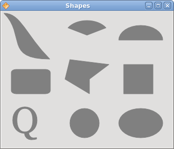
Figure: Shapes
Transparent rectangles
Transparency is the quality of being able to see through a material. The easiest way to understand transparency is to imagine a piece of glass or water. Technically, the rays of light can go through the glass and this way we can see objects behind the glass.In computer graphics, we can achieve transparency effects using alpha compositing. Alpha compositing is the process of combining an image with a background to create the appearance of partial transparency. The composition process uses an alpha channel. (wikipedia.org, answers.com)
package com.zetcode;In the example we will draw ten rectangles with different levels of transparency.
import com.trolltech.qt.gui.QApplication;
import com.trolltech.qt.gui.QColor;
import com.trolltech.qt.gui.QPaintEvent;
import com.trolltech.qt.gui.QPainter;
import com.trolltech.qt.gui.QPen;
import com.trolltech.qt.gui.QWidget;
/**
* ZetCode QtJambi tutorial
*
* This program draws ten
* rectangles with different
* levels of transparency
*
* @author jan bodnar
* website zetcode.com
* last modified March 2009
*/
public class JambiApp extends QWidget {
public JambiApp() {
setWindowTitle("Transparent rectangles");
resize(590, 90);
move(400, 300);
show();
}
@Override
protected void paintEvent(QPaintEvent event) {
QPainter painter = new QPainter(this);
drawRectangles(painter);
}
private void drawRectangles(QPainter painter) {
painter.setPen(QPen.NoPen);
for (int i=1; i<11; i++) {
    painter.setBrush(new QColor(0, 0, 255, i*25));
    painter.drawRect(50*i, 20, 40, 40);
}
}
public static void main(String[] args) {
QApplication.initialize(args);
new JambiApp();
QApplication.exec();
}
}
painter.setPen(QPen.NoPen);We use no pen.
for (int i=1; i<11; i++) {
painter.setBrush(new QColor(0, 0, 255, i*25));
painter.drawRect(50*i, 20, 40, 40);
}
The last parameter of the QColor object is the alpha transparency value. 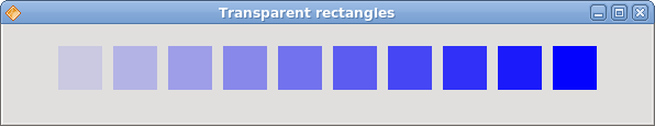
Figure: Transparent rectangles
Donut Shape
In the following example we create a complex shape by rotating a bunch of ellipses.package com.zetcode;In this example, we create a donut. The shape resembles a cookie, hence the name donut.
import com.trolltech.qt.core.QPoint;
import com.trolltech.qt.gui.QApplication;
import com.trolltech.qt.gui.QColor;
import com.trolltech.qt.gui.QPaintEvent;
import com.trolltech.qt.gui.QPainter;
import com.trolltech.qt.gui.QPen;
import com.trolltech.qt.gui.QWidget;
/**
* ZetCode QtJambi tutorial
*
* This program draws a donut
* shape
*
* @author jan bodnar
* website zetcode.com
* last modified March 2009
*/
public class JambiApp extends QWidget {
public JambiApp() {
setWindowTitle("Donut");
resize(350, 280);
move(400, 300);
show();
}
@Override
protected void paintEvent(QPaintEvent event) {
QPainter painter = new QPainter(this);
drawDonut(painter);
}
private void drawDonut(QPainter painter) {
QColor color = new QColor();
color.setNamedColor("#333333");
painter.setPen(new QPen(color, 0.5));
painter.setRenderHint(QPainter.RenderHint.Antialiasing);
int w = width();
int h = height();
painter.translate(new QPoint(w/2, h/2));
for (double rot=0; rot < 360.0; rot+=5.0 ) {
    painter.drawEllipse(-125, -40, 250, 80);
    painter.rotate(5.0);
}
}
public static void main(String[] args) {
QApplication.initialize(args);
new JambiApp();
QApplication.exec();
}
}
QColor color = new QColor();We can use a hexadecimal notation to create a color object.
color.setNamedColor("#333333");
int w = width();Here we determine the width and height of the window.
int h = height();
painter.translate(new QPoint(w/2, h/2));We move the coordinate system to the middle of the window. This way we make the drawing mathematically easier.
for (double rot=0; rot < 360.0; rot+=5.0 ) {
painter.drawEllipse(-125, -40, 250, 80);
painter.rotate(5.0);
}
We draw an ellipse object 72 times. Each time, we rotate the ellipse by 5 degrees. This will create our donut shape. 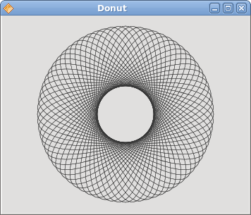
Figure: Donut
Drawing text
In the last example, we are going to draw text on the window.package com.zetcode;We draw a song lyrics on the window.
import com.trolltech.qt.core.QPoint;
import com.trolltech.qt.gui.QApplication;
import com.trolltech.qt.gui.QColor;
import com.trolltech.qt.gui.QFont;
import com.trolltech.qt.gui.QPaintEvent;
import com.trolltech.qt.gui.QPainter;
import com.trolltech.qt.gui.QWidget;
/**
* ZetCode QtJambi tutorial
*
* This program draws text
* on the window
*
* @author jan bodnar
* website zetcode.com
* last modified March 2009
*/
public class JambiApp extends QWidget {
public JambiApp() {
setWindowTitle("Soulmate");
resize(370, 240);
move(400, 300);
show();
}
@Override
protected void paintEvent(QPaintEvent event) {
QPainter painter = new QPainter(this);
drawLyrics(painter);
}
private void drawLyrics(QPainter painter) {
painter.setBrush(new QColor(25, 25, 25));
painter.setFont(new QFont("Purisa", 10));
painter.drawText(new QPoint(20, 30),
        "Most relationships seem so transitory");
painter.drawText(new QPoint(20, 60),
"They're good but not the permanent one");
painter.drawText(new QPoint(20, 120),
"Who doesn't long for someone to hold");
painter.drawText(new QPoint(20, 150),
"Who knows how to love without being told");
painter.drawText(new QPoint(20, 180),
"Somebody tell me why I'm on my own");
painter.drawText(new QPoint(20, 210),
"If there's a soulmate for everyone");
}
public static void main(String[] args) {
QApplication.initialize(args);
new JambiApp();
QApplication.exec();
}
}
painter.setFont(new QFont("Purisa", 10));
We set a Purisa font for our text. painter.drawText(new QPoint(20, 30),The drawText() method is used to draw the text.
"Most relationships seem so transitory");
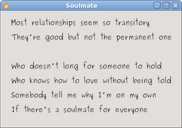
Figure: Drawing text
In this part of the QtJambi programming tutorial, we did some painting. Dialogs in QtJambi
QtJambi dialogs
In this part of the QtJambi programming tutorial, we will work with dialogs.Dialog windows or dialogs are an indispensable part of most modern GUI applications. A dialog is defined as a conversation between two or more persons. In a computer application a dialog is a window which is used to "talk" to the application. A dialog is used to input data, modify data, change the application settings etc. Dialogs are important means of communication between a user and a computer program.
Message boxes
Message boxes are convenient dialogs that provide messages to the user the application. The message consists of text and image data.package com.zetcode;We use the GridLayout manager to set up a grid of five buttons. Each of the buttons shows a different message box.
import com.trolltech.qt.QSignalEmitter;
import com.trolltech.qt.gui.QApplication;
import com.trolltech.qt.gui.QGridLayout;
import com.trolltech.qt.gui.QMessageBox;
import com.trolltech.qt.gui.QPushButton;
import com.trolltech.qt.gui.QWidget;
/**
* ZetCode QtJambi tutorial
*
* This program demonstrates
* QMessageBox dialogs
*
* @author jan bodnar
* website zetcode.com
* last modified March 2009
*/
public class JambiApp extends QWidget {
public JambiApp() {
setWindowTitle("Message Dialogs");
initUI();
resize(220, 90);
move(400, 300);
show();
}
private void initUI() {
QGridLayout grid = new QGridLayout(this);
grid.setSpacing(2);
QPushButton error = new QPushButton("Error", this);
QPushButton warning = new QPushButton("Warning", this);
QPushButton question = new QPushButton("Question", this);
QPushButton information = new QPushButton("Information", this);
QPushButton about = new QPushButton("About", this);
grid.addWidget(error, 0, 0);
grid.addWidget(warning, 0, 1);
grid.addWidget(question, 1, 0);
grid.addWidget(information, 1, 1);
grid.addWidget(about, 2, 0);
error.clicked.connect(this, "showDialog()");
warning.clicked.connect(this, "showDialog()");
question.clicked.connect(this, "showDialog()");
information.clicked.connect(this, "showDialog()");
about.clicked.connect(this, "showDialog()");
}
private void showDialog() {
QPushButton button = (QPushButton) QSignalEmitter.signalSender();
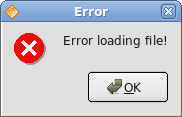
if ("Error".equals(button.text())) {
    QMessageBox.critical(this, "Error", "Error loading file!");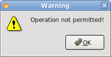
} else if ("Warning".equals(button.text())) {
QMessageBox.warning(this, "Warning", "Operation not permitted!");
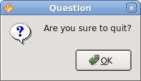
} else if ("Question".equals(button.text())) {
QMessageBox.question(this, "Question", "Are you sure to quit?");
} else if ("Information".equals(button.text())) {
QMessageBox.information(this, "Information", "Download completed.");
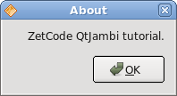
} else if ("About".equals(button.text())) {
QMessageBox.about(this, "About", "ZetCode QtJambi tutorial.");
}
}
public static void main(String[] args) {
QApplication.initialize(args);
new JambiApp();
QApplication.exec();
}
}
QPushButton button = (QPushButton) QSignalEmitter.signalSender();Here we determine, which button called the showDialog() method.
if ("Error".equals(button.text())) {
QMessageBox.critical(this, "Error", "Error loading file!");
}
In case we pressed the error button, we show the error dialog. We use static methods of the QMessageBox class to show the message boxes. 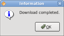
QInputDialog
The QInputDialog class provides a simple convenience dialog to get a single value from the user. The input value can be a string, a number or an item from a list. A label must be set to tell the user what they should enter.package com.zetcode;In the code example, we have a button and a line edit. The button shows an input dialog. We get some text and the text is shown in the line edit widget.
import com.trolltech.qt.core.Qt;
import com.trolltech.qt.gui.QApplication;
import com.trolltech.qt.gui.QInputDialog;
import com.trolltech.qt.gui.QLineEdit;
import com.trolltech.qt.gui.QPushButton;
import com.trolltech.qt.gui.QWidget;
/**
* ZetCode QtJambi tutorial
*
* This program shows an input
* dialog
*
* @author jan bodnar
* website zetcode.com
* last modified March 2009
*/
public class JambiApp extends QWidget {
QLineEdit edit;
public JambiApp() {
setWindowTitle("Input Dialog");
initUI();
move(400, 300);
show();
}
private void initUI() {
setGeometry(300, 300, 350, 80);
QPushButton show = new QPushButton("Dialog", this);
show.clicked.connect(this, "showDialog()");
show.setFocusPolicy(Qt.FocusPolicy.NoFocus);
show.move(20, 20);
edit = new QLineEdit(this);
edit.move(130, 22);
}
private void showDialog() {
String text = QInputDialog.getText(
        this, "Input Dialog", "Enter your name");
if (text!=null && !text.trim().isEmpty()) {
    edit.setText(text);
}
}
public static void main(String[] args) {
QApplication.initialize(args);
new JambiApp();
QApplication.exec();
}
}
String text = QInputDialog.getText(The getText() static method creates the input dialog. The text from the dialog is stored in the text variable.
this, "Input Dialog", "Enter your name");
if (text!=null && !text.trim().isEmpty()) {
edit.setText(text);
}
Before we update the line edit, we ensure, that the text variable is not null and that it is not empty and does not consists only from spaces. 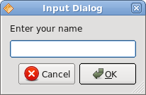
Figure: Input dialog
QColorDialog
The QColorDialog class provides a dialog widget for specifying colors. The color dialog's function is to allow users to choose colors.package com.zetcode;We show a some text in the center of the window. By clicking on the area of the window, we show a color dialog. We change the text foreground color to the selected color from the dialog.
import com.trolltech.qt.core.Qt;
import com.trolltech.qt.gui.QApplication;
import com.trolltech.qt.gui.QColor;
import com.trolltech.qt.gui.QColorDialog;
import com.trolltech.qt.gui.QLabel;
import com.trolltech.qt.gui.QMouseEvent;
import com.trolltech.qt.gui.QVBoxLayout;
import com.trolltech.qt.gui.QWidget;
import java.util.Formatter;
/**
* ZetCode QtJambi tutorial
*
* In this program, we use the
* QColorDialog to change the color
* of a label text
*
* @author jan bodnar
* website zetcode.com
* last modified March 2009
*/
public class JambiApp extends QWidget {
QLabel label;
public JambiApp() {
setWindowTitle("Color Dialog");
initUI();
resize(250, 200);
move(400, 300);
show();
}
private void initUI() {
label = new QLabel("ZetCode QtJambi tutorial", this);
QVBoxLayout vbox = new QVBoxLayout(this);
label.setAlignment(Qt.AlignmentFlag.AlignCenter);
vbox.addWidget(label);
}
@Override
public void mousePressEvent(QMouseEvent event) {
QColor color = QColorDialog.getColor();
if (!color.isValid()) return;
Formatter fmt = new Formatter();
fmt.format("QWidget { color: %s }", color.name());

label.setStyleSheet(fmt.toString());
}
public static void main(String[] args) {
QApplication.initialize(args);
new JambiApp();
QApplication.exec();
}
}
@OverrideIn order to receive mouse press events for our window, we must reimplement the mousePressEvent() method.
public void mousePressEvent(QMouseEvent event) {
...
}
QColor color = QColorDialog.getColor();The QColorDialog is being created. The selected color is stored in the color variable.
Formatter fmt = new Formatter();Here we update the foreground color of the label's text.
fmt.format("QWidget { color: %s }", color.name());
label.setStyleSheet(fmt.toString());
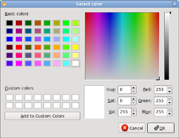
Figure: QColorDialog
QFontDialog
The QFontDialog class provides a dialog widget for selecting a font.package com.zetcode;This example is similar to the previous one. This time, we change the font of the text.
import com.trolltech.qt.core.Qt;
import com.trolltech.qt.gui.QApplication;
import com.trolltech.qt.gui.QFontDialog;
import com.trolltech.qt.gui.QLabel;
import com.trolltech.qt.gui.QMouseEvent;
import com.trolltech.qt.gui.QVBoxLayout;
import com.trolltech.qt.gui.QWidget;
/**
* ZetCode QtJambi tutorial
*
* In this program, we use the
* QFontDialog to change the font
* of a label text
*
* @author jan bodnar
* website zetcode.com
* last modified March 2009
*/
public class JambiApp extends QWidget {
QLabel label;
public JambiApp() {
setWindowTitle("QFontColor dialog");
initUI();
resize(250, 200);
move(300, 300);
show();
}
private void initUI() {
label = new QLabel("ZetCode QtJambi tutorial", this);
QVBoxLayout vbox = new QVBoxLayout(this);
label.setAlignment(Qt.AlignmentFlag.AlignCenter);
vbox.addWidget(label);
}
@Override
public void mousePressEvent(QMouseEvent event) {
QFontDialog.Result result = QFontDialog.getFont();
if (!result.ok) return;
label.setFont(result.font);
}
public static void main(String[] args) {
QApplication.initialize(args);
new JambiApp();
QApplication.exec();
}
}
QFontDialog.Result result = QFontDialog.getFont();The QFontDialog is being created. The dialog returns the QFontDialog.Result class. This class has two fields. The font and the ok field.
if (!result.ok) return;The boolean ok variable is true, if we clicked on the OK button of the dialog. We return from the method, if the cancel button was pressed.
label.setFont(result.font);The font field stores the selected font. We update the label's font to the newly selected font.
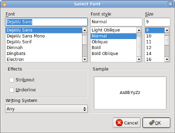
Figure: QFontDialog
In this part of the QtJambi tutorial, we worked with dialog windows. Menus And toolbars in QtJambi
Menus And toolbars in QtJambi
In this part of the QtJambi programming tutorial, we will work with menus and toolbar.A menubar is one of the most visible parts of the GUI application. It is a group of commands located in various menus. While in console applications you had to remember all those arcane commands, here we have most of the commands grouped into logical parts. There are accepted standards that further reduce the amount of time spending to learn a new application. Menus group commands that we can use in an application. Toolbars provide a quick access to the most frequently used commands.
Simple menu The first example will show a simple menu.
package com.zetcode;We have a menubar, a menu and an action. In order to work with menus, we must inherit from QMainWindow widget.
import com.trolltech.qt.gui.QAction;
import com.trolltech.qt.gui.QApplication;
import com.trolltech.qt.gui.QMainWindow;
import com.trolltech.qt.gui.QMenu;
/**
* ZetCode QtJambi tutorial
*
* This program shows a simple
* menu. It has one action, which
* will terminate the program, when
* selected.
*
* @author jan bodnar
* website zetcode.com
* last modified March 2009
*/
public class JambiApp extends QMainWindow {
public JambiApp() {
setWindowTitle("Simple menu");
initUI();
resize(250, 200);
move(300, 300);
show();
}
private void initUI() {
QAction quit = new QAction("&Quit", this);
QMenu file = menuBar().addMenu("&File");
file.addAction(quit);
quit.triggered.connect(QApplication.instance(), "quit()");
}
public static void main(String[] args) {
QApplication.initialize(args);
new JambiApp();
QApplication.exec();
}
}
QAction quit = new QAction("&Quit", this);
This code line creates a QAction. Each QMenu has one or more action objects. Note the ampersand (&) character. It creates a shortcut for the item. Alt + Q. It also underlines the Q character. The shortcut is active, when the file menu is dropped down. QMenu file = menuBar().addMenu("&File");
file.addAction(quit);
We create a QMenu object. The ampersand character creates a shortcut. Alt + F. The consecutive shortcuts Alt + F, Alt + Q quit the application. quit.triggered.connect(QApplication.instance(), "quit()");When we select this option from the menu, the application quits.
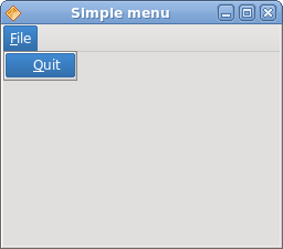
Figure: Simple menu
Creating a submenu
A submenu is a menu plugged into another menu object. The next example demonstrates this.package com.zetcode;In the example, we have three options in a submenu of a file menu.
import com.trolltech.qt.gui.QAction;
import com.trolltech.qt.gui.QApplication;
import com.trolltech.qt.gui.QMainWindow;
import com.trolltech.qt.gui.QMenu;
/**
* ZetCode QtJambi tutorial
*
* This program creates a
* submenu
*
* @author jan bodnar
* website zetcode.com
* last modified March 2009
*/
public class JambiApp extends QMainWindow {
public JambiApp() {
setWindowTitle("Submenu");
initUI();
resize(250, 200);
move(300, 300);
show();
}
private void initUI() {
QAction quit = new QAction("&Quit", this);
QMenu file = menuBar().addMenu("&File");
QMenu impm = new QMenu("Import");
QAction seeds = new QAction("Import news feed...", this);
QAction marks = new QAction("Import bookmarks...", this);
QAction mail = new QAction("Import mail...", this);
impm.addAction(seeds);
impm.addAction(marks);
impm.addAction(mail);
file.addMenu(impm);
file.addAction(quit);
quit.triggered.connect(QApplication.instance(), "quit()");
}
public static void main(String[] args) {
QApplication.initialize(args);
new JambiApp();
QApplication.exec();
}
}
QMenu file = menuBar().addMenu("&File");
QMenu impm = new QMenu("Import");
We have two QMenu objects. The file menu and the import menu. QAction seeds = new QAction("Import news feed...", this);
QAction marks = new QAction("Import bookmarks...", this);
QAction mail = new QAction("Import mail...", this);
We create three action objects. impm.addAction(seeds);We add the action objects into the import menu.
impm.addAction(marks);
impm.addAction(mail);
file.addMenu(impm);Finally, we add the import menu into the file menu.
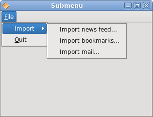
Figure: Submenu
Images, menus, separators
In the following example, we will further enhance our previous application. We will add icons to the menus, use shortcuts and a separator.package com.zetcode;In our example, we have one menu with three actions. Only the quit action will actually do something, if we select it. We also create a separator and a Ctrl + Q shortcut, which will terminate the application.
import com.trolltech.qt.gui.QAction;
import com.trolltech.qt.gui.QApplication;
import com.trolltech.qt.gui.QIcon;
import com.trolltech.qt.gui.QMainWindow;
import com.trolltech.qt.gui.QMenu;
/**
* ZetCode QtJambi tutorial
*
* This program shows image
* menus, shortcuts and a separator
*
* @author jan bodnar
* website zetcode.com
* last modified March 2009
*/
public class JambiApp extends QMainWindow {
public JambiApp() {
setWindowTitle("Image menu");
initUI();
resize(250, 200);
move(300, 300);
show();
}
private void initUI() {
QIcon newpix = new QIcon("new.png");
QIcon openpix = new QIcon("open.png");
QIcon quitpix = new QIcon("quit.png");
QAction newa = new QAction(newpix, "&New", this);
QAction open = new QAction(openpix, "&Open", this);
QAction quit = new QAction(quitpix, "&Quit", this);
quit.setShortcut("Ctrl+Q");
QMenu file;
file = menuBar().addMenu("&File");
file.addAction(newa);
file.addAction(open);
file.addSeparator();
file.addAction(quit);
quit.triggered.connect(QApplication.instance(), "quit()");
}
public static void main(String[] args) {
QApplication.initialize(args);
new JambiApp();
QApplication.exec();
}
}
QIcon newpix = new QIcon("new.png");
QIcon openpix = new QIcon("open.png");
QIcon quitpix = new QIcon("quit.png");
These are png images, that we will use in the application. QAction newa = new QAction(newpix, "&New", this);Here we create three action objects. The first parameter is the QIcon.
QAction open = new QAction(openpix, "&Open", this);
QAction quit = new QAction(quitpix, "&Quit", this);
quit.setShortcut("Ctrl+Q");
This line creates a shortcut. By pressing this shortcut, we will run the quit action, which will quit the application. file.addSeparator();We create a separator. The separator is a horizontal line, which enables us to group menu actions into some logical parts.
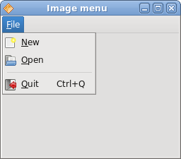
Figure: Images, shortcut and a separator
A toolbar
The QToolBar class provides a movable panel that contains a set of controls, which provide a quick access to the application actions.package com.zetcode;We create a toolbar with three action objects and one separator.
import com.trolltech.qt.gui.QAction;
import com.trolltech.qt.gui.QApplication;
import com.trolltech.qt.gui.QIcon;
import com.trolltech.qt.gui.QMainWindow;
import com.trolltech.qt.gui.QToolBar;
/**
* ZetCode QtJambi tutorial
*
* This program creates a
* toolbar
*
* @author jan bodnar
* website zetcode.com
* last modified April 2009
*/
public class JambiApp extends QMainWindow {
public JambiApp() {
setWindowTitle("Toolbar");
initUI();
resize(250, 200);
move(300, 300);
show();
}
private void initUI() {
QIcon newpi = new QIcon("new.png");
QIcon openpi = new QIcon("open.png");
QIcon quitpi = new QIcon("quit.png");
QToolBar toolbar = addToolBar("main toolbar");
toolbar.addAction(newpi, "New File");
toolbar.addAction(openpi, "Open File");
toolbar.addSeparator();
QAction quit = toolbar.addAction(quitpi,
"Quit Application");
quit.triggered.connect(QApplication.instance(), "quit()");
}
public static void main(String[] args) {
QApplication.initialize(args);
new JambiApp();
QApplication.exec();
}
}
QIcon newpi = new QIcon("new.png");
QIcon openpi = new QIcon("open.png");
QIcon quitpi = new QIcon("quit.png");
Toolbar action objects will display these icons. QToolBar toolbar = addToolBar("main toolbar");
The addToolBar() method of the QMainWindowcreates a toolbar for the application. The text string gives a toolbar a name. This name is used to reference this toolbar, because there can be multiple toolbars in one application. If we right click on the window area, we can see a checkable option, which shows/hides the toolbar. toolbar.addSeparator();We create a vertical separator.
quit.triggered.connect(QApplication.instance(), "quit()");When we click on the quit action object, the application terminates.
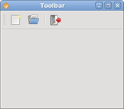
Figure: Toolbar
Undo redo
The following example demonstrates, how we can deactivate toolbar buttons on the toolbar. It is a common practice in GUI programming. For example the save button. If we save all changes of our document to the disk, the save button is deactivated in most text editors. This way the application indicates to the user, that all changes are already saved.package com.zetcode;In our example, we have three QAction objects and a separator. After several clicks on the undo or redo buttons, they become deactivated. Visually, the buttons are grayed out.
import com.trolltech.qt.QSignalEmitter;
import com.trolltech.qt.gui.QAction;
import com.trolltech.qt.gui.QApplication;
import com.trolltech.qt.gui.QIcon;
import com.trolltech.qt.gui.QMainWindow;
import com.trolltech.qt.gui.QToolBar;
/**
* ZetCode QtJambi tutorial
*
* This program disables/enables
* actions on a toolbar
*
* @author jan bodnar
* website zetcode.com
* last modified March 2009
*/
public class JambiApp extends QMainWindow {
private int count = 0;
private QAction undo;
private QAction redo;
public JambiApp() {
setWindowTitle("Undo redo");
initUI();
resize(300, 200);
move(400, 300);
show();
}
private void initUI() {
QIcon undoi = new QIcon("undo.png");
QIcon redoi = new QIcon("redo.png");
QIcon quitpi = new QIcon("quit.png");
QToolBar toolbar = addToolBar("first toolbar");
undo = toolbar.addAction(undoi, "Undo");
redo = toolbar.addAction(redoi, "Redo");
undo.triggered.connect(this, "count()");
redo.triggered.connect(this, "count()");
toolbar.addSeparator();
QAction quit = toolbar.addAction(quitpi, "Quit Application");
quit.triggered.connect(QApplication.instance(), "quit()");
}
private void count() {
QAction action = (QAction) QSignalEmitter.signalSender();
if ("Undo".equals(action.text())) {
    count += -1;
} else {
    count += 1;
}
if (count <= 0) {
    undo.setDisabled(true);
    redo.setDisabled(false);
}
if (count >= 5) {
undo.setDisabled(false);
redo.setDisabled(true);
}
}
public static void main(String[] args) {
QApplication.initialize(args);
new JambiApp();
QApplication.exec();
}
}
private int count = 0;The count variable determines, which button is activated and deactivated.
undo.triggered.connect(this, "count()");Clicking on the toolbar button, the triggered signal is emitted. We connect this signal to the count() method.
redo.triggered.connect(this, "count()");
QAction action = (QAction) QSignalEmitter.signalSender();Both toolbar buttons call the count() method. We need to tell between them. This line determines, which action object actually emitted the signal.
if ("Undo".equals(action.text())) {
count += -1;
} else {
count += 1;
}
The undo toolbar button subtracts 1 from the count variable. The redo adds 1. Depending on the value of the count variable, we enable/disable the toolbar buttons. if (count <= 0) {
undo.setDisabled(true);
redo.setDisabled(false);
}
The setDisabled() method activates or deactivates the toolbar buttons. 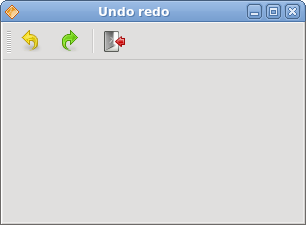
Figure: Undo redo
In this part of the QtJambi tutorial, we mentioned the menus and toolbars. Widgets in QtJambi
Widgets in QtJambi
In this part of the QtJambi programming tutorial, we will cover QtJambi widgets.Widgets are basic building blocks of a GUI application. Over the years, several widgets became a standard in all toolkits on all OS platforms. For example a button, a check box or a scroll bar. QtJambi has a rich set of widgets which cover most of the programming needs. More specialized widgets can be created as custom widgets.
QCheckBox
The QCheckBox is a widget, that has two states. On and Off. The On state is visualized by a check mark. It is used to denote some boolean property. The QCheckBox widget provides a checkbox with a text label.package com.zetcode;In our example, we place a check box on the window. The check box shows/hides the title of the window.
import com.trolltech.qt.core.Qt.FocusPolicy;
import com.trolltech.qt.gui.QApplication;
import com.trolltech.qt.gui.QCheckBox;
import com.trolltech.qt.gui.QWidget;
/**
* ZetCode QtJambi tutorial
*
* This program uses QCheckBox
* widget to show/hide the title
* of the window
*
* @author jan bodnar
* website zetcode.com
* last modified March 2009
*/
public class JambiApp extends QWidget {
public JambiApp() {
setWindowTitle("QCheckBox");
initUI();
resize(250, 150);
move(300, 300);
show();
}
public void initUI() {
QCheckBox cb = new QCheckBox("Show Title", this);
cb.setFocusPolicy(FocusPolicy.NoFocus);
cb.setChecked(true);
cb.toggled.connect(this, "onChanged(boolean)");
cb.move(50, 50);
}
public void onChanged(boolean state) {
if (state) {
    setWindowTitle("QCheckBox");
} else {
    setWindowTitle("");
}
}
public static void main(String[] args) {
QApplication.initialize(args);
new JambiApp();
QApplication.exec();
}
}
setWindowTitle("QCheckBox");
During the construction of the window, we set a title for the window. QCheckBox cb = new QCheckBox("Show Title", this);
The QCheckBox widget is created. The first parameter of the constructor is its text label. The second parameter is the parent widget. cb.setFocusPolicy(FocusPolicy.NoFocus);I do not like the visual representation of a focused check box. This line disables focus.
cb.setChecked(true);The title is visible at the start of the application. So the check box must be checked too.
cb.toggled.connect(this, "onChanged(boolean)");The toggled() signal is emitted when the state of a check box changes. When the signal is emitted, we trigger the onChanged() method.
if (state) {
setWindowTitle("QCheckBox");
} else {
setWindowTitle("");
}
Depending on the state of the check box, we show or hide the title of the window. 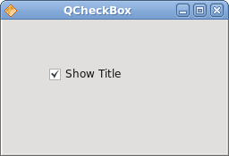
Figure: QCheckBox
QLabel
The QLabel widget is used to display text or image. No user interaction is available.package com.zetcode;Our example shows lyrics of a song in the window.
import com.trolltech.qt.gui.QApplication;
import com.trolltech.qt.gui.QFont;
import com.trolltech.qt.gui.QLabel;
import com.trolltech.qt.gui.QVBoxLayout;
import com.trolltech.qt.gui.QWidget;
/**
* ZetCode QtJambi tutorial
*
* This program uses QLabel to
* show lyrics of a song
*
* @author jan bodnar
* website zetcode.com
* last modified March 2009
*/
public class JambiApp extends QWidget {
public JambiApp() {
setWindowTitle("You know I'm no Good");
initUI();
move(300, 300);
show();
}
private void initUI() {
String text =
"Meet you downstairs in the bar and heard\n" +
"your rolled up sleeves and your skull t-shirt\n" +
"You say why did you do it with him today?\n" +
"and sniff me out like I was Tanqueray\n\n" +
"cause you're my fella, my guy\n" +
"hand me your stella and fly\n" +
"by the time I'm out the door\n" +
"you tear men down like Roger Moore\n\n" +
"I cheated myself\n" +
"like I knew I would\n" +
"I told ya, I was trouble\n" +
"you know that I'm no good";
QLabel label = new QLabel(text, this);
label.setFont(new QFont("Purisa", 9));
QVBoxLayout vbox = new QVBoxLayout();
vbox.addWidget(label);
setLayout(vbox);
}
public static void main(String[] args) {
QApplication.initialize(args);
new JambiApp();
QApplication.exec();
}
}
String text =We define a multi line text.
"Meet you downstairs in the bar and heard\n" +
...
QLabel label = new QLabel(text, this);We create the label widget and change its font.
label.setFont(new QFont("Purisa", 9));
QVBoxLayout vbox = new QVBoxLayout();Instead of manually coding the position and size of the label, we put the label into a box layout.
vbox.addWidget(label);
setLayout(vbox);
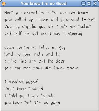
Figure: QLabel
QLineEdit
The QLineEdit is a widget that allows to enter and edit a single line of plain text. There are undo/redo, cut/paste and drag & drop functions available for QLineEdit widget.package com.zetcode;In our example we show two widgets. A line edit and a label widget. The text entered into the line edit is shown in the label widget.
import com.trolltech.qt.gui.QApplication;
import com.trolltech.qt.gui.QLabel;
import com.trolltech.qt.gui.QLineEdit;
import com.trolltech.qt.gui.QWidget;
/**
* ZetCode QtJambi tutorial
*
* This program shows text
* which is entered in a QLineEdit
* widget in a QLabel widget
*
* @author jan bodnar
* website zetcode.com
* last modified March 2009
*/
public class JambiApp extends QWidget {
QLabel label;
public JambiApp() {
setWindowTitle("QLineEdit");
initUI();
resize(250, 200);
move(300, 300);
show();
}
private void initUI() {
label = new QLabel(this);
QLineEdit edit = new QLineEdit(this);
edit.textChanged.connect(this, "onChanged(String)");
edit.move(60, 100);
label.move(60, 40);
}
private void onChanged(String text) {
    label.setText(text);
    label.adjustSize();
}
public static void main(String[] args) {
QApplication.initialize(args);
new JambiApp();
QApplication.exec();
}
}
QLineEdit edit = new QLineEdit(this);The QLineEdit widget is created.
edit.textChanged.connect(this, "onChanged(String)");When we type or delete some text from the line edit, the onChanged()method is triggered.
private void onChanged(String text) {
label.setText(text);
label.adjustSize();
}
In the onChanged() method, we set the contents of the line edit to the label widget. The adjustSize() method ensures, that all text is visible. 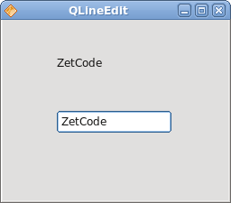
Figure: QLineEdit widget
Toggle buttons
Toggle buttons are push buttons with a checkable flag set. Toggle button is a button that has two states. Pressed and not pressed. You toggle between these two states by clicking on it. There are situations where this functionality fits well.package com.zetcode;In the code example, we use three toggle buttons to change the color of a rectangular widget.
import com.trolltech.qt.gui.QApplication;
import com.trolltech.qt.gui.QColor;
import com.trolltech.qt.gui.QPushButton;
import com.trolltech.qt.gui.QWidget;
import java.util.Formatter;
/**
* ZetCode QtJambi tutorial
*
* This program uses toggle buttons to
* change the background color of
* a widget
*
* @author jan bodnar
* website zetcode.com
* last modified March 2009
*/
public class JambiApp extends QWidget {
private QWidget square;
private QColor color;

private QPushButton redb;
private QPushButton greenb;
private QPushButton blueb;
public JambiApp() {
setWindowTitle("Toggle Buttons");
initUI();
resize(350, 240);
move(300, 300);
show();
}
private void initUI() {
color = new QColor();
redb = new QPushButton("Red", this);
redb.setCheckable(true);
greenb = new QPushButton("Green", this);
greenb.setCheckable(true);
blueb = new QPushButton("Blue", this);
blueb.setCheckable(true);
redb.toggled.connect(this, "onToggled()");
greenb.toggled.connect(this, "onToggled()");
blueb.toggled.connect(this, "onToggled()");
square = new QWidget(this);
square.setStyleSheet("QWidget { background-color: black }");
redb.move(30, 30);
greenb.move(30, 80);
blueb.move(30, 130);
square.setGeometry(150, 25, 150, 150);
}
public void onToggled() {
int red = color.red();
int green = color.green();
int blue = color.blue();
if (redb.isChecked()) {
    red = 255;
} else {
    red = 0;
}
if (greenb.isChecked()) {
green = 255;
} else {
green = 0;
}
if (blueb.isChecked()) {
blue = 255;
} else {
blue = 0;
}
color = new QColor(red, green, blue);
Formatter fmt = new Formatter();
fmt.format("QWidget { background-color: %s }", color.name());
square.setStyleSheet(fmt.toString());
}
public static void main(String[] args) {
QApplication.initialize(args);
new JambiApp();
QApplication.exec();
}
}
private QWidget square;We define five objects. The square widget is a QWidget, which shows the color. The color variable is used to hold the color value. The three buttons are toggle buttons, which are used to mix the color value.
private QColor color;
private QPushButton redb;
private QPushButton greenb;
private QPushButton blueb;
redb = new QPushButton("Red", this);
redb.setCheckable(true);
We create a QPushButton widget. The setCheckable() method changes the push button into a toggle button. redb.toggled.connect(this, "onToggled()");All three buttons are plugged into one method call, the onToggled() method.
greenb.toggled.connect(this, "onToggled()");
blueb.toggled.connect(this, "onToggled()");
square = new QWidget(this);We create the square widget. At the beginning, it is black. In QtJambi, we use style sheets to customize the appearance of a widget.
square.setStyleSheet("QWidget { background-color: black }");
Inside the onToggled() method, we determine the color value and update the square widget to a new color.
int red = color.red();Here we determine the current color of the square widget.
int green = color.green();
int blue = color.blue();
if (redb.isChecked()) {
red = 255;
} else {
red = 0;
}
Change the red part of the color, depending on the state of the red toggle button. color = new QColor(red, green, blue);We create a new color value.
Formatter fmt = new Formatter();These two lines create the text for the style sheet. We use the Java Formatter object.
fmt.format("QWidget { background-color: %s }", color.name());
square.setStyleSheet(fmt.toString());The color of the square is updated.
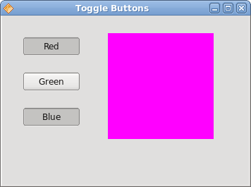
Figure: Toggle buttons
QComboBox
The QComboBox is a widget that allows the user to choose from a list of options. It is a selection widget that displays the current item, and can pop up a list of selectable items. A combo box may be editable. It presents a list of options to the user in a way that takes up the minimum amount of screen space.package com.zetcode;In our code example, we have two widgets. A combo box and a label widget. The option selected from a combo box is shown in the label.
import com.trolltech.qt.gui.QApplication;
import com.trolltech.qt.gui.QComboBox;
import com.trolltech.qt.gui.QLabel;
import com.trolltech.qt.gui.QWidget;
/**
* ZetCode QtJambi tutorial
*
* This program uses the QComboBox widget.
* The option selected from the combo box is
* displayed in the label widget.
*
* @author jan bodnar
* website zetcode.com
* last modified March 2009
*/
public class JambiApp extends QWidget {
QLabel label;
public JambiApp() {
setWindowTitle("QComboBox");
initUI();
resize(250, 200);
move(300, 300);
show();
}
private void initUI() {
label = new QLabel("Ubuntu", this);
QComboBox combo = new QComboBox(this);
combo.addItem("Ubuntu");
combo.addItem("Fedora");
combo.addItem("Mandriva");
combo.addItem("Red Hat");
combo.addItem("Mint");
combo.currentStringChanged.connect(this, "OnActivated(String)");
combo.move(50, 30);
label.move(50, 100);
}
private void OnActivated(String text) {
    label.setText(text);
    label.adjustSize();
}
public static void main(String[] args) {
QApplication.initialize(args);
new JambiApp();
QApplication.exec();
}
}
label = new QLabel("Ubuntu", this);
This is the label, that will show the currently selected option from the combo box. QComboBox combo = new QComboBox(this);We create the instance of the QComboBox widget.
combo.addItem("Ubuntu");
combo.addItem("Fedora");
combo.addItem("Mandriva");
combo.addItem("Red Hat");
combo.addItem("Mint");
Combo box is filled with values. combo.currentStringChanged.connect(this, "OnActivated(String)");When we select an option from the combo box, the OnActivated() method is triggered.
private void OnActivated(String text) {
label.setText(text);
label.adjustSize();
}
In the OnActivated() method, we update the label widget to the currently selected string from the combo box. 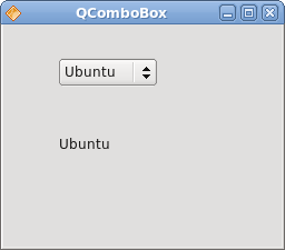
Figure: QComboBox widget
In this part of the QtJambi tutorial, we have presented several QtJambi widgets. Layout management in QtJambi
Layout management in QtJambi
In this part of the QtJambi programming tutorial, we will introduce layout managers.When we design the GUI of our application, we decide what components we will use and how we will organize those components in the application. To organize our components, we use specialized non visible objects called layout managers. There are several options in QtJambi. We can use absolute positioning, built-in layout managers or create a custom layout manager. We can also visually build the layouts using the Qt Designer.
QtJambi has some important built-in layout managers. The QVBoxLayout class lines up widgets vertically. QHBoxLayout lines up widgets horizontally. The QGridLayout class lays out widgets in a grid. The grid layout is the most flexible layout manager. The box layouts nest into one another to create complex layouts.
Absolute positioning
In most cases, programmers should use layout managers. There are a few situations, where we can use absolute positioning. In absolute positioning, the programmer specifies the position and the size of each widget in pixels. The size and the position of a widget do not change, if you resize a window. Applications look different on various platforms, and what looks OK on Linux, might not look OK on Mac. Changing fonts in your application might spoil the layout. If you translate your application into another language, you must redo your layout. For all these issues, use the absolute positioning only when you have a reason to do so.package com.zetcode;In this example, we show three images using the absolute positioning.
import com.trolltech.qt.gui.QApplication;
import com.trolltech.qt.gui.QLabel;
import com.trolltech.qt.gui.QPixmap;
import com.trolltech.qt.gui.QWidget;
/**
* ZetCode QtJambi tutorial
*
* In this program, we lay out widgets
* using absolute positioning
*
* @author jan bodnar
* website zetcode.com
* last modified April 2009
*/
public class JambiApp extends QWidget {
public JambiApp() {
setWindowTitle("Absolute");
initUI();
resize(300, 280);
move(300, 300);
show();
}
private void initUI() {
setStyleSheet("QWidget { background-color: #414141 }");
QPixmap bardejov = new QPixmap("bardejov.jpg");
QPixmap rotunda = new QPixmap("rotunda.jpg");
QPixmap mincol = new QPixmap("mincol.jpg");
QLabel barLabel = new QLabel(this);
barLabel.setPixmap(bardejov);
barLabel.move(20, 20);
QLabel rotLabel = new QLabel(this);
rotLabel.setPixmap(rotunda);
rotLabel.move(40, 160);
QLabel minLabel = new QLabel(this);
minLabel.setPixmap(mincol);
minLabel.move(170, 50);
}
public static void main(String[] args) {
QApplication.initialize(args);
new JambiApp();
QApplication.exec();
}
}
QLabel barLabel = new QLabel(this);The QLabel widget is used to hold the image.
barLabel.setPixmap(bardejov);
barLabel.move(20, 20);We use the move() method to position the label on the window at x=20, y=20.
When we resize the window, the labels retain their initial size.
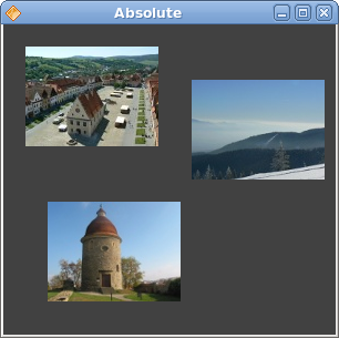
Figure: Absolute positioning
Buttons example
In the following example, we will position two buttons in the bottom right corner of the window.package com.zetcode;We use nested box layouts to get our intended layout.
import com.trolltech.qt.core.Qt;
import com.trolltech.qt.gui.QApplication;
import com.trolltech.qt.gui.QHBoxLayout;
import com.trolltech.qt.gui.QPushButton;
import com.trolltech.qt.gui.QVBoxLayout;
import com.trolltech.qt.gui.QWidget;
/**
* ZetCode QtJambi tutorial
*
* In this program, use box layouts
* to position two buttons in the
* bottom right corner of the window
*
* @author jan bodnar
* website zetcode.com
* last modified April 2009
*/
public class JambiApp extends QWidget {
public JambiApp() {
setWindowTitle("Buttons");
initUI();
resize(300, 150);
move(300, 300);
show();
}
private void initUI() {
QVBoxLayout vbox = new QVBoxLayout(this);
QHBoxLayout hbox = new QHBoxLayout();
QPushButton ok = new QPushButton("OK", this);
QPushButton apply = new QPushButton("Apply", this);
hbox.addWidget(ok, 1, Qt.AlignmentFlag.AlignRight);
hbox.addWidget(apply);
vbox.addStretch(1);
vbox.addLayout(hbox);
}
public static void main(String[] args) {
QApplication.initialize(args);
new JambiApp();
QApplication.exec();
}
}
QVBoxLayout vbox = new QVBoxLayout(this);We use one vertical and one horizontal box.
QHBoxLayout hbox = new QHBoxLayout();
QPushButton ok = new QPushButton("OK", this);
QPushButton apply = new QPushButton("Apply", this);
These are the two buttons, that will go into the bottom right corner of the window. hbox.addWidget(ok, 1, Qt.AlignmentFlag.AlignRight);We put the ok button into the horizontal box. The second parameter is the stretch factor. It expands the area allotted to the ok button. It takes all available space left. Inside this area, the button is aligned to the right.
vbox.addStretch(1);This line creates a vertically expanded white space, which will push the horizontal box with the buttons to the bottom.
vbox.addLayout(hbox);The horizontal box is nested into the vertical box.
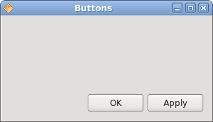
Figure: Buttons example
Windows example
The following is a more complicated example with nested box layouts.package com.zetcode;In this layout, we use two vertical and horizontal boxes.
import com.trolltech.qt.core.Qt.AlignmentFlag;
import com.trolltech.qt.gui.QApplication;
import com.trolltech.qt.gui.QHBoxLayout;
import com.trolltech.qt.gui.QLabel;
import com.trolltech.qt.gui.QPushButton;
import com.trolltech.qt.gui.QTextEdit;
import com.trolltech.qt.gui.QVBoxLayout;
import com.trolltech.qt.gui.QWidget;
/**
* ZetCode QtJambi tutorial
*
* In this program, use box layouts
* to create a windows example
*
* @author jan bodnar
* website zetcode.com
* last modified April 2009
*/
public class JambiApp extends QWidget {
public JambiApp() {
setWindowTitle("Windows");
initUI();
resize(350, 300);
move(300, 300);
show();
}
private void initUI() {
QVBoxLayout vbox = new QVBoxLayout(this);
QVBoxLayout vbox1 = new QVBoxLayout();
QHBoxLayout hbox1 = new QHBoxLayout();
QHBoxLayout hbox2 = new QHBoxLayout();
QLabel windLabel = new QLabel("Windows", this);
QTextEdit edit = new QTextEdit(this);
edit.setEnabled(false);
QPushButton activate = new QPushButton("Activate", this);
QPushButton close = new QPushButton("Close", this);
QPushButton help = new QPushButton("Help", this);
QPushButton ok = new QPushButton("OK", this);
vbox.addWidget(windLabel);
vbox1.addWidget(activate);
vbox1.addWidget(close, 0, AlignmentFlag.AlignTop);
hbox1.addWidget(edit);
hbox1.addLayout(vbox1);

vbox.addLayout(hbox1);
hbox2.addWidget(help);
hbox2.addStretch(1);
hbox2.addWidget(ok);

vbox.addLayout(hbox2, 1);
setLayout(vbox);
}
public static void main(String[] args) {
QApplication.initialize(args);
new JambiApp();
QApplication.exec();
}
}
QVBoxLayout vbox = new QVBoxLayout(this);This is the base layout of the example.
vbox.addWidget(windLabel);First goes the label widget. It goes simply to the top of the vertical box.
vbox1.addWidget(activate);In the center part of the window we have a text edit widget and two vertically lined up buttons. The buttons go into a vertical box. The buttons are aligned to the top within this vertical box. The vertical box and the text edit go into a horizontal box. This horizontal box goes to the base vertical box, just below the label widget.
vbox1.addWidget(close, 0, AlignmentFlag.AlignTop);
hbox1.addWidget(edit);
hbox1.addLayout(vbox1);
vbox.addLayout(hbox1);
hbox2.addWidget(help);The help and the ok button go into another horizontal box. There is an expanded white space between these two buttons. Again, the horizontal box goes to the base vertical box.
hbox2.addStretch(1);
hbox2.addWidget(ok);
vbox.addLayout(hbox2, 1);
setLayout(vbox);The base vertical box is set to be the main layout of the window.
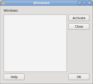
Figure: Windows example
New Folder example
In the last example, we use the QGridLayout manager to create a New Folder layout example.package com.zetcode;In our example, we have one label, one line edit, one text edit and two buttons.
import com.trolltech.qt.gui.QApplication;
import com.trolltech.qt.gui.QGridLayout;
import com.trolltech.qt.gui.QLabel;
import com.trolltech.qt.gui.QLineEdit;
import com.trolltech.qt.gui.QPushButton;
import com.trolltech.qt.gui.QTextEdit;
import com.trolltech.qt.gui.QWidget;
/**
* ZetCode QtJambi tutorial
*
* In this program, use the QGridLayout
* to create a New Folder example
*
* @author jan bodnar
* website zetcode.com
* last modified April 2009
*/
public class JambiApp extends QWidget {
public JambiApp() {
setWindowTitle("New Folder");
initUI();
move(300, 300);
show();
}
private void initUI() {
QGridLayout grid = new QGridLayout(this);
QLabel nameLabel = new QLabel("Name", this);
QLineEdit nameEdit = new QLineEdit(this);
QTextEdit text = new QTextEdit(this);
QPushButton okButton = new QPushButton("OK", this);
QPushButton closeButton = new QPushButton("Close", this);
grid.addWidget(nameLabel, 0, 0);
grid.addWidget(nameEdit, 0, 1, 1, 3);
grid.addWidget(text, 1, 0, 2, 4);
grid.setColumnStretch(1, 1);
grid.addWidget(okButton, 4, 2);
grid.addWidget(closeButton, 4, 3);
}
public static void main(String[] args) {
QApplication.initialize(args);
new JambiApp();
QApplication.exec();
}
}
QGridLayout grid = new QGridLayout(this);We create an instance of the QGridLayout manager.
grid.addWidget(nameLabel, 0, 0);We place the label widget in the first cell of the grid. The cells count from 0. The last two parameters are the row and column number.
grid.addWidget(nameEdit, 0, 1, 1, 3);The line edit widget is placed at the first row, second column. The last two parameters are the row span and the column span. Horizontally, the widget will span three columns.
grid.setColumnStretch(1, 1);The parameters of the method are the column number and the stretch factor. Here we set stretch factor 1 to the second column. This means, that this column will take all remaining space. This was set, because we wanted our buttons to retain their initial size.
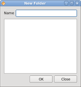
Figure: New Folder example
In this part of the QtJambi tutorial, we mentioned layout management of widgets. 