Showing posts with label Tk. Show all posts
Showing posts with label Tk. Show all posts
Nibbles in Tk Programming
Nibbles
In this part of the Tcl/Tk tutorial, we will create a Nibbles game clone.Nibbles is an older classic video game. It was first created in late 70s. Later it was brought to PCs. In this game the player controls a snake. The objective is to eat as many apples as possible. Each time the snake eats an apple, its body grows. The snake must avoid the walls and its own body.
Development
The size of each of the joints of a snake is 10px. The snake is controlled with the cursor keys. Initially, the snake has three joints. The game starts immediately. When the game is finished, we display "Game Over" message in the center of the window.We use the
canvas widget to create the game. The objects in the game are images. We use canvas commands to create image items. We use canvas commands to find items on the canvas using tags and to do collision detection. #!/usr/bin/wishFirst we will define some constants used in our game.
# ZetCode Tcl/Tk tutorial
#
# This is simple Nibbles game clone.
#
# author: Jan Bodnar
# last modified: March 2011
# website: www.zetcode.com
package require Img
set WIDTH 300
set HEIGHT 300
set DELAY 100
set DOT_SIZE 10
set ALL_DOTS [expr $WIDTH * $HEIGHT / ($DOT_SIZE * $DOT_SIZE)]
set RAND_POS 27
canvas .c -width $WIDTH -height $HEIGHT -background black
pack .c
proc initGame {} {
set ::left false
set ::right true
set ::up false
set ::down false
set ::inGame true
set dots 3
set ::apple_x 100
set ::apple_y 190
for {set i 0} {$i<$dots} {incr i} {
set x($i) [expr 50 - $i * 10]
set y($i) 50
}
set ::idot [image create photo img1 -file "dot.png"]
set ::ihead [image create photo img2  -file "head.png"]
set ::iapple [image create photo img3 -file "apple.png"]
createObjects
locateApple
bind . "<Key>" "onKeyPressed %K"
after $::DELAY onTimer
}
proc createObjects {} {

    .c create image $::apple_x $::apple_y \
        -image $::iapple -tag apple -anchor nw
    .c create image 50 50 -image $::ihead -tag head -anchor nw
    .c create image 30 50 -image $::idot -tag dot -anchor nw
    .c create image 40 50 -image $::idot -tag dot -anchor nw
}
proc checkApple {} {
set apple [.c find withtag apple]
set head [.c find withtag head]
set l [.c bbox head]
set overlap [eval .c find overlapping $l]
foreach over $overlap {

    if {$over == $apple} {
        set crd [.c coords $apple]
        set x [lindex $crd 0]
        set y [lindex $crd 1]
        .c create image $x $y -image $::idot -anchor nw -tag dot
        locateApple
    }
}
}
proc doMove {} {
set dots [.c find withtag dot]
set head [.c find withtag head]
set items [concat $dots $head]
set z 0

while {$z < [expr [llength $items] - 1]} {

    set c1 [.c coords [lindex $items $z]]
    set c2 [.c coords [lindex $items [expr $z+1]]]

    .c move [lindex $items $z] [expr [lindex $c2 0]  - [lindex $c1 0] ] \
        [expr [lindex $c2 1]  - [lindex $c1 1] ]
    incr z
}
if { [string compare $::left true] == 0} {
    .c move head -$::DOT_SIZE 0
}
if {[string compare $::right true] == 0} {
.c move head $::DOT_SIZE 0
}
if {[string compare $::up true] == 0} {
.c move head 0 -$::DOT_SIZE
}
if {[string compare $::down true] == 0} {
.c move head 0 $::DOT_SIZE
}
}
proc checkCollisions {} {
set dots [.c find withtag dot]
set head [.c find withtag head]
set l [.c bbox head]
set overlap [eval .c find overlapping $l]

foreach dot $dots {

    foreach over $overlap {
        if {$over == $dot} {
              set ::inGame false
        }
    }
}
set x1 [lindex $l 0]
set y1 [lindex $l 1]
if {$x1 < 0} {
set ::inGame false
}
if {$x1 > [expr $::WIDTH - $::DOT_SIZE]} {
set ::inGame false
}
if {$y1 < 0} {
set ::inGame false
}
if {$y1 > [expr $::HEIGHT - $::DOT_SIZE]} {
    set ::inGame false
}
}
proc locateApple {} {
set apple [.c find withtag apple]
.c delete lindex apple 0
set r [expr round(rand() * $::RAND_POS)]
set ::apple_x [expr $r * $::DOT_SIZE]
set r [expr round(rand() * $::RAND_POS)]
set ::apple_y [expr $r * $::DOT_SIZE]
.c create image $::apple_x $::apple_y -anchor nw \
-image $::iapple -tag apple
}
proc onKeyPressed {key} {
set a1 [ expr [string compare $key Left] == 0]
set a2 [ expr [string compare $::right true] != 0]

if { $a1 && $a2 } {

    set ::left true
    set ::up false
    set ::down false
    }
set b1 [ expr [string compare $key Right] == 0]
set b2 [ expr [string compare $::left true] != 0]
if { $b1 && $b2 } {
set ::right true
set ::up false
set ::down false
}
set c1 [ expr [string compare $key Up] == 0]
set c2 [ expr [string compare $::down true] != 0]
if { $c1 && $c2 } {
set ::up true
set ::left false
set ::right false
}
set d1 [ expr [string compare $key Down] == 0]
set d2 [ expr [string compare $::up true] != 0]
if { $d1 && $d2 } {
set ::down true
set ::left false
set ::right false
}
}
proc onTimer {} {

    if {$::inGame} {
        checkCollisions
        checkApple
        doMove
        after $::DELAY onTimer
    } else {
        gameOver
    }
}
proc gameOver {} {

   .c delete all

   set x [ expr [winfo width .] / 2 ]
   set y [ expr [winfo height .] / 2]

   .c create text $x $y  -text "Game over" -fill white
}
initGame
wm title . "Nibbles"
wm geometry . +150+150
The
WIDTH and HEIGHT constants determine the size of the Board. The DELAY constant determines the speed of the game. The DOT_SIZE is the size of the apple and the dot of the snake. The ALL_DOTS constant defines the maximum number of possible dots on the Board. The RAND_POS constant is used to calculate a random position of an apple. The
initGame procedure initializes variables, loads images and starts a timeout procedure. set ::idot [image create photo img1 -file "dot.png"]In these lines, we load our images. There are three images in the Nibbles game. The head, the dot and the apple.
set ::ihead [image create photo img2 -file "head.png"]
set ::iapple [image create photo img3 -file "apple.png"]
createObjectsThe createObjects procedure creates items on the canvas. The locateApple puts an apple randomly on the canvas.
locateApple
bind . "<Key>" "onKeyPressed %K"We bind the keyboard events to the onKeyPressed procedure. The game is controlled with keyboard cursor keys. The %K is a Tk symbolic name for the pressed key. It is passed to the onKeyPressed procedure.
proc createObjects {} {
.c create image $::apple_x $::apple_y \
-image $::iapple -tag apple -anchor nw
.c create image 50 50 -image $::ihead -tag head -anchor nw
.c create image 30 50 -image $::idot -tag dot -anchor nw
.c create image 40 50 -image $::idot -tag dot -anchor nw
}
In the createObjects procedure, we create game objects on the canvas. These are canvas items. They are given initial x, y coordinates. The -image option provides the image to be displayed. The -anchor option is set to nw; this way the coordinates of the canvas item are the top-left points of the items. This is important if we want to be able to display images next to the borders of the root window. If you don't know what I mean, try to delete the anchor option. The -tag option is used to identify items on the canvas. One tag may be used for multiple canvas items. The checkApple procedure checks, if the snake has hit the apple object. If so, we add another snake joint and call the locateApple.
set apple [.c find withtag apple]The
set head [.c find withtag head]
find withtag command finds an item on the canvas using its tag. We need two items. The head of the snake and the apple. set l [.c bbox head]The
set overlap [eval .c find overlapping $l]
bbox command returns the bounding box points of an item. The find overlapping command finds colliding items for the given coordinates. foreach over $overlap {
if {$over == $apple} {
set crd [.c coords $apple]
set x [lindex $crd 0]
set y [lindex $crd 1]
.c create image $x $y -image $::idot -anchor nw -tag dot
locateApple
}
}
If the apple collides with the head, we create a new dot item at the coordinates of the apple object. We call the locateApple procedure, which deletes the old apple item from the canvas and creates and randomly positions a new one. In the doMove procedure we have the key algorithm of the game. To understand it, look at how the snake is moving. You control the head of the snake. You can change its direction with the cursor keys. The rest of the joints move one position up the chain. The second joint moves where the first was, the third joint where the second was etc.
set z 0This code moves the joints up the chain.
while {$z < [expr [llength $items] - 1]} {
set c1 [.c coords [lindex $items $z]]
set c2 [.c coords [lindex $items [expr $z+1]]]
.c move [lindex $items $z] [expr [lindex $c2 0] - [lindex $c1 0] ] \
[expr [lindex $c2 1] - [lindex $c1 1] ]
incr z
}
if { [string compare $::left true] == 0} {
.c move head -$::DOT_SIZE 0
}
Move the head to the left. In the
checkCollisions procedure, we determine if the snake has hit itself or one of the walls. set l [.c bbox head]Finish the game, if the snake hits one of its joints with the head.
set overlap [eval .c find overlapping $l]
foreach dot $dots {
foreach over $overlap {
if {$over == $dot} {
set ::inGame false
}
}
}
if {$y1 > [expr $::HEIGHT - $::DOT_SIZE]} {
set ::inGame false
}
Finish the game, if the snake hits the bottom of the Board. The locateApple procedure locates a new apple randomly on the board and deletes the old one.
set apple [.c find withtag apple]Here we find and delete the apple, that was eaten by the snake.
.c delete lindex apple 0
set r [expr round(rand() * $::RAND_POS)]We get a random number from 0 to RAND_POS - 1.
set ::apple_x [expr $r * $::DOT_SIZE]These lines set the x, y coordinates of the apple object.
...
set ::apple_y [expr $r * $::DOT_SIZE]
In the onKeyPressed procedure we determine the keys that were pressed.
set a1 [ expr [string compare $key Left] == 0]If we hit the left cursor key, we set left variable to true. This variable is used in the doMove procedure to change the coordinates of the snake object. Notice also, that when the snake is heading to the right, we cannot turn immediately to the left.
set a2 [ expr [string compare $::right true] != 0]
if { $a1 && $a2 } {
set ::left true
set ::up false
set ::down false
}
proc onTimer {} {
if {$::inGame} {
checkCollisions
checkApple
doMove
after $::DELAY onTimer
} else {
gameOver
}
}
Every DELAYms, the onTimer procedure is called. If we are in the game, we call three procedures, that build the logic of the game. Otherwise the game is finished. The timer is based on the after command which calls a procedure after DELAYms only once. To repeteadly call the timer, we recursively call the onTimer procedure. proc gameOver {} {
.c delete all
set x [ expr [winfo width .] / 2 ]
set y [ expr [winfo height .] / 2]
.c create text $x $y -text "Game over" -fill white
}
If the game is over, we delete all items on the canvas. Then we draw "Game Over" in the center of the screen. 
Figure: Nibbles
This was the Nibbles computer game created with Tcl/Tk. Drawing in Tk Programming
Drawing
In this part of the Tcl/Tk tutorial we will do some drawing. Drawing in Tk is done on thecanvas widget. The canvas is a high level facility for graphics in Tk.It can be used to create charts, custom widgets or to create games.
Colors
A color is an object representing a combination of Red, Green, and Blue (RGB) intensity values.#!/usr/bin/wishIn the code example, we draw three rectangles and fill them with different color values.
# ZetCode Tcl/Tk tutorial
#
# This program draws three
# rectangles filled with different
# colors.
#
# author: Jan Bodnar
# last modified: March 2011
# website: www.zetcode.com
canvas .can
.can create rect 30 10 120 80 \
    -outline #fb0 -fill #fb0
.can create rect 150 10 240 80 \
-outline #f50 -fill #f50
.can create rect 270 10 370 80 \
-outline #05f -fill #05f
pack .can
wm title . "colors"
wm geometry . 400x100+300+300
canvas .canWe create the
canvas widget. .can create rect 30 10 120 80 \With the
-outline #fb0 -fill #fb0
create command, we create a new rectangle item on the canvas. The first four parameters are the x, y coordinates of the two bounding points. The top-left and the bottom-right. With the -outline option we control the color of the outline of the rectangle. Likewise, the -fill option provides a color for the inside of the rectangle. 
Figure: colors
Shapes
We can draw various shapes on the canvas. The following code example will show some of them.#!/usr/bin/wishWe draw five different shapes on the window. A circle, an ellipse, a rectangle, an arc and a polygon. Outlines and insides are drawn in the same gray color.
# ZetCode Tcl/Tk tutorial
#
# In this script, we draw basic
# shapes on the canvas.
#
# author: Jan Bodnar
# last modified: March 2011
# website: www.zetcode.com
canvas .can
.can create oval 10 10 80 80 -outline #777 \
    -fill #777
.can create oval 110 10 210 80 -outline #777 \
-fill #777
.can create rect 230 10 290 60 -outline #777 \
    -fill #777
.can create arc 30 200 90 100 -start 0 -extent 210 \
    -outline #777 -fill #777
set points  [ list 150 100 200 120 240 180 210 \
    200 150 150 100 200 ]
.can create polygon $points -outline #777 \
    -fill #777
pack .can
wm title . "shapes"
wm geometry . 330x220+300+300
.can create oval 10 10 80 80 -outline #777 \The
-fill #777
create oval creates a circle. The first four parameters are the bounding box coordinates of the circle. In other words, they are x, y coordinates of the top-left and bottom-right points of the box, in which the circle is drawn. .can create rect 230 10 290 60 -outline #777 \We create a rectangle item. The coordinates are again the bounding box of the rectangle to be drawn.
-fill #777
.can create arc 30 200 90 100 -start 0 -extent 210 \This code line creates an arc. An arc is a part of the circumference of the circle. We provide the bounding box. The -start option is the start angle of the arc. The -extent is the angle size.
-outline #777 -fill #777
set points [ list 150 100 200 120 240 180 210 \A polygon is created. It is a shape with multiple corners. To create a polygon in Tk, we provide the list of polygon coordinates to the
200 150 150 100 200 ]
.can create polygon $points -outline #777 \
-fill #777
create polygon command. 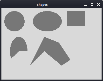
Figure: shapes
Drawing image
In the following example we will create an image item on the canvas.#!/usr/bin/wishWe display an image on the canvas.
# ZetCode Tcl/Tk tutorial
#
# This program draws an image
# on the canvas widget.
#
# author: Jan Bodnar
# last modified: March 2011
# website: www.zetcode.com
package require Img
image create photo img -file "tatras.jpg"
set height [image height img]
set width [image width img]
canvas .can -height $height -width $width
.can create image 0 0 -anchor nw -image img
pack .can
wm title . "High Tatras"
wm geometry . +300+300
image create photo img -file "tatras.jpg"We create a photo image from a jpg image located in the current working directory.
set height [image height img]We get the height and width of the image.
set width [image width img]
canvas .can -height $height -width $widthWe create the
canvas widget. It takes the size of the image into account. .can create image 0 0 -anchor nw -image imgWe use the
create image command to create an image item on the canvas. To show the whole image, it is anchored to the north and to the west. The -image option provides the photo image to display. Drawing text
In the last example, we are going to draw text on the window.#!/usr/bin/wishWe draw a lyrics of a song on the window.
# ZetCode Tcl/Tk tutorial
#
# In this script, we draw text
# on the window.
#
# author: Jan Bodnar
# last modified: March 2011
# website: www.zetcode.com
canvas .can
.can create text 10 30 -anchor w -font Purisa \
    -text "Most relationships seem so transitory"
.can create text 10 60 -anchor w -font Purisa \
-text "They're good but not the permanent one"
.can create text 10 110 -anchor w -font Purisa \
-text "Who doesn't long for someone to hold"
.can create text 10 140 -anchor w -font Purisa \
-text "Who knows how to love without being told"
.can create text 10 170 -anchor w -font Purisa \
-text "Somebody tell me why I'm on my own"
.can create text 10 200 -anchor w -font Purisa \
-text "If there's a soulmate for everyone"
pack .can
wm title . "lyrics"
wm geometry . 430x250+300+300
.can create text 10 30 -anchor w -font Purisa \The first two parameters are the x, y coordinates of the center point of the text. If we anchor the text item to the west, the text starts from this position. The -font option provides the font of the text and the -text option is the text to be displayed.
-text "Most relationships seem so transitory"
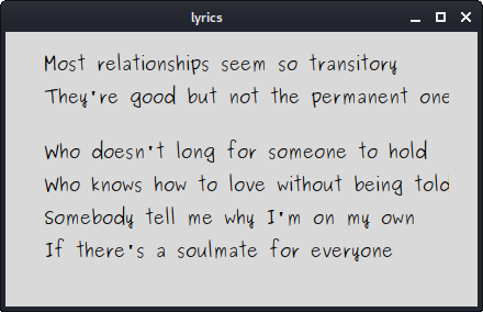
Figure: Drawing text
In this part of the Tcl/Tk tutorial, we did some drawing. Dialogs in Tk Programming
Dialogs in Tk
In this part of the Tcl/Tk tutorial, we will work with dialogs.Dialog windows or dialogs are an indispensable part of most modern GUI applications. A dialog is defined as a conversation between two or more persons. In a computer application a dialog is a window which is used to "talk" to the application. A dialog is used to input data, modify data, change the application settings etc. Dialogs are important means of communication between a user and a computer program.
Message boxes
Message boxes are convenient dialogs that provide messages to the user of the application. The message consists of text and image data. Message boxes in Tk are created with thetk_messageBox command. #!/usr/bin/wishWe use the grid manager to set up a grid of four buttons. Each of the buttons shows a different message box.
# ZetCode Tcl/Tk tutorial
#
# In this program, we show various
# message boxes.
#
# author: Jan Bodnar
# last modified: March 2011
# website: www.zetcode.com
frame .fr
pack .fr
ttk::button .fr.erButton -text Error -command onError
grid .fr.erButton
ttk::button .fr.wButton -text Warning -command onWarn
grid .fr.wButton -row 1 -column 0
ttk::button .fr.queButton -text Question -command onQuest
grid .fr.queButton -row 0 -column 1 -sticky we -columnspan 6
ttk::button .fr.infButton -text Information -command onInfo
grid .fr.infButton -row 1 -column 1
proc onError {} {
    tk_messageBox -type ok -icon error -title Error \
    -message "Could not open file"
}
proc onWarn {} {
tk_messageBox -type ok -icon warning -title Warning \
-message "Deprecated function call"
}
proc onQuest {} {
tk_messageBox -type ok -icon question -title Question \
-message "Are you sure to quit?"
}
proc onInfo {} {
tk_messageBox -type ok -icon info -title Information \
-message "Download completed"
}
wm title . "message boxes"
wm geometry . 300x150+300+300
ttk::button .fr.erButton -text Error -command onErrorWe create an error button, which calls the onError procedure. Inside the method, we show the error message dialog. The button is placed into the first cell of the grid. Widgets inside the ttk namespace are themed. The
grid .fr.erButton
button and ttk::button are the same buttons in terms of functionality. The difference is that we can apply themes on the latter. proc onError {} {
tk_messageBox -type ok -icon error -title Error \
-message "Could not open file"
}
In case we pressed the error button, we show the error dialog. We use the tk_messageBox command to create the message box. The -type option specifies which buttons are shown in the dialog. In our case it is a single OK button. The -icon specifies the type of the icon to be shown. The -title provides the title of the dialog and the -message its message. 
Figure: Warning message dialog
Color chooser
The color chooser is a dialog for selecting a color. We use thetk_chooseColor command to display the dialog. #!/usr/bin/wishWe have a button and a label. Clicking on the button we show a color chooser dialog. We will change the color of the label text by selecting a color from the dialog.
# ZetCode Tcl/Tk tutorial
#
# In this script, we use tk_chooseColor
# dialog to change the color of the text.
#
# author: Jan Bodnar
# last modified: March 2011
# website: www.zetcode.com
label .l -text ZetCode
place .l -x 20 -y 90
button .b -text "Choose a color..." \
        -command "onSelect .l"
place .b -x 20 -y 30
wm title . "color dialog"
wm geometry . 350x200+300+300
proc onSelect {widget} {
    set col \
        [tk_chooseColor -title "Choose a color" -parent .]
    $widget configure -foreground $col
}
label .l -text ZetCodeWe create a
place .l -x 20 -y 90
label widget and place it on the window. button .b -text "Choose a color..." \We create a
-command "onSelect .l"
place .b -x 20 -y 30
button widget and place it on the window. We pass the widget path of the label to the onSelect procedure, which shows the dialog and changes the color of the label. proc onSelect {widget} {
set col \
[tk_chooseColor -title "Choose a color" -parent .]
$widget configure -foreground $col
}
Inside the onSelect procedure, we show the dialog and change the label color. First we display the dialog and store the chosen color value in the col variable. Later we use the configure command to change the foreground of the label. The command is executed on the widget's path name. The label's path name was passed to the procedure. 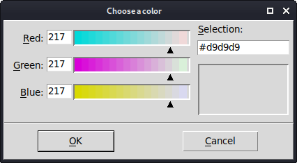
Figure: Color chooser
File dialog
tk_getOpenFile dialog allows a user to select a file from the filesystem. #!/usr/bin/wishIn our code example, we use the
# ZetCode Tcl/Tk tutorial
#
# In this program, we use the
# tk_getOpenFile dialog to select a file from
# a filesystem.
#
# author: Jan Bodnar
# last modified: March 2011
# website: www.zetcode.com
set types {
    {"All Source Files"     {.tcl .tk } }
    {"Image Files"          {.gif .png .jpg} }
    {"All files"            *}
}
proc onSelect { label } {
    global types
    set file [tk_getOpenFile -filetypes $types -parent .]
    $label configure -text $file
}
label .l -text "..."
place .l -x 20 -y 90
button .b -text "Select a file" \
-command "onSelect .l"
place .b -x 20 -y 30
wm title . "openfile"
wm geometry . 350x200+300+300
tk_getOpenFile dialog to select a file and display its name in a label widget. set types {
{"All Source Files" {.tcl .tk } }
{"Image Files" {.gif .png .jpg} }
{"All files" *}
}
These are file filters. These filters can be used to show only specific files in the dialog. proc onSelect { label } {
global types
set file [tk_getOpenFile -filetypes $types -parent .]
$label configure -text $file
}
We show the dialog with the tk_getOpenFile command. We apply the file filters using the -filetypes option. The selected file name is stored in the file variable. The configure command is used to change the text of the label. 
Figure: tk_getOpenFile
In this part of the Tcl/Tk tutorial, we worked with dialog windows. Menus And toolbars in Tk Programming
Menus & toolbars
In this part of the Tcl/Tk tutorial, we will work with menus and a toolbar.A menubar is one of the most visible parts of the GUI application. It is a group of commands located in various menus. While in console applications you had to remember all those arcane commands, here we have most of the commands grouped into logical parts. There are accepted standards that further reduce the amount of time spending to learn a new application. Menus group commands that we can use in an application. Toolbars provide a quick access to the most frequently used commands.
Simple menu
The first example will show a simple menu.#!/usr/bin/wishOur example will show a File menu with one item. By selecting the exit menu item we close the application.
# ZetCode Tcl/Tk tutorial
#
# In this code example, we create
# a simple menu.
#
# author: Jan Bodnar
# last modified: March 2011
# website: www.zetcode.com
menu .mbar
. configure -menu .mbar
menu .mbar.fl -tearoff 0
.mbar add cascade -menu .mbar.fl -label File \
    -underline 0
.mbar.fl add command -label Exit -command { exit }
wm title . "Simple menu"
wm geometry . 250x150+300+300
menu .mbarWe create a menubar. A menubar is a special case of a menu.
. configure -menu .mbar
menu .mbar.fl -tearoff 0File menu is created. The -tearoff option specifies that the menu cannot be removed from the menubar.
.mbar add cascade -menu .mbar.fl -label File \We add the file menu to the menubar. The -underline option underlines the first character of the label. Now the menu can be pulled down with the Alt + F shortcut.
-underline 0
.mbar.fl add command -label Exit -command { exit }
An Exit command is added to the File menu. This will create a menu item. When the menu item is selected, the application terminates. 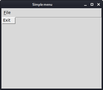
Figure: Simple menu
Submenu
A submenu is a menu plugged into another menu object. The next example demonstrates this.#!/usr/bin/wishIn the example, we have three options in a submenu of a file menu. We create a separator and keyboard shortcuts.
# ZetCode Tcl/Tk tutorial
#
# In this code example, we create
# a submenu.
#
# author: Jan Bodnar
# last modified: March 2011
# website: www.zetcode.com
menu .mbar
. configure -menu .mbar
menu .mbar.fm -tearoff 0
.mbar add cascade -menu .mbar.fm -label File \
-underline 0
menu .mbar.fm.sb
.mbar.fm.sb add command -label "News feed"
.mbar.fm.sb add command -label Bookmarks
.mbar.fm.sb add command -label Mail
.mbar.fm add cascade -label Import -menu \
    .mbar.fm.sb -underline 0
.mbar.fm add separator
.mbar.fm add command -label Exit -underline 0 \
-command {exit}
wm title . submenu
wm geometry . 250x150+300+300
menu .mbar.fm.sbWe have a submenu with three commands. The submenu is a regular menu. Note the hierarchy of the widget path name.
.mbar.fm.sb add command -label "News feed"
.mbar.fm.sb add command -label Bookmarks
.mbar.fm.sb add command -label Mail
.mbar.fm add cascade -label Import -menu \By adding the menu to the File menu and not to the menubar, we create a submenu. The underline parameter creates a keyboard shortcut. We provide a character position, which should be underlined. In our case it is the first. Positions start from zero. When we click on the File menu, a popup window is shown. The Import menu has one character underlined. We can select it either with the mouse pointer, or with the Alt + I shortcut.
.mbar.fm.sb -underline 0
.mbar.fm add separatorA separator is a horizontal line that visually separates the menu commands. This way we can group items into some logical places.
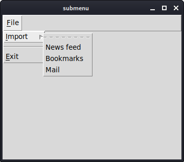
Figure: Submenu
Popup menu
In the next example, we create a popup menu. Popup menu is also called a context menu. It can be shown anywhere on the client area of a window.#!/usr/bin/wishIn our example, we create a popup menu with two commands.
# ZetCode Tcl/Tk tutorial
#
# In this code example, we create
# a popup menu.
#
# author: Jan Bodnar
# last modified: March 2011
# website: www.zetcode.com
menu .m -tearoff 0
.m add command -label Beep
.m add command -label Exit -command {exit}
bind . "<Button-3>" "showMenu %X %Y"
wm title . popupmenu
wm geometry . 250x150+300+300
proc showMenu {x y} {
    tk_popup .m $x $y
}
menu .m -tearoff 0A context menu is a regular
.m add command -label Beep
.m add command -label Exit -command {exit}
menu widget. The tearoff feature is turned off. bind . "<Button-3>" "showMenu %X %Y"We bind the <Button-3> event to the showMenu procedure. The event is generated when we right click on the client area of the window. We pass two parameters to the procedure. These are the x, y coordinates of the mouse click.
proc showMenu {x y} {
tk_popup .m $x $y
}
The showMenu procedure shows the context menu. The popup menu is shown at the x, y coordinates of the mouse click. To display the popup menu, we use the tk_popup command. 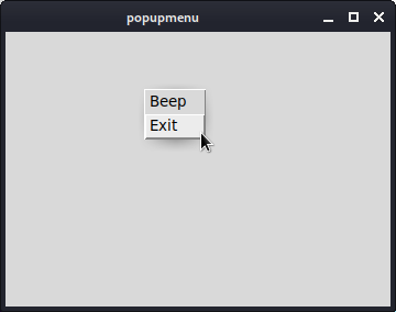
Figure: Popup menu
Toolbar
Menus group commands that we can use in an application. Toolbars provide a quick access to the most frequently used commands. There is no toolbar widget in Tk.#!/usr/bin/wishOur toolbar will be a frame on which we will put a button.
# ZetCode Tcl/Tk tutorial
#
# In this code example, we create
# a toolbar.
#
# author: Jan Bodnar
# last modified: March 2011
# website: www.zetcode.com
package require Img
menu .mbar
. configure -menu .mbar
menu .mbar.fl -tearoff 0
.mbar add cascade -menu .mbar.fl -label File \
-underline 0
frame .toolbar -bd 1 -relief raised
image create photo img -file "exit.png"
button .toolbar.exitButton -image img -relief flat -command {exit}
pack .toolbar.exitButton -side left -padx 2 -pady 2
pack .toolbar -fill x
wm title . toolbar
wm geometry . 250x150+300+300
frame .toolbar -bd 1 -relief raisedA toolbar is created. It is a
frame. We created a raised border, so that the boundaries of a toolbar are visible. image create photo img -file "exit.png"An exit button with an image is created.
button .toolbar.exitButton -image img -relief flat -command {exit}
pack .toolbar.exitButton -side left -padx 2 -pady 2The toolbar is a frame and a frame is a container widget. We pack the button to the left side. We add some padding.
pack .toolbar -fill xThe toolbar is packed to the root window. It is horizontally stretched.
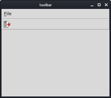
Figure: Toolbar
In this part of the Tcl/Tk tutorial, we have shown how to create a menubar with menus and menu items and a toolbar. Tk Programming Widgets
Tk Widgets
In this part of the Tcl/Tk tutorial, we will cover some basic Tk widgets. We will have an example for acheckbutton, label, scale and listbox widgets.Widgets are basic building blocks of a GUI application. Over the years, several widgets became a standard in all toolkits on all OS platforms. For example a button, a check box or a scroll bar. Some of them might have a different name. For instance, a check box is called a check button in Tk. Tk has a small set of widgets which cover the basic programming needs. More specialized widgets can be created as custom widgets.
Checkbutton
Thecheckbutton is a widget, that has two states. On and Off. The On state is visualized by a check mark. It is used to denote some boolean property. The checkbutton widget provides a check box with a text label. #!/usr/bin/wishIn our example, we place a check button on the window. The check button shows/hides the title of the window.
# ZetCode Tcl/Tk tutorial
#
# This program toggles the title of the
# window with the checkbutton widget.
#
# author: Jan Bodnar
# last modified: March 2011
# website: www.zetcode.com
frame .fr
pack .fr -fill both -expand 1
checkbutton .fr.cb -text "Show title" -command onClick  \
    -onvalue true -offvalue false -variable selected
.fr.cb select
place .fr.cb -x 50 -y 50
proc onClick {} {
global selected
if {$selected==true} {

    wm title . checkbutton
} else {
    wm title . ""
}
}
wm title . checkbutton
wm geometry . 250x150+300+300
checkbutton .fr.cb -text "Show title" -command onClick \The
-onvalue true -offvalue false -variable selected
checkbutton command creates a checkbutton widget. The -text option specifies the text which is displayed by the widget. When we click on the widget, the onClick procedure is executed. When the checkbutton is checked the selected variable has true value. Otherwise it has false value. .fr.cb selectInitially, the title is shown in the titlebar. So at the start, we make the widget checked with the
select command. place .fr.cb -x 50 -y 50We place the checkbutton widget on the frame at x=50, y=50 coordinates.
if {$selected==true} {
wm title . checkbutton
} else {
wm title . ""
}
Inside the onClick procedure, we display or hide the title based on the selected variable. 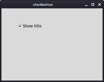
Figure: checkbutton
Label
Thelabel widget is used to display text or images. No user interaction is available. sudo apt-get install libtk-imgIn order to run this example, we must install libtk-img package.
#!/usr/bin/wishOur example shows an image on the window.
# ZetCode Tcl/Tk tutorial
#
# In this script, we use a label
# widget to show an image.
#
# author: Jan Bodnar
# last modified: March 2011
# website: www.zetcode.com
package require Img
frame .fr
pack .fr
image create photo img -file "tatras.jpg"
label .fr.lbl -image img
pack .fr.lbl
wm title . label
wm geometry . +300+300
package require ImgBy default, the
label widget can display only a limited set of image types. To display a jpg image, we must use an Img package. image create photo img -file "tatras.jpg"We create a photo image from the image on the file system.
label .fr.lbl -image imgThe photoimage is given to the
image parameter of the label widget. pack .fr.lblThe image is packed into the frame.
wm geometry . +300+300We specify the x, y coordinates. These are used to position a window on the screen. We omit the size of the window. The pack manager will set the window size to the size of the image.
Scale
scale is a widget that lets the user graphically select a value by sliding a knob within a bounded interval. Our example will show a selected number in a label widget. #!/usr/bin/wishWe have two widgets in the above script. A scale and a label. A value from the scale widget is shown in the label widget.
# ZetCode Tcl/Tk tutorial
#
# In this script, we show how to
# use the scale widget.
#
# author: Jan Bodnar
# last modified: March 2011
# website: www.zetcode.com
frame .fr
pack .fr -fill both -expand 1
scale .fr.scl -orient horizontal -from 0 -to 100 \
    -length 150  -variable val -showvalue 0
place .fr.scl -x 50 -y 50
label .fr.lbl -textvariable val
place .fr.lbl -x 80 -y 110
wm title . scale
wm geometry . 250x150+300+300
scale .fr.scl -orient horizontal -from 0 -to 100 \
-length 150 -variable val -showvalue 0
scale widget is created. The -orient option makes the widget horizontal. We provide the lower and upper bounds with the -from and -to options. The currently selected number is stored in the val variable. By default the scale widget shows also the selected number. With the -showvalue option, we hide it. label .fr.lbl -textvariable valA
label widget is created. It will display the beforementioned val variable. 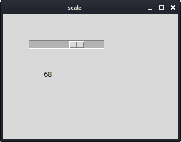
Figure: scale widget
Listbox
listbox is a widget that displays a list of objects. It allows the user to select one or more items. #!/usr/bin/wishIn our example, we show a list of actresses in the
# ZetCode Tcl/Tk tutorial
#
# In this script, we show how to
# use the listbox widget.
#
# author: Jan Bodnar
# last modified: March 2011
# website: www.zetcode.com
frame .fr
pack .fr -fill both -expand 1
listbox .fr.lb
.fr.lb insert end "Scarlett Johansson" "Rachel Weiss" "Natalie Portman" \
    "Jessica Alba"
bind .fr.lb <<ListboxSelect>> { setLabel [%W curselection]}
place .fr.lb -x 20 -y 20
label .fr.lbl
place .fr.lbl -x 20 -y 210
wm title . listbox
wm geometry . 300x250+300+300
proc setLabel { idx } {

    set val [.fr.lb get $idx]
    .fr.lbl configure -text $val

}
listbox. The currently selected actress is displayed in a label widget. listbox .fr.lbA
listbox widget is created with the listbox command. .fr.lb insert end "Scarlett Johansson" "Rachel Weiss" "Natalie Portman" \Here we insert four actresses to the widget.
"Jessica Alba"
bind .fr.lb <<ListboxSelect>> { setLabel [%W curselection]}
When we select an item in the listbox, the <<ListboxSelect>> event is generated. We bind the setLabel procedure to this event. We also send a parameter to the procedure. The index of the currently selected value. The %W curselection returns the index. The %W is a handler for the widget in question and the curselection is a command executed on this widget. proc setLabel { idx } {
set val [.fr.lb get $idx]
.fr.lbl configure -text $val
}
In the setLabel procedure we find out the value based on the index that we have obtained. This value is later shown in the label widget. 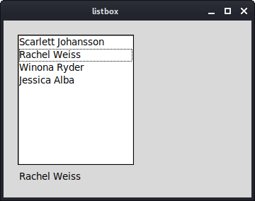
Figure: listbox widget
In this part of the Tcl/Tk tutorial, we have presented several Tk widgets. Layout management in Tk
Layout management in Tk
In this part of the Tcl/Tk programming tutorial, we will introduce layout managers.When we design the GUI of our application, we decide what widgets we will use and how we will organize those widgets in the application. To organize our widgets, we use specialized non visible objects called layout managers.
There are two kinds of widgets. Containers and their children. The containers group their children into suitable layouts.
Tk has three built-in layout managers. The pack, grid and place managers. The pack geometry manager organizes widgets in vertical and horizontal boxes. The grid geometry managers places widgets in a two dimensional grid. Finally, the place geometry manager places widgets on their containers using absolute positioning.
Absolute positioning
In most cases, programmers should use layout managers. There are a few situations, where we can use absolute positioning. In absolute positioning, the programmer specifies the position and the size of each widget in pixels. The size and the position of a widget do not change, if you resize a window. Applications look different on various platforms, and what looks OK on Linux, might not look OK on Mac. Changing fonts in your application might spoil the layout. If you translate your application into another language, you must redo your layout.#!/usr/bin/wishIn this example, we place three images using absolute positioning. We will use the place geometry manager.
# ZetCode Tcl/Tk tutorial
#
# In this script, we lay out images
# using absolute positioning.
#
# author: Jan Bodnar
# last modified: March 2011
# website: www.zetcode.com
package require Img
frame .fr -background "#333"
pack .fr -fill both -expand 1
image create photo img1 -file "bardejov.jpg"
label .fr.lbl1 -image img1
place .fr.lbl1 -x 20 -y 20
image create photo img2 -file "rotunda.jpg"
label .fr.lbl2 -image img2
place .fr.lbl2 -x 40 -y 160
image create photo img3 -file "mincol.jpg"
label .fr.lbl3 -image img3
place .fr.lbl3 -x 170 -y 50
wm title . "absolute"
wm geometry . 300x280+300+300
package require ImgWe use the Img package to display jpg images. On Ubuntu we must install the libtk-img package.
package require ImgTo display jpg images, we use the Img package.
frame .fr -background "#333"Our frame will have a dark gray background.
image create photo img1 -file "bardejov.jpg"We create a photo image object from an image in the current working directory.
label .fr.lbl1 -image img1We create a
label with an image. Labels can contain text or images. place .fr.lbl1 -x 20 -y 20The label is placed on the frame at x=20, y=20 coordinates. Absolute positioning is done with the
place command. 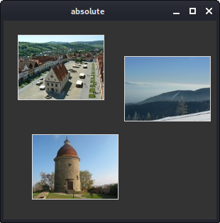
Figure: Absolute positioning
Buttons example
In the following example, we will position two buttons in the bottom right corner of the window. We will use the pack manager.#!/usr/bin/wishWe will have two frames. There is the base frame and an additional frame, which will expand in both directions and push the two buttons to the bottom of the base frame. The buttons are placed in a horizontal box and placed to the right of this box.
# ZetCode Tcl/Tk tutorial
#
# In this script, we use pack manager
# to position two buttons in the
# bottom right corner of the window.
#
# author: Jan Bodnar
# last modified: March 2011
# website: www.zetcode.com
frame .fr
pack .fr -fill both -expand 1
frame .fr.pnl -relief raised -borderwidth 1
pack .fr.pnl -fill both -expand 1
ttk::button .fr.cb -text "Close"
pack .fr.cb -padx 5 -pady 5 -side right
ttk::button .fr.ok -text "OK"
pack .fr.ok -side right
wm title . "buttons"
wm geometry . 300x200+300+300
frame .fr.pnl -relief raised -borderwidth 1We create another
pack .fr.pnl -fill both -expand 1
frame widget. This widget takes the bulk of the area. We change the border of the frame so that the frame is visible. By default it is flat. The packmanager expands the frame in both directions. Horizontal and vertical. ttk::button .fr.cb -text "Close"A close button is created. It is put into a horizontal box. The -side option will create a horizontal box layout, in which the button is placed to the right of the box. The -padx and the -pady options will put some space between the widgets. The -padx puts some space between the button widgets and between the close button and the right border of the root window. The -pady puts some space between the button widgets and the borders of the frame and the root window.
pack .fr.cb -padx 5 -pady 5 -side right
pack .fr.ok -side rightThe ok button is placed next to the close button. With 5px space between them.
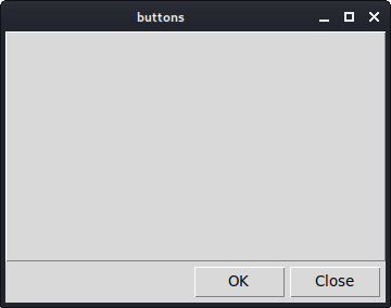
Figure: Buttons example
Calculator
We will use a Tk grid geometry manager to create a skeleton of a calculator.#!/usr/bin/wishIn this example, we use the grid manager is used to organize buttons in the frame container widget.
# ZetCode Tcl/Tk tutorial
#
# In this script, we use the grid manager
# to create a skeleton of a calculator.
#
# author: Jan Bodnar
# last modified: March 2011
# website: www.zetcode.com
frame .fr -padx 5 -pady 5
pack .fr -fill both -expand 1
ttk::style configure TButton -width 8 -height 8 -font "serif 10"
entry .fr.ent
grid .fr.ent -row 0 -columnspan 4 -sticky we
ttk::button .fr.cls -text "Cls"
grid .fr.cls -row 1 -column 0
ttk::button .fr.bck -text "Back"
grid .fr.bck -row 1 -column 1
ttk::button .fr.lbl
grid .fr.lbl -row 1 -column 2
ttk::button .fr.clo -text "Close"
grid .fr.clo -row 1 -column 3
ttk::button .fr.sev -text "7"
grid .fr.sev -row 2 -column 0
ttk::button .fr.eig -text "8"
grid .fr.eig -row 2 -column 1
ttk::button .fr.nin -text "9"
grid .fr.nin -row 2 -column 2
ttk::button .fr.div -text "/"
grid .fr.div -row 2 -column 3
ttk::button .fr.fou -text "4"
grid .fr.fou -row 3 -column 0
ttk::button .fr.fiv -text "5"
grid .fr.fiv -row 3 -column 1
ttk::button .fr.six -text "6"
grid .fr.six -row 3 -column 2
ttk::button .fr.mul -text "*"
grid .fr.mul -row 3 -column 3
ttk::button .fr.one -text "1"
grid .fr.one -row 4 -column 0
ttk::button .fr.two -text "2"
grid .fr.two -row 4 -column 1
ttk::button .fr.thr -text "3"
grid .fr.thr -row 4 -column 2
ttk::button .fr.mns -text "-"
grid .fr.mns -row 4 -column 3
ttk::button .fr.zer -text "0"
grid .fr.zer -row 5 -column 0
ttk::button .fr.dot -text "."
grid .fr.dot -row 5 -column 1
ttk::button .fr.equ -text "="
grid .fr.equ -row 5 -column 2
ttk::button .fr.pls -text "+"
grid .fr.pls -row 5 -column 3
grid columnconfigure .fr 0 -pad 3
grid columnconfigure .fr 1 -pad 3
grid columnconfigure .fr 2 -pad 3
grid columnconfigure .fr 3 -pad 3
grid rowconfigure .fr 0 -pad 3
grid rowconfigure .fr 1 -pad 3
grid rowconfigure .fr 2 -pad 3
grid rowconfigure .fr 3 -pad 3
grid rowconfigure .fr 4 -pad 3
wm title . "calculator"
wm geometry . +300+300
ttk::style configure TButton -width 8 -height 8 -font "serif 10"We configure the themed
button widget to have a specific font and to have some internal padding. entry .fr.entThe
grid .fr.ent -row 0 -columnspan 4 -sticky we
entry widget is where the digits are displayed. The widget is placed at the first row and it will span all four columns. Widgets may not occupy all the space allotted by cells in the grid. The -sticky option will expand the widget in a given direction. In our case, we ensure, that the entry widget is expanded from left to the right. ttk::button .fr.cls -text "Cls"The cls button is placed at the second row, first column. Note that the rows and columns start at zero. The ttk::button is a themed button.
grid columnconfigure .fr 0 -pad 3We use the
...
grid rowconfigure .fr 0 -pad 3
columnconfigure and the rowconfigurecommands to define some space in grid columns and rows. This way we achieve that the buttons are separated by some space. 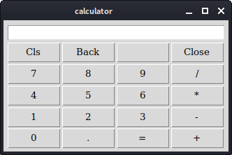
Figure: Calculator
Windows example
The following example creates the windows dialog using the grid geometry manager. The dialog comes from the JDeveloper application.#!/usr/bin/wishIn this example, we will use a
# ZetCode Tcl/Tk tutorial
#
# In this script, we use the grid
# manager to create a more complicated
# layout.
#
# author: Jan Bodnar
# last modified: March 2011
# website: www.zetcode.com
frame .fr -padx 5 -pady 5
pack .fr -fill both -expand 1
label .fr.lbl -text Windows
grid .fr.lbl -sticky w -pady 4 -padx 5
text .fr.area
grid .fr.area -row 1 -column 0 -columnspan 2 \
    -rowspan 4 -padx 5 -sticky ewsn
ttk::button .fr.act -text Activate
grid .fr.act -row 1 -column 3
ttk::button .fr.cls -text Close
grid .fr.cls -row 2 -column 3 -pady 4
ttk::button .fr.hlp -text Help
grid .fr.hlp -row 5 -column 0 -padx 5
ttk::button .fr.ok -text OK
grid .fr.ok -row 5 -column 3
grid columnconfigure .fr 1 -weight 1
grid columnconfigure .fr 3 -pad 7

grid rowconfigure .fr 3 -weight 1
grid rowconfigure .fr 5 -pad 7
wm title . "Windows"
wm geometry . 350x300+300+300
label widget, a text widget and four buttons. label .fr.lbl -text WindowsThe label widget is created and put into the grid. If no column and row is specified, then the first column/row is assumed. The label sticks to west and it has some padding around its text.
grid .fr.lbl -sticky w -pady 4 -padx 5
text .fr.areaThe
grid .fr.area -row 1 -column 0 -columnspan 2 \
-rowspan 4 -padx 5 -sticky ewsn
text widget is created and starts from the second row, first column. It spans 2 columns and 4 rows. There is 4px space between the widget and the left border of the root window. Finally, it sticks to all the four sides. So when the window is resized, the text widget grows in all directions. grid columnconfigure .fr 1 -weight 1We define some spaces among widgets in the grid. The largest space is put between the
grid columnconfigure .fr 3 -pad 7
grid rowconfigure .fr 3 -weight 1
grid rowconfigure .fr 5 -pad 7
text widget and the buttons. 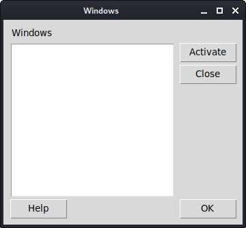
Figure: Windows example
In this part of the Tcl/Tk tutorial, we mentioned layout management of widgets. Introduction to Tcl and Tk Programming Tutorial
Introduction to Tcl and Tk
In this part of the Tcl/Tk tutorial, we will introduce the Tk toolkit and create our first programs.The purpose of this tutorial is to get you started with the Tk toolkit with the Tcl language. Images used in this tutorial can be downloaded here. I used some icons from the Tango icons pack of the Gnome project.
Tk
Tk is an open source, cross-platform widget toolkit that provides a library of basic elements for building a graphical user interface (GUI). The first public release of Tk was in 1991. Tk is an extension for the Tcl language. This means that Tk extends the Tcl language with additional commands for building user interfaces. There are bindings for several other languages including Ada, Perl, Ruby, Python or Common Lisp. The Tk library is often referred with its main language as Tcl/Tk.Tcl
Tcl is a string based scripting language. The source code is compiled into bytecode, which is later interpreted by the Tcl interpreter. It was created by John Osterhoutin 1988. The purpose was to create a language which is easily embeddable into applications. But it is often used outside its original area. The language is commonly used for rapid prototyping, scripted applications, GUIs and testing. The Tcl stands for tool command language, where the source code of a Tcl script consists of commands.Tcl is a procedural language. It has some functional features. OOP support is planned for the next official release.
The official web site for both Tcl and Tk is tcl.tk
Simple example
In our first example, we will show a basic window on the screen.#!/usr/bin/wishWhile this code is very small, the application window can do quite a lot. It can be resized, maximized, minimized. All the complexity that comes with it has been hidden from the application programmer.
frame .fr
wm title . Simple
wm geometry . 250x150+300+300
#!/usr/bin/wishThe
wish is a Tcl/Tk interpreter. It understands both Tcl and Tk commands. frame .frThe
frame widget is created. The frame is a Tk command to create a frame widget. The argument to the command is the widget path name. The widget path name begins with a dot character. This character stands for the main application window. In Tk widgets form a hierarchy. The .fr means that the frame widget is placed inside the main application window. Widget path is a string starting with a dot and consisting of several names separated by dots. These names are widget names that comprise widget's hierarchy. wm title . SimpleThe
wm command is used to interact with a window manager. This code line sets a window title. wm geometry . 250x150+300+300Here we set the size for the window and place it on the screen. The first two numbers specify the width and height of the window. The third and fourth parameters are the x, y coordinates on the monitor screen.
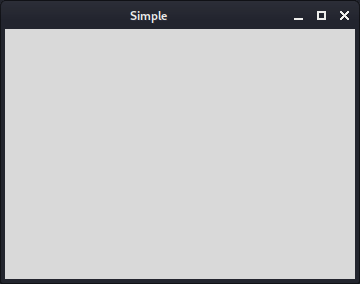
Figure: Simple window
Centering window
This script centers a window on the screen.#!/usr/bin/wishWe need to have the size of the window and the size of the screen to position the window in the center of the monitor screen.
# ZetCode Tcl/Tk tutorial
#
# In this script, we center a window
# on the screen.
#
# author: Jan Bodnar
# last modified: March 2011
# website: www.zetcode.com
set width 250
set height 150
set x [expr { ( [winfo vrootwidth  .] - $width  ) / 2 }]
set y [expr { ( [winfo vrootheight .] - $height ) / 2 }]
wm title . "Center"
wm geometry . ${width}x${height}+${x}+${y}
set width 250These are the width and height values of the application window.
set height 150
set x [expr { ( [winfo vrootwidth .] - $width ) / 2 }]
set y [expr { ( [winfo vrootheight .] - $height ) / 2 }]
Given its width and height, we determine the x, y coordinates for a centered window. wm geometry . ${width}x${height}+${x}+${y}
The window is placed on the screen. Quit button
In the last example of this section, we will create a quit button. When we press this button, the application terminates.#!/usr/bin/wishWe position a
# ZetCode Tcl/Tk tutorial
#
# This program creates a quit
# button. When we press the button,
# the application terminates.
#
# author: Jan Bodnar
# last modified: March 2011
# website: www.zetcode.com
button .hello -text "Quit" -command { exit }
place .hello -x 50 -y 50
wm title . "Quit button"
wm geometry . 250x150+300+300
button on the window. Clicking on the button will terminate the application. button .hello -text "Quit" -command { exit }
The button widget is created. The label for the button is provided with the -text option. The -command option specifies the procedure to be executed, when the button is pressed. In our case the application is terminated with the built-in exit command. place .hello -x 50 -y 50We use the
place geometry manager to position the button in absolute coordinates. 50x50px from the top-left corner of the root window. 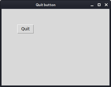
Figure: Quit button
Reference
The wikipedia.org and tcl.tkwere used to create this tutorial.This section was an introduction to the Tcl and Tk.
