Showing posts with label JRuby Swing. Show all posts
Showing posts with label JRuby Swing. Show all posts
Nibbles Clone in JRuby Swing
Nibbles
In this part of the JRuby Swing programming tutorial, we will create a Nibbles game clone.Nibbles is an older classic video game. It was first created in late 70s. Later it was brought to PCs. In this game the player controls a snake. The objective is to eat as many apples as possible. Each time the snake eats an apple, its body grows. The snake must avoid the walls and its own body.
Development
The size of each of the joints of a snake is 10px. The snake is controlled with the cursor keys. Initially, the snake has three joints. The game starts immediately. When the game is finished, we display "Game Over" message in the center of the window.#!/usr/local/bin/jrubyFirst we will define some constants used in our game.
# ZetCode JRuby Swing tutorial
#
# In this program, we create
# a Nibbles game clone.
#
# author: Jan Bodnar
# website: www.zetcode.com
# last modified: December 2010
include Java
import java.awt.Color
import java.awt.Font
import java.awt.Dimension
import java.awt.Toolkit
import java.awt.event.ActionListener
import java.awt.event.KeyEvent
import java.awt.event.KeyListener
import javax.swing.JFrame
import javax.swing.ImageIcon
import javax.swing.JPanel
import javax.swing.Timer
NWIDTH = 300
NHEIGHT = 300
DOT_SIZE = 10
ALL_DOTS = NWIDTH * NHEIGHT / (DOT_SIZE * DOT_SIZE)
RAND_POS = 25
DELAY = 140
$x = [0] * ALL_DOTS
$y = [0] * ALL_DOTS
class Board < JPanel
include KeyListener, ActionListener
def initialize
super
self.setFocusable true
self.initGame
end
def initGame
@left = false
@right = true
@up = false
@down = false
@inGame = true
@dots = 3
begin
iid = ImageIcon.new "dot.png"
@ball = iid.getImage
iia = ImageIcon.new "apple.png"
@apple = iia.getImage
iih = ImageIcon.new "head.png"
@head = iih.getImage
rescue
puts "cannot load images"
end
for i in 0..@dots
$x[i] = 50 - i * 10
$y[i] = 50
end
self.locateApple
self.setBackground Color.black
self.addKeyListener self
@timer = Timer.new DELAY, self
@timer.start
end
def paint g

    super g

    if @inGame

        self.drawObjects g

        Toolkit.getDefaultToolkit.sync
        g.dispose

    else
        self.gameOver g
    end
end
def drawObjects g

    g.drawImage @apple, @apple_x, @apple_y, self

    for z in 0..@dots
        if z == 0
            g.drawImage @head, $x[z], $y[z], self
        else
            g.drawImage @ball, $x[z], $y[z], self
        end
    end
end
def gameOver g

    msg = "Game Over"
    small = Font.new "Helvetica", Font::BOLD, 14
    metr = self.getFontMetrics small

    g.setColor Color.white
    g.setFont small
    g.drawString msg,  (NWIDTH - metr.stringWidth(msg)) / 2,
                  NHEIGHT / 2
    @timer.stop
end
def checkApple

    if $x[0] == @apple_x and $y[0] == @apple_y
        @dots = @dots + 1
        self.locateApple
    end
end
def move
z = @dots
while z > 0
    $x[z] = $x[(z - 1)]
    $y[z] = $y[(z - 1)]
    z = z - 1
end
if @left
    $x[0] -= DOT_SIZE
end
if @right
$x[0] += DOT_SIZE
end
if @up
$y[0] -= DOT_SIZE
end
if @down
$y[0] += DOT_SIZE
end
end
def checkCollision
z = @dots
while z > 0
    if z > 4 and $x[0] == $x[z] and $y[0] == $y[z]
        @inGame = false
    end
    z = z - 1
end
if $y[0] > NHEIGHT - DOT_SIZE
    @inGame = false
end
if $y[0] < 0
@inGame = false
end
if $x[0] > NWIDTH - DOT_SIZE
@inGame = false
end
if $x[0] < 0
@inGame = false
end
end
def locateApple
r = rand RAND_POS
@apple_x = r * DOT_SIZE
r = rand RAND_POS
@apple_y = r * DOT_SIZE
end
def actionPerformed e

    if @inGame
        self.checkApple
        self.checkCollision
        self.move
    end

    self.repaint

end
def keyReleased e
end
def keyPressed e
key = e.getKeyCode
if key == KeyEvent::VK_LEFT and not @right
    @left = true
    @up = false
    @down = false
end
if key == KeyEvent::VK_RIGHT and not @left
@right = true
@up = false
@down = false
end
if key == KeyEvent::VK_UP and not @down
@up = true
@right = false
@left = false
end
if key == KeyEvent::VK_DOWN and not @up
@down = true
@right = false
@left = false
end
end
end
class Example < JFrame

    def initialize
        super "Nibbles"

        self.initUI
    end

    def initUI

        board = Board.new
        board.setPreferredSize Dimension.new NWIDTH, NHEIGHT
        self.add board

        self.pack

        self.setResizable false
        self.setDefaultCloseOperation JFrame::EXIT_ON_CLOSE
        self.setLocationRelativeTo nil
        self.setVisible true
    end
end
Example.new
The
WIDTH and HEIGHT constants determine the size of the Board. The DOT_SIZE is the size of the apple and the dot of the snake. The ALL_DOTS constant defines the maximum number of possible dots on the Board. The RAND_POS constant is used to calculate a random position of an apple. The DELAY constant determines the speed of the game. $x = [0] * ALL_DOTSThese two arrays store x, y coordinates of all possible joints of a snake.
$y = [0] * ALL_DOTS
The
initGame method initializes variables, loads images and starts a timeout function. def paint gInside the
super g
if @inGame
self.drawObjects g
Toolkit.getDefaultToolkit.sync
g.dispose
else
self.gameOver g
end
end
paint method, we check the @inGame variable. If it is true, we draw our objects. The apple and the snake joints. Otherwise we display "Game over" text. The Toolkit.getDefaultToolkit.sync method ensures that the display is up-to-date. It is useful for animation. def drawObjects gThe
g.drawImage @apple, @apple_x, @apple_y, self
for z in 0..@dots
if z == 0
g.drawImage @head, $x[z], $y[z], self
else
g.drawImage @ball, $x[z], $y[z], self
end
end
end
drawObjects method draws the apple and the joints of the snake. The first joint of a snake is its head, which is represented by a red circle. def gameOver gIn the gameOver method, we display "Game Over" message in the center of the window. We also stop the timer.
msg = "Game Over"
small = Font.new "Helvetica", Font::BOLD, 14
metr = self.getFontMetrics small
g.setColor Color.white
g.setFont small
g.drawString msg, (NWIDTH - metr.stringWidth(msg)) / 2,
NHEIGHT / 2
@timer.stop
end
def checkAppleThe
if $x[0] == @apple_x and $y[0] == @apple_y
@dots = @dots + 1
self.locateApple
end
end
checkApple method checks, if the snake has hit the apple object. If so, we add another snake joint and call the locateApple method, which randomly places a new apple object. In the
move method we have the key algorithm of the game. To understand it, look at how the snake is moving. You control the head of the snake. You can change its direction with the cursor keys. The rest of the joints move one position up the chain. The second joint moves where the first was, the third joint where the second was etc. while z > 0This code moves the joints up the chain.
$x[z] = $x[(z - 1)]
$y[z] = $y[(z - 1)]
z = z - 1
end
if @leftMove the head to the left.
$x[0] -= DOT_SIZE
end
In the
checkCollision method, we determine if the snake has hit itself or one of the walls. while z > 0Finish the game, if the snake hits one of its joints with the head.
if z > 4 and $x[0] == $x[z] and $y[0] == $y[z]
@inGame = false
end
z = z - 1
end
if $y[0] > NHEIGHT - DOT_SIZEFinish the game, if the snake hits the bottom of the Board.
@inGame = false
end
The
locateApple method locates an apple randomly on the board. r = rand RAND_POSWe get a random number from 0 to RAND_POS - 1.
@apple_x = r * DOT_SIZEThese lines set the x, y coordinates of the apple object.
...
@apple_y = r * DOT_SIZE
def actionPerformed eEvery DELAY ms, the
if @inGame
self.checkApple
self.checkCollision
self.move
end
self.repaint
end
actionPerformed method is called. If we are in the game, we call three methods, that build the logic of the game. In the
keyPressed method of the Board class, we determine the keys that were pressed. if key == KeyEvent::VK_LEFT and not @rightIf we hit the left cursor key, we set
@left = true
@up = false
@down = false
end
@left variable to true. This variable is used in the movemethod to change coordinates of the snake object. Notice also, that when the snake is heading to the right, we cannot turn immediately to the left. class Example < JFrameIn this class, we set up the Nibbles game.
def initialize
super "Nibbles"
self.initUI
end
def initUI
board = Board.new
board.setPreferredSize Dimension.new NWIDTH, NHEIGHT
self.add board
self.pack
self.setResizable false
self.setDefaultCloseOperation JFrame::EXIT_ON_CLOSE
self.setLocationRelativeTo nil
self.setVisible true
end
end
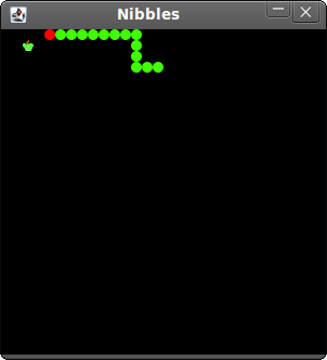
Figure: Nibbles
This was the Nibbles computer game programmed with the Swing library and the JRuby programming language. Painting in JRuby Swing
Painting
In this part of the JRuby Swing programming tutorial we will do some painting.We use painting to create charts, custom components or create games. To do the painting, we use the painting API provided by the Swing toolkit. The painting is done within the
paintComponent method. In the painting process, we use the Graphics2D object. It is a graphics context that allows an application to draw onto components. It is the fundamental class for rendering 2-dimensional shapes, text and images. Colors
A color is an object representing a combination of Red, Green, and Blue (RGB) intensity values. We use theColorclass to work with colors in Swing. #!/usr/local/bin/jrubyIn the code example, we draw nine rectangles and fill them with different color values.
# ZetCode JRuby Swing tutorial
#
# In this example we draw nine rectangles
# filled with nine different colors.
#
# author: Jan Bodnar
# website: www.zetcode.com
# last modified: December 2010
include Java
import java.awt.Color
import javax.swing.JFrame
import javax.swing.JPanel
class Canvas < JPanel
def paintComponent g
self.drawColorRectangles g
end
def drawColorRectangles g
g.setColor Color.new 125, 167, 116
g.fillRect 10, 15, 90, 60
g.setColor Color.new 42, 179, 231
g.fillRect 130, 15, 90, 60
g.setColor Color.new 70, 67, 123
g.fillRect 250, 15, 90, 60
g.setColor Color.new 130, 100, 84
g.fillRect 10, 105, 90, 60
g.setColor Color.new 252, 211, 61
g.fillRect 130, 105, 90, 60
g.setColor Color.new 241, 98, 69
g.fillRect 250, 105, 90, 60
g.setColor Color.new 217, 146, 54
g.fillRect 10, 195, 90, 60
g.setColor Color.new 63, 121, 186
g.fillRect 130, 195, 90, 60
g.setColor Color.new 31, 21, 1
g.fillRect 250, 195, 90, 60
end
end
class Example < JFrame
def initialize
super "Colors"
self.initUI
end
def initUI
canvas = Canvas.new
self.getContentPane.add canvas
self.setDefaultCloseOperation JFrame::EXIT_ON_CLOSE
self.setSize 360, 300
self.setLocationRelativeTo nil
self.setVisible true
end
end
Example.new
def paintComponent gCustom painting is done in
paintComponent in most cases. The g parameter is the graphics context. We call the painting operations on this object. g.setColor Color.new 125, 167, 116We set the context's current color to the specified color. All subsequent graphics operations using this graphics context use this specified color.
g.fillRect 10, 15, 90, 60We fill a rectangle located at x=10, y=15 having width=90 and height=60 with the above specified color value.
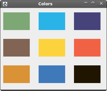
Figure: Colors
Shapes
The Swing painting API can draw various shapes. The following programming code example will show some of them.#!/usr/local/bin/jrubyIn this code example, we draw six different shapes on the window. A square, a rectangle, a rounded rectangle, an ellipse, an arc and an oval. We do not draw outlines of the shapes, but we fill the inner space of the shapes with a gray color.
# ZetCode JRuby Swing tutorial
#
# This example draws simple shapes
# on a panel.
#
# author: Jan Bodnar
# website: www.zetcode.com
# last modified: December 2010
include Java
import java.awt.Color
import java.awt.RenderingHints
import java.awt.geom.Ellipse2D
import javax.swing.JFrame
import javax.swing.JPanel
class Canvas < JPanel
def paintComponent g
self.drawShapes g
end
def drawShapes g
g.setColor Color.new 150, 150, 150
rh = RenderingHints.new RenderingHints::KEY_ANTIALIASING,
      RenderingHints::VALUE_ANTIALIAS_ON
rh.put RenderingHints::KEY_RENDERING,
RenderingHints::VALUE_RENDER_QUALITY
g.setRenderingHints rh
g.fillRect 20, 20, 50, 50
g.fillRect 120, 20, 90, 60
g.fillRoundRect 250, 20, 70, 60, 25, 25
g.fill Ellipse2D::Double.new 10, 100, 80, 100
g.fillArc 120, 130, 110, 100, 5, 150
g.fillOval 270, 130, 50, 50
end
end
class Example < JFrame
def initialize
super "Shapes"
self.initUI
end
def initUI
canvas = Canvas.new
self.getContentPane.add canvas
self.setDefaultCloseOperation JFrame::EXIT_ON_CLOSE
self.setSize 350, 250
self.setLocationRelativeTo nil
self.setVisible true
end
end
Example.new
rh = RenderingHints.new RenderingHints::KEY_ANTIALIASING,With the rendering hints, we control the quality of the painting. In the above code, we implement antialiasing. With antialiasing, the shapes are more smooth.
RenderingHints::VALUE_ANTIALIAS_ON
g.setColor Color.new 150, 150, 150We will be painting in some gray color.
g.fillRect 20, 20, 50, 50Here we draw a rectangle, a square and a rounded rectangle. The first four parameters in these methods are the x, y coordinates and width and height. The last two parameters for the
g.fillRect 120, 20, 90, 60
g.fillRoundRect 250, 20, 70, 60, 25, 25
fillRoundRectare the horizontal and vertical diameter of the arc at the four corners. g.fill Ellipse2D::Double.new 10, 100, 80, 100These three lines draw an ellipse, an arc and an oval.
g.fillArc 120, 130, 110, 100, 5, 150
g.fillOval 270, 130, 50, 50
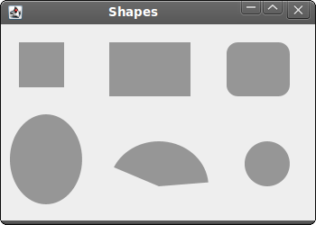
Figure: Shapes
Transparent rectangles
Transparency is the quality of being able to see through a material. The easiest way to understand transparency is to imagine a piece of glass or water. Technically, the rays of light can go through the glass and this way we can see objects behind the glass.In computer graphics, we can achieve transparency effects using alpha compositing. Alpha compositing is the process of combining an image with a background to create the appearance of partial transparency. The composition process uses an alpha channel. (wikipedia.org, answers.com)
#!/usr/local/bin/jrubyIn the example we will draw ten rectangles with different levels of transparency.
# ZetCode JRuby Swing tutorial
#
# This program draws ten
# rectangles with different
# levels of transparency.
#
# author: Jan Bodnar
# website: www.zetcode.com
# last modified: December 2010
include Java
import java.awt.Color
import java.awt.AlphaComposite
import javax.swing.JFrame
import javax.swing.JPanel
class Canvas < JPanel
def paintComponent g
g.setColor Color::BLUE
for i in 1..10 do
g.setComposite AlphaComposite.getInstance AlphaComposite::SRC_OVER,
                                                        i * 0.1
g.fillRect 50 * i, 20, 40, 40
end
end
end
class Example < JFrame
def initialize
super "Transparent rectangles"
self.initUI
end
def initUI
canvas = Canvas.new
self.getContentPane.add canvas
self.setDefaultCloseOperation JFrame::EXIT_ON_CLOSE
self.setSize 590, 120
self.setLocationRelativeTo nil
self.setVisible true
end
end
Example.new
g.setComposite AlphaComposite.getInstance AlphaComposite::SRC_OVER,The
i * 0.1
AlphaComposite class implements basic alpha compositing rules. 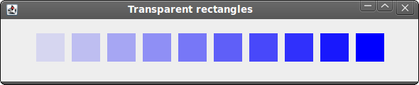
Figure: Transparent rectangles
Donut Shape
In the following example we create a complex shape by rotating a bunch of ellipses. An affine transform is composed of zero or more linear transformations (rotation, scaling or shear) and translation (shift). TheAffineTransformis the class in Swing to perform affine transformations. #!/usr/local/bin/jrubyIn this example, we create a donut. The shape resembles a cookie, hence the name donut. The donut is centered in the window.
# ZetCode JRuby Swing tutorial
#
# In this code example, we create
# a Donut shape.
#
# author: Jan Bodnar
# website: www.zetcode.com
# last modified: December 2010
include Java
import java.awt.BasicStroke
import java.awt.Color
import java.awt.RenderingHints
import java.awt.geom.AffineTransform
import java.awt.geom.Ellipse2D
import javax.swing.JFrame
import javax.swing.JPanel
class Canvas < JPanel
def paintComponent g
self.drawDonut g
end
def drawDonut g
rh = RenderingHints.new RenderingHints::KEY_ANTIALIASING,
RenderingHints::VALUE_ANTIALIAS_ON
rh.put RenderingHints::KEY_RENDERING,
RenderingHints::VALUE_RENDER_QUALITY
g.setRenderingHints rh
size = self.getSize
w = size.getWidth
h = size.getHeight
e = Ellipse2D::Double.new 0, 0, 80, 130
g.setStroke BasicStroke.new 1
g.setColor Color.gray
deg = 0

72.times do
at = AffineTransform.getTranslateInstance w / 2, h / 2
at.rotate deg/180.0 * Math::PI
g.draw at.createTransformedShape e
deg += 5
end
end
end
class Example < JFrame
def initialize
super "Donut"
self.initUI
end
def initUI
canvas = Canvas.new
self.getContentPane.add canvas
self.setDefaultCloseOperation JFrame::EXIT_ON_CLOSE
self.setSize 350, 320
self.setLocationRelativeTo nil
self.setVisible true
end
end
Example.new
size = self.getSizeHere we determine the width and height of the window. We need these values to center the donut shape.
w = size.getWidth
h = size.getHeight
e = Ellipse2D::Double.new 0, 0, 80, 130We create an ellipse shape. We will rotate this ellipse to create the donut shape.
g.setStroke BasicStroke.new 1We set the stroke and the color for the outlines of the shapes.
g.setColor Color.gray
deg = 0We draw an ellipse object 72 times. Each time, we rotate the ellipse by additional 5 degrees. This will create our donut shape.
72.times do
at = AffineTransform.getTranslateInstance w / 2, h / 2With the help of the
at.rotate deg/180.0 * Math::PI
g.draw at.createTransformedShape e
AffineTransform class we translate the drawing to the center of the window. Then we do rotation. The createTransformedShape method will apply these affine transforms to the ellipse. And the transformed ellipse is drawn using the draw method. The rotate method takes angles in radians, so we calculate radians out of degrees. Drawing text
In the last example, we are going to draw text on the window.#!/usr/local/bin/jrubyWe draw a lyrics of a song on the window.
# ZetCode JRuby Swing tutorial
#
# In this example we draw lyrics of a
# song on the window panel.
#
# author: Jan Bodnar
# website: www.zetcode.com
# last modified: December 2010
include Java
import java.awt.Color
import java.awt.Font
import java.awt.RenderingHints
import java.awt.geom.Ellipse2D
import javax.swing.JFrame
import javax.swing.JPanel
class Canvas < JPanel
def paintComponent g
self.drawLyrics g
end
def drawLyrics g
rh = RenderingHints.new RenderingHints::KEY_ANTIALIASING,
RenderingHints::VALUE_ANTIALIAS_ON
rh.put RenderingHints::KEY_RENDERING,
RenderingHints::VALUE_RENDER_QUALITY
g.setRenderingHints rh
g.setFont Font.new "Purisa", Font::PLAIN, 13
g.drawString "Most relationships seem so transitory", 20, 30
g.drawString "They're all good but not the permanent one", 20, 60
g.drawString "Who doesn't long for someone to hold", 20, 90
g.drawString "Who knows how to love you without being told", 20, 120
g.drawString "Somebody tell me why I'm on my own", 20, 150
g.drawString "If there's a soulmate for everyone", 20, 180
end
end
class Example < JFrame
def initialize
super "Soulmate"
initUI
end
def initUI
canvas = Canvas.new
self.getContentPane.add canvas
self.setDefaultCloseOperation JFrame::EXIT_ON_CLOSE
self.setSize 400, 250
self.setLocationRelativeTo nil
self.setVisible true
end
end
Example.new
rh = RenderingHints.new RenderingHints::KEY_TEXT_ANTIALIASING,We apply text antialiasing on the painting.
RenderingHints::VALUE_TEXT_ANTIALIAS_ON
g.setRenderingHints rh
g.setFont Font.new "Purisa", Font::PLAIN, 13We specify the font name, style and point size, in which we draw the lyrics.
g.drawString "Most relationships seem so transitory", 20, 30The
drawString method draws the text. 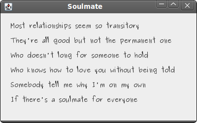
Figure: Drawing text
In this part of the JRuby Swing programming tutorial, we did some painting. Dialogs in JRuby Swing
Dialogs
In this part of the JRuby Swing programming tutorial, we will work with dialogs.Dialog windows or dialogs are an indispensable part of most modern GUI applications. A dialog is defined as a conversation between two or more persons. In a computer application a dialog is a window which is used to "talk" to the application. A dialog is used to input data, modify data, change the application settings etc. Dialogs are important means of communication between a user and a computer program.
Message boxes
Message boxes are convenient dialogs that provide messages to the user of the application. The message consists of text and image data.#!/usr/local/bin/jrubyWe use the
# ZetCode JRuby Swing tutorial
#
# This program demonstrates
# message dialogs.
#
# author: Jan Bodnar
# website: www.zetcode.com
# last modified: December 2010
include Java
import java.awt.GridLayout
import javax.swing.JFrame
import javax.swing.JButton
import javax.swing.JPanel
import javax.swing.JOptionPane
class Example < JFrame
def initialize
super "Message boxes"
self.initUI
end
def initUI
panel = JPanel.new
panel.setLayout GridLayout.new 2, 2
errorButton = JButton.new "Error"
errorButton.addActionListener do |e|
    JOptionPane.showMessageDialog panel, "Could not open file",
        "Error", JOptionPane::ERROR_MESSAGE
end
warningButton = JButton.new "Warning"
warningButton.addActionListener do |e|
JOptionPane.showMessageDialog panel, "A deprecated call",
"Warning", JOptionPane::WARNING_MESSAGE
end
questionButton = JButton.new "Question"
questionButton.addActionListener do |e|
JOptionPane.showMessageDialog panel, "Are you sure to quit?",
"Question", JOptionPane::QUESTION_MESSAGE
end
informButton = JButton.new "Information"
informButton.addActionListener do |e|
JOptionPane.showMessageDialog panel, "Download completed",
"Information", JOptionPane::INFORMATION_MESSAGE
end
panel.add errorButton
panel.add warningButton
panel.add questionButton
panel.add informButton
self.add panel
self.setDefaultCloseOperation JFrame::EXIT_ON_CLOSE
self.setSize 300, 200
self.setLocationRelativeTo nil
self.setVisible true
end
end
Example.new
GridLayout manager to set up a grid of four buttons. Each of the buttons shows a different message box. errorButton.addActionListener do |e|In case we pressed the error button, we show the error dialog. We use the
JOptionPane.showMessageDialog panel, "Could not open file",
"Error", JOptionPane::ERROR_MESSAGE
end
showMessageDialog method to show the dialog on the screen. The first parameter of this method is the panel, in which the dialog is displayed. The second parameter is the message to be displayed. The third parameter is the title of the dialog. The final parameter is the message type. The default icon is determined by the message type. In our case, we have ERROR_MESSAGE message type for the error dialog. 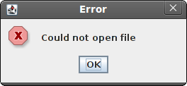
Figure: Error message dialog
JFileChooser
JFileChooser dialog allows user to select a file from the filesystem. #!/usr/local/bin/jrubyIn our code example, we use the
# ZetCode JRuby Swing tutorial
#
# In this program, we use a JFileChooser
# to load a c file.
#
# author: Jan Bodnar
# website: www.zetcode.com
# last modified: December 2010
include Java
import java.awt.BorderLayout
import java.awt.Color
import javax.swing.JFrame
import javax.swing.JButton
import javax.swing.JPanel
import javax.swing.JToolBar
import javax.swing.JFileChooser
import javax.swing.JTextArea
import javax.swing.JTextPane
import javax.swing.JScrollPane
import javax.swing.BorderFactory
import javax.swing.filechooser::FileNameExtensionFilter
class Example < JFrame
def initialize
super "FileChooser"
self.initUI
end
def initUI
@panel = JPanel.new
@panel.setLayout BorderLayout.new
toolbar = JToolBar.new
openb = JButton.new "Choose file"
openb.addActionListener do |e|
chooseFile = JFileChooser.new
filter = FileNameExtensionFilter.new "c files", "c"
chooseFile.addChoosableFileFilter filter
ret = chooseFile.showDialog @panel, "Choose file"
if ret == JFileChooser::APPROVE_OPTION
    file = chooseFile.getSelectedFile
    text = self.readFile file
    @area.setText text.to_s
end
end
toolbar.add openb
@area = JTextArea.new
@area.setBorder BorderFactory.createEmptyBorder 10, 10, 10, 10
pane = JScrollPane.new
pane.getViewport.add @area
@panel.setBorder BorderFactory.createEmptyBorder 10, 10, 10, 10
@panel.add pane
self.add @panel
self.add toolbar, BorderLayout::NORTH
self.setDefaultCloseOperation JFrame::EXIT_ON_CLOSE
self.setSize 450, 400
self.setLocationRelativeTo nil
self.setVisible true
end
def readFile file

    filename = file.getCanonicalPath
    f = File.open filename, "r"
    text = IO.readlines filename
    return text
end
end
Example.new
JFileChooser dialog to select a C file and display its contents in a JTextArea. @area = JTextArea.newThis is the
JTextArea in which we will show the contents of a selected file. chooseFile = JFileChooser.newWe create an instance of the
filter = FileNameExtensionFilter.new "c files", "c"
chooseFile.addChoosableFileFilter filter
JFileChooser dialog. We create a filter which will show only C files. ret = chooseFile.showDialog @panel, "Choose file"The dialog is shown on the screen. We get the return value.
if ret == JFileChooser::APPROVE_OPTIONIf the user has selected a file, we get the name of the file. Read its contents and set the text to the text area component.
file = chooseFile.getSelectedFile
text = self.readFile file
@area.setText text.to_s
end
def readFile fileThis code reads the text from the file. The
filename = file.getCanonicalPath
f = File.open filename, "r"
text = IO.readlines filename
return text
end
getCanonicalPathreturns an absolute file name. 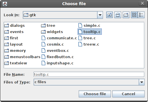
Figure: JFileChooser
In this part of the JRuby Swing tutorial, we worked with dialog windows. Menus And toolbars in JRuby Swing
Menus And toolbars
In this part of the JRuby Swing programming tutorial, we will work with menus and toolbar.A menubar is one of the most visible parts of the GUI application. It is a group of commands located in various menus. While in console applications you had to remember all those arcane commands, here we have most of the commands grouped into logical parts. There are accepted standards that further reduce the amount of time spending to learn a new application. Menus group commands that we can use in an application. Toolbars provide a quick access to the most frequently used commands.
Simple menu
The first example will show a simple menu.#!/usr/local/bin/jrubyOur example will show a menu with one item. By selecting the exit menu item we close the application.
# ZetCode JRuby Swing tutorial
#
# This program creates a simple
# menu.
#
# author: Jan Bodnar
# website: www.zetcode.com
# last modified: December 2010
include Java
import java.awt.event.KeyEvent
import javax.swing.JButton
import javax.swing.JFrame
import javax.swing.JMenuBar
import javax.swing.JMenuItem
import javax.swing.JMenu
import javax.swing.ImageIcon
import java.lang.System
class Example < JFrame
def initialize
super "Simple menu"
self.initUI
end
def initUI
menubar = JMenuBar.new
icon = ImageIcon.new "exit.png"
fileMenu = JMenu.new "File"
fileMenu.setMnemonic KeyEvent::VK_F
itemExit = JMenuItem.new "Exit", icon
itemExit.addActionListener do |e|
System.exit 0
end
itemExit.setMnemonic KeyEvent::VK_C
itemExit.setToolTipText "Exit application"
fileMenu.add itemExit
menubar.add fileMenu
self.setJMenuBar menubar
self.setDefaultCloseOperation JFrame::EXIT_ON_CLOSE
self.setSize 250, 200
self.setLocationRelativeTo nil
self.setVisible true
end
end
Example.new
menubar = JMenuBar.newHere we create a menubar.
icon = ImageIcon.new "exit.png"We will display an icon in the menu item.
fileMenu = JMenu.new "File"We create a menu object. A menu is a popup window containing
fileMenu.setMnemonic KeyEvent::VK_F
JMenuItems. Menus are located on the menubar. The menus can be accessed via the keyboard as well. To bind a menu to a particular key, we use the setMnemonic method. In our case, the menu can be opened with the ALT + F shortcut. itemExit = JMenuItem.new "Close", iconHere we create a
itemExit.addActionListener do |e|
System.exit 0
end
JMenuItem. A menu item is an object shown in a popup window of the selected menu. We also provide a shortcut for the menu item and a tooltip as well. fileMenu.add itemExitA menu item is added to the menu.
menubar.add fileMenuA menu is added to the menubar.
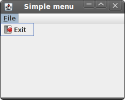
Figure: Simple menu
Submenu
A submenu is a menu plugged into another menu object. The next example demonstrates this.#!/usr/local/bin/jrubyIn the example, we have three options in a submenu of a file menu.
# ZetCode JRuby Swing tutorial
#
# This program creates a
# submenu.
#
# author: Jan Bodnar
# website: www.zetcode.com
# last modified: December 2010
include Java
import java.awt.event.KeyEvent
import java.awt.event.ActionEvent
import javax.swing.JFrame
import javax.swing.ImageIcon
import javax.swing.JMenuBar
import javax.swing.JMenu
import javax.swing.JMenuItem
import javax.swing.KeyStroke
import java.lang.System
class Example < JFrame
def initialize
super "Submenu"
self.initUI
end
def initUI
menubar = JMenuBar.new
iconNew = ImageIcon.new "new.png"
iconOpen = ImageIcon.new "open.png"
iconSave = ImageIcon.new "save.png"
iconExit = ImageIcon.new "exit.png"
fileMenu = JMenu.new "File"
fileMenu.setMnemonic KeyEvent::VK_F
imp = JMenu.new "Import"
imp.setMnemonic KeyEvent::VK_M
newsf = JMenuItem.new "Import newsfeed list..."
bookm = JMenuItem.new "Import bookmarks..."
mail = JMenuItem.new "Import mail..."
imp.add newsf
imp.add bookm
imp.add mail
fileNew = JMenuItem.new "New", iconNew
fileNew.setMnemonic KeyEvent::VK_N
fileOpen = JMenuItem.new "Open", iconOpen
fileNew.setMnemonic KeyEvent::VK_O
fileSave = JMenuItem.new "Save", iconSave
fileSave.setMnemonic KeyEvent::VK_S
fileExit = JMenuItem.new "Exit", iconExit
fileExit.addActionListener do |e|
System.exit 0
end
fileExit.setMnemonic KeyEvent::VK_C
fileExit.setToolTipText "Exit application"
fileExit.setAccelerator KeyStroke.getKeyStroke KeyEvent::VK_W,
            ActionEvent::CTRL_MASK
fileMenu.add fileNew
fileMenu.add fileOpen
fileMenu.add fileSave
fileMenu.addSeparator
fileMenu.add imp
fileMenu.addSeparator
fileMenu.add fileExit
menubar.add fileMenu
self.setJMenuBar menubar
self.setDefaultCloseOperation JFrame::EXIT_ON_CLOSE
self.setSize 320, 220
self.setLocationRelativeTo nil
self.setVisible true
end
end
Example.new
imp = JMenu.new "Import"A submenu is just like any other normal menu. It is created the same way. We simply add a menu to existing menu.
...
fileMenu.add imp
fileExit.setAccelerator KeyStroke.getKeyStroke KeyEvent::VK_W,An accelerator is a key shortcut that launches a menu item. In our case, by pressing Ctrl + W we close the application.
ActionEvent::CTRL_MASK
fileMenu.addSeparatorA separator is a horizontal line that visually separates the menu items. This way we can group items into some logical places.
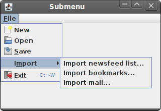
Figure: Submenu
Popup menu
In the next example, we create a popup menu.#!/usr/local/bin/jrubyIn our example, we create a popup menu with two menu items.
# ZetCode JRuby Swing tutorial
#
# This program creates a
# popup menu.
#
# author: Jan Bodnar
# website: www.zetcode.com
# last modified: December 2010
include Java
import java.awt.event.MouseAdapter
import javax.swing.JFrame
import javax.swing.JPopupMenu
import javax.swing.JMenuItem
import java.lang.System
class MouseAction < MouseAdapter
def mouseReleased e
source = e.source
menu = source.getMenu
if e.getButton == e.button
menu.show e.getComponent, e.getX, e.getY
end
end
end
class Example < JFrame
def initialize
super "Popup menu"
self.initUI
end
def initUI
@menu = JPopupMenu.new
menuItemBeep = JMenuItem.new "Beep"
menuItemBeep.addActionListener do |e|
toolkit = getToolkit
toolkit.beep
end
@menu.add menuItemBeep
menuItemExit = JMenuItem.new "Exit"
menuItemExit.addActionListener do |e|
System.exit 0
end
@menu.add menuItemExit
self.addMouseListener MouseAction.new
self.setDefaultCloseOperation JFrame::EXIT_ON_CLOSE
self.setSize 250, 200
self.setLocationRelativeTo nil
self.setVisible true
end
def getMenu
@menu
end
end
Example.new
@menu = JPopupMenu.newWe create a popup menu and a menu item.
menuItemBeep = JMenuItem.new "Beep"
self.addMouseListener MouseAction.newWe add a mouse listener to the Example class. The mouse listener is a MouseAction user defined class, which inherits from a
MouseAdapter. It is a convenience class which implements all five required methods. The methods are empty. Instead of implementing all five methods, we implement only the methods, that we need. class MouseAction < MouseAdapterIn our MouseAction class we implement the
def mouseReleased e
...
mouseReleased method. if e.getButton == e.button:We show the popup menu window at the x, y coordinates of the mouse click.
menu.show e.getComponent, e.getX, e.getY
end
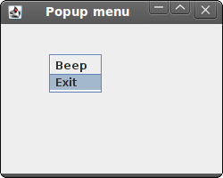
Figure: Popup menu
JToolbar
Menus group commands that we can use in an application. Toolbars provide a quick access to the most frequently used commands. In Swing, theJToolBar class creates a toolbar in an application. #!/usr/local/bin/jrubyThe example creates a toolbar with one exit button.
# ZetCode JRuby Swing tutorial
#
# This program creates a
# toolbar.
#
# author: Jan Bodnar
# website: www.zetcode.com
# last modified: December 2010
include Java
import java.awt.BorderLayout
import javax.swing.JFrame
import javax.swing.ImageIcon
import javax.swing.JButton
import javax.swing.JMenuBar
import javax.swing.JMenu
import javax.swing.JToolBar
import java.lang.System
class Example < JFrame
def initialize
super "Toolbar"
self.initUI
end
def initUI
menubar = JMenuBar.new
fileMenu = JMenu.new "File"
menubar.add fileMenu
toolbar = JToolBar.new
iconExit = ImageIcon.new "exit2.png"
exitButton = JButton.new iconExit
exitButton.addActionListener do |e|
System.exit 0
end
toolbar.add exitButton
self.add toolbar, BorderLayout::NORTH
self.setJMenuBar menubar
self.setDefaultCloseOperation JFrame::EXIT_ON_CLOSE
self.setSize 350, 250
self.setLocationRelativeTo nil
self.setVisible true
end
end
Example.new
toolbar = JToolBar.newA toolbar is created.
exitButton = JButton.new iconExitWe create a button and add it to the toolbar.
...
toolbar.add exitButton
self.add toolbar, BorderLayout::NORTHThe toolbar is placed into the north part of the
BorderLayoutmanager. The BorderLayout manager is the default layout manager for the JFrame container. 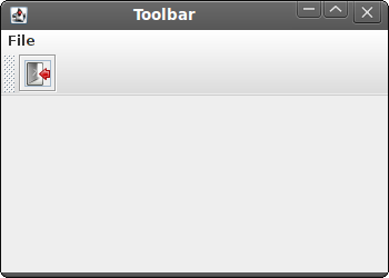
Figure: Toolbar
In this part of the JRuby Swing tutorial, we mentioned menus and toolbars. Components in JRuby Swing
Components
In this part of the JRuby Swing programming tutorial, we will cover basic Swing components.Components are basic building blocks of a GUI application. Over the years, several components became a standard in all toolkits on all OS platforms. For example a button, a check box or a scroll bar. Swing has a rich set of components which covers most of the programming needs. More specialized components can be created as custom components.
JCheckBox
TheJCheckBox is a component, that has two states. On and Off. The On state is visualized by a check mark. It is used to denote some boolean property. The JCheckBox component provides a check box with a text label. #!/usr/local/bin/jrubyIn our example, we place a check box on the window. The check box shows/hides the title of the window.
# ZetCode JRuby Swing tutorial
#
# This program uses JCheckBox
# component to show/hide the title
# of the window
#
# author: Jan Bodnar
# website: www.zetcode.com
# last modified: December 2010
include Java
import java.awt.Dimension
import javax.swing.JCheckBox
import javax.swing.Box
import javax.swing.BoxLayout
import javax.swing.JFrame
class Example < JFrame
def initialize
super "JCheckBox example"
self.initUI
end
def initUI
self.setLayout BoxLayout.new getContentPane, BoxLayout::Y_AXIS
self.add Box.createRigidArea Dimension.new 15, 20
cb = JCheckBox.new "Show Title", true
cb.setBounds 50, 60, 80, 30
cb.setFocusable(false)
cb.add_action_listener do |e|
    if self.getTitle.empty?
        self.setTitle "JCheckBox example"
    else
        self.setTitle ""
    end
end
add cb
self.setDefaultCloseOperation JFrame::EXIT_ON_CLOSE
self.setSize 300, 200
self.setLocationRelativeTo nil
self.setVisible true
end
end
Example.new
self.setLayout BoxLayout.new getContentPane, BoxLayout::Y_AXISIn this example, we use a
self.add Box.createRigidArea Dimension.new 15, 20
BoxLayout layout manager. We put some space there, so that the check box is not too close to the corner. cb = JCheckBox.new "Show Title", trueThe
JCheckBox component is created. The first parameter of the constructor is its text label. The second parameter is a boolean value indicating the initial selection state. If true the check box is selected. cb.setFocusable falseWe disable the focus for the check box. A
JCheckBox that has a focus may be selected or unselected with a spacebar. cb.add_action_listener do |e|Inside the action listener, we check if the title is set. If there is a title, we remove it. If there is no title, we set one. This way we toggle the visibility of a title.
if self.getTitle.empty?
self.setTitle "JCheckBox example"
else
self.setTitle ""
end
end
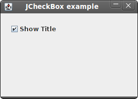
Figure: JCheckBox
JLabel
TheJLabel component is used to display text, image or both. No user interaction is available. #!/usr/local/bin/jrubyOur example shows lyrics of a song in the window. We can use HTML tags in
# ZetCode JRuby Swing tutorial
#
# In this program, we show lyrics of a
# song in a window.
#
# author: Jan Bodnar
# website: www.zetcode.com
# last modified: December 2010
include Java
import java.awt.BorderLayout
import java.awt.Color
import java.awt.Font
import javax.swing.JFrame
import javax.swing.BorderFactory
import javax.swing.JPanel
import javax.swing.JLabel
class Example < JFrame
def initialize
super "Lyrics"
self.initUI
end
def initUI
lyrics = "<html>It's way too late to think of<br>
Someone I would call now<br>
And neon signs got tired<br>
Red eye flights help the stars out<br>
I'm safe in a corner<br>
Just hours before me<br>
<br>
I'm waking with the roaches<br>
The world has surrendered<br>
I'm dating ancient ghosts<br>
The ones I made friends with<br>
The comfort of fireflies<br>
Long gone before daylight<br>
<br>
And if I had one wishful field tonight<br>
I'd ask for the sun to never rise<br>
If God leant his voice for me to speak<br>
I'd say go to bed, world<br>
<br>
I've always been too late<br>
To see what's before me<br>
And I know nothing sweeter than<br>
Champaign from last New Years<br>
Sweet music in my ears<br>
And a night full of no fears<br>
<br>
But if I had one wishful field tonight<br>
I'd ask for the sun to never rise<br>
If God passed a mic to me to speak<br>
I'd say stay in bed, world<br>
Sleep in peace</html>"
panel = JPanel.new
panel.setLayout BorderLayout.new 10, 10
label = JLabel.new lyrics
label.setFont Font.new "Georgia", Font::PLAIN, 14
label.setForeground Color.new 50, 50, 25
panel.add label, BorderLayout::CENTER
panel.setBorder BorderFactory.createEmptyBorder 10, 10, 10, 10
self.add panel
self.pack
self.setDefaultCloseOperation JFrame::EXIT_ON_CLOSE
self.setLocationRelativeTo nil
self.setVisible true
end
end
Example.new
JLabel component. We use the <br> tag to separate lines. lyrics = "<html>It's way too late to think of<br>We define a multi line text.
Someone I would call now<br>
And neon signs got tired<br>
...
label = JLabel.new lyricsHere we create the label component. We set its font to plain Georgia, 14px tall.
label.setFont Font.new "Georgia", Font::PLAIN, 14
panel.add label, BorderLayout::CENTERWe put the label into the center of the panel. We put 10px around the label.
panel.setBorder BorderFactory.createEmptyBorder 10, 10, 10, 10
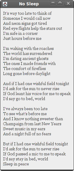
Figure: JLabel component
JSlider
JSlider is a component that lets the user graphically select a value by sliding a knob within a bounded interval. Our example will show a volume control. #!/usr/local/bin/jrubyIn the code example, we show a
# ZetCode JRuby Swing tutorial
#
# In this program we use a JSlider
# component to control volume images.
#
# author: Jan Bodnar
# website: www.zetcode.com
# last modified: December 2010
include Java
import java.awt.Dimension
import java.awt.BorderLayout
import javax.swing.event.ChangeListener
import javax.swing.JFrame
import javax.swing.JSlider
import javax.swing.JLabel
import javax.swing.JPanel
import javax.swing.BorderFactory
import javax.swing.Box
import javax.swing.BoxLayout
import javax.swing.ImageIcon
class ChangeEvent
include ChangeListener
def setLabel label
@label = label
end
def setIcons mute, min, med, max
@mute = mute
@min = min
@med = med
@max = max
end
def stateChanged e
sender = e.getSource
value = sender.getValue
if value == 0
@label.setIcon(@mute)
elsif value > 0 and value <= 30
@label.setIcon(@min)
elsif value > 30 and value < 80
@label.setIcon(@med)
else
@label.setIcon(@max)
end
end
end
class Example < JFrame
def initialize
super "JSlider"
self.initUI
end
def initUI
mute = ImageIcon.new "mute.png"
min = ImageIcon.new "min.png"
med = ImageIcon.new "med.png"
max = ImageIcon.new "max.png"
panel = JPanel.new
panel.setLayout BoxLayout.new panel, BoxLayout::X_AXIS
panel.setBorder BorderFactory.createEmptyBorder 40, 40, 40, 40
self.setLayout BorderLayout.new
panel.add Box.createHorizontalGlue
label = JLabel.new mute, JLabel::CENTER
slider = JSlider.new 0, 150, 0
ce = ChangeEvent.new
ce.setLabel label
ce.setIcons mute, min, med, max
slider.add_change_listener ce
slider.setPreferredSize Dimension.new 150, 30
panel.add slider
panel.add label
panel.add Box.createRigidArea Dimension.new 5, 0
panel.add Box.createHorizontalGlue
self.add panel, BorderLayout::CENTER
self.pack
self.setDefaultCloseOperation JFrame::EXIT_ON_CLOSE
self.setSize 300, 200
self.setLocationRelativeTo nil
self.setVisible true
end
end
Example.new
JSlider and a JLabel. By dragging the slider, we change the icon on the label component. We have four images that represent various states of the sound. mute = ImageIcon.new "mute.png"Here we create an image icon.
panel.setLayout BoxLayout.new panel, BoxLayout::X_AXISPanel component has a horizontal
BoxLayout. panel.setBorder BorderFactory.createEmptyBorder 40, 40, 40, 40We creare a 40px border around the panel.
panel.add Box.createHorizontalGlueWe put resizable space to both sides, left and right. It is to prevent
JSlider from growing to unnatural sizes. label = JLabel.new mute, JLabel::CENTERThis line creates a
JLabel instance with the specified image and horizontal alignment. The label is centered vertically in its display area by default. slider = JSlider.new 0, 150, 0This is a
JSlider constructor. The parameters are minimum value, maximum value and current value. ce = ChangeEvent.newA ChangeEvent object is created. We set a label and icons to this object.
ce.setLabel label
ce.setIcons mute, min, med, max
slider.add_change_listener ceEach time we move the slider, the
stateChanged method of the ChangeEvent object will be called. panel.add Box.createRigidArea Dimension.new 5, 0We place a 5px rigid space between the two components. They are too close to each other, when the slider is at the end position.
class ChangeEventThis is a ChangeEvent class, which implements the
include ChangeListener
ChangeListener. As a consequence, this class must implement a changeEvent method. sender = e.getSourceInside the
value = sender.getValue
changeEvent method, we get the event source. It is the slider, which has generated the event. From the sender, we get the current value. if value == 0If the value is equal to zero, we update the label to have a mute.png image.
@label.setIcon(@mute)
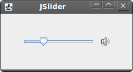
Figure: JSlider
JToggleButton
JToggleButton is a button that has two states. Pressed and not pressed. You toggle between these two states by clicking on it. There are situations where this functionality fits well. #!/usr/local/bin/jrubyIn the code example, we use three toggle buttons to change the color of a rectangular component.
# ZetCode JRuby Swing tutorial
#
# This program uses toggle buttons to
# change the background color of
# a panel.
#
# author: Jan Bodnar
# website: www.zetcode.com
# last modified: December 2010
include Java
import java.awt.Color
import java.awt.Dimension
import java.awt.event.ActionListener
import javax.swing.JToggleButton
import javax.swing.Box
import javax.swing.BoxLayout
import javax.swing.BorderFactory
import javax.swing.JFrame
import javax.swing.JPanel
import javax.swing.border.LineBorder
class Example < JFrame
    include ActionListener
def initialize
super "JToggleButton"
self.initUI
end
def initUI
self.setPreferredSize Dimension.new 280, 200
bottom = JPanel.new
bottom.setLayout BoxLayout.new bottom, BoxLayout::X_AXIS
bottom.setBorder BorderFactory.createEmptyBorder 20, 20, 20, 20
leftPanel = JPanel.new
leftPanel.setLayout BoxLayout.new leftPanel, BoxLayout::Y_AXIS
@display = JPanel.new
@display.setPreferredSize Dimension.new 110, 110
@display.setBorder LineBorder.createGrayLineBorder
@display.setBackground Color.black
bottom.add @display
redButton = JToggleButton.new "red"
redButton.addActionListener self
greenButton = JToggleButton.new "green"
greenButton.addActionListener self
blueButton = JToggleButton.new "blue"
blueButton.addActionListener self
blueButton.setMaximumSize greenButton.getMaximumSize
redButton.setMaximumSize greenButton.getMaximumSize
leftPanel.add redButton
leftPanel.add Box.createRigidArea Dimension.new 25, 7
leftPanel.add greenButton
leftPanel.add Box.createRigidArea Dimension.new 25, 7
leftPanel.add blueButton
bottom.add leftPanel
bottom.add Box.createRigidArea Dimension.new 20, 0
self.add bottom
self.pack
self.setDefaultCloseOperation JFrame::EXIT_ON_CLOSE
self.setSize 300, 200
self.setLocationRelativeTo nil
self.setVisible true
end
def actionPerformed e
color = @display.getBackground
red = color.getRed
green = color.getGreen
blue = color.getBlue
if e.getActionCommand == "red"
    if red == 0
        red = 255
    else
        red = 0
    end
end
if e.getActionCommand == "green"
if green == 0
green = 255
else
green = 0
end
end
if e.getActionCommand == "blue"
if blue == 0
blue = 255
else
blue = 0
end
end
setCol = Color.new red, green, blue
@display.setBackground setCol
end
end
Example.new
class Example < JFrameThe class implements the
include ActionListener
ActionListener. We will do some action in the actionPerformed method of the Example class. redButton = JToggleButton.new "red"We create a
redButton.addActionListener self
JToggleButton component. We add an action listener to the button. The action listener is the Example class. When we click on the redButton, the actionPerformed method of the Example class will be called. blueButton.setMaximumSize greenButton.getMaximumSizeWe make all three buttons of equal size.
redButton.setMaximumSize greenButton.getMaximumSize
color = @display.getBackgroundWe determine the current red, green, blue parts of the display background color.
red = color.getRed
green = color.getGreen
blue = color.getBlue
if e.getActionCommand == "red"We determine, which button was toggled, and update the color part of the RGB value accordingly.
if red == 0
red = 255
else
red = 0
end
end
setCol = Color.new red, green, blueHere a new color is created and the display panel is updated to a new color.
@display.setBackground setCol
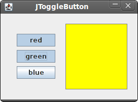
Figure: JToggleButton
JList
JList is a component that displays a list of objects. It allows the user to select one or more items. #!/usr/local/bin/jrubyIn our example, we will display a
# ZetCode JRuby Swing tutorial
#
# In this program, we show all
# available fonts of a system in
# a JList component.
#
# author: Jan Bodnar
# website: www.zetcode.com
# last modified: December 2010
include Java
import java.awt.BorderLayout
import java.awt.Dimension
import java.awt.Font
import java.awt.GraphicsEnvironment
import javax.swing.JFrame
import javax.swing.BorderFactory
import javax.swing.JScrollPane
import javax.swing.JPanel
import javax.swing.JLabel
import javax.swing.JList
class Example < JFrame
def initialize
super "JList"
initUI
end
def initUI
panel = JPanel.new
panel.setLayout BorderLayout.new
panel.setBorder BorderFactory.createEmptyBorder 20, 20, 20, 20
ge = GraphicsEnvironment.getLocalGraphicsEnvironment
fonts = ge.getAvailableFontFamilyNames
list = JList.new fonts
list.add_list_selection_listener do |e|
sender = e.source
if not e.getValueIsAdjusting
name = sender.getSelectedValue
font = Font.new name, Font::PLAIN, 13
@label.setFont font
end
end
pane = JScrollPane.new
pane.getViewport.add list
pane.setPreferredSize Dimension.new 250, 200
panel.add pane
@label = JLabel.new "Aguirre, der Zorn Gottes"
@label.setFont Font.new "Serif", Font::PLAIN, 12
self.add @label, BorderLayout::SOUTH
self.add panel
self.pack
self.setDefaultCloseOperation JFrame::EXIT_ON_CLOSE
self.setLocationRelativeTo nil
self.setVisible true
end
end
Example.new
JList and a JLabel components. The list component contains a list of all available font family names on our system. If we select an item from the list, the label will be displayed in a font, we have chosen. ge = GraphicsEnvironment.getLocalGraphicsEnvironmentHere we obtain all possible font family names on our system.
fonts = ge.getAvailableFontFamilyNames
list = JList.new fontsWe create an instance of the
JList component. It will display all font family names. if not e.getValueIsAdjustingEvents in list selection are grouped. We receive events for both selecting and unselecting. To filter only the selecting events, we use the
getValueIsAdjusting method. name = sender.getSelectedValueWe get the selected item and set a new font for the label.
font = Font.new name, Font::PLAIN, 13
@label.setFont font
pane = JScrollPane.new
pane.getViewport.add list
JList component is not scrollable by default. We put the list into the JScrollPane to make it scrollable. 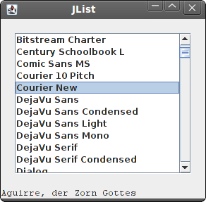
Figure: JList component
In this part of the JRuby Swing tutorial, we have presented several Swing components.
Layout management in JRuby Swing
Layout management
In this part of the JRuby Swing programming tutorial, we will introduce layout managers.When we design the GUI of our application, we decide what components we will use and how we will organize those components in the application. To organize our components, we use specialized non visible objects called layout managers. The Swing toolkit has two kind of components. Containers and children. The containers group children into suitable layouts. To create layouts, we use layout managers.
Absolute positioning
In most cases, programmers should use layout managers. There are a few situations, where we can use absolute positioning. In absolute positioning, the programmer specifies the position and the size of each component in pixels. The size and the position of a component do not change, if you resize a window. Applications look different on various platforms, and what looks OK on Linux, might not look OK on Mac. Changing fonts in your application might spoil the layout. If you translate your application into another language, you must redo your layout. For all these issues, use the absolute positioning only when you have a reason to do so.#!/usr/local/bin/jrubyIn this example, we show three images using absolute positioning.
# ZetCode JRuby Swing tutorial
#
# In this program, we lay out three images
# using absolute positioning.
#
# author: Jan Bodnar
# website: www.zetcode.com
# last modified: December 2010
include Java
import java.awt.Color
import javax.swing.ImageIcon
import javax.swing.JLabel
import javax.swing.JPanel
import javax.swing.JFrame
class Example < JFrame
def initialize
super "Absolute"
self.initUI
end
def initUI
panel = JPanel.new
panel.setLayout nil
panel.setBackground Color.new 66, 66, 66
self.getContentPane.add panel
rot = ImageIcon.new "rotunda.jpg"
rotLabel = JLabel.new rot
rotLabel.setBounds 20, 20, rot.getIconWidth, rot.getIconHeight
min = ImageIcon.new "mincol.jpg"
minLabel = JLabel.new min
minLabel.setBounds 40, 160, min.getIconWidth, min.getIconHeight
bar = ImageIcon.new "bardejov.jpg"
barLabel = JLabel.new bar
barLabel.setBounds 170, 50, bar.getIconWidth, bar.getIconHeight
panel.add rotLabel
panel.add minLabel
panel.add barLabel
self.setDefaultCloseOperation JFrame::EXIT_ON_CLOSE
self.setSize 350, 300
self.setLocationRelativeTo nil
self.setVisible true
end
end
Example.new
panel.setLayout nilContainers in Swing already have a default layout manager.
JPanelhas a FlowLayout manager as its default layout manager. We use the setLayout method with a nil parameter to remove the default layout manager and use absolute positioning instead. rot = ImageIcon.new "rotunda.jpg"We create an
rotLabel = JLabel.new rot
rotLabel.setBounds 20, 20, rot.getIconWidth, rot.getIconHeight
ImageIcon object. We put the icon into the JLabelcomponent to display it. Then we use the setBounds method to position the label on the panel. The first two parameters are the x, y positions of the label. The 3th and 4th parameters are the width and the height of the icon. panel.add rotLabelWe add the label to the panel container.
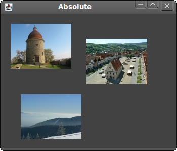
Figure: Absolute positioning
Buttons example
In the following example, we will position two buttons in the bottom right corner of the window.#!/usr/local/bin/jrubyWe will create two panels. The basic panel has a vertical box layout. The bottom panel has a horizontal one. We will put a bottom panel into the basic panel. We will right align the bottom panel. The space between the top of the window and the bottom panel is expandable. It is done by the vertical glue.
# ZetCode JRuby Swing tutorial
#
# In this program, we use the BoxLayout
# manager to position two buttons in the
# bottom right corner of the window.
#
# author: Jan Bodnar
# website: www.zetcode.com
# last modified: December 2010
include Java
import java.awt.Dimension
import javax.swing.JButton
import javax.swing.JPanel
import javax.swing.JFrame
import javax.swing.BoxLayout
import javax.swing.Box
class Example < JFrame
def initialize
super "Buttons"
self.initUI
end
def initUI
basic = JPanel.new
basic.setLayout BoxLayout.new basic, BoxLayout::Y_AXIS
self.add basic
basic.add Box.createVerticalGlue
bottom = JPanel.new
bottom.setLayout BoxLayout.new bottom, BoxLayout::X_AXIS
bottom.setAlignmentX 1.0
okButton = JButton.new "OK"
closeButton = JButton.new "Close"
bottom.add okButton
bottom.add Box.createRigidArea Dimension.new 5, 0
bottom.add closeButton
bottom.add Box.createRigidArea Dimension.new 15, 0
basic.add bottom
basic.add Box.createRigidArea Dimension.new 0, 15
self.setDefaultCloseOperation JFrame::EXIT_ON_CLOSE
self.setSize 300, 200
self.setLocationRelativeTo nil
self.setVisible true
end
end
Example.new
basic = JPanel.newThe basic panel has a vertical box layout. The bottom panel has a horizontal box layout.
basic.setLayout BoxLayout.new basic, BoxLayout::Y_AXIS
...
bottom = JPanel.new
bottom.setLayout BoxLayout.new bottom, BoxLayout::X_AXIS
bottom.setAlignmentX 1.0The bottom panel is right aligned.
basic.add Box.createVerticalGlueWe create a vertical glue. The glue is vertically expandable white space, which will push the horizontal box with the buttons to the bottom.
okButton = JButton.new "OK"These are the two buttons, that will go into the bottom right corner of the window.
closeButton = JButton.new "Close"
bottom.add okButtonWe put the OK button into the horizontal box. We put some rigid space next to the button. So that there is some space between the two buttons.
bottom.add Box.createRigidArea Dimension.new 5, 0
basic.add Box.createRigidArea Dimension.new 0, 15We put some space between the buttons and the border of the window.
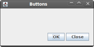
Figure: Buttons example
Windows example
The following example creates the windows dialog using theGroupLayout manager. The dialog comes from the JDeveloper application. The
GroupLayout manager divides the creation of the layout into two steps. In one step, we lay out components alongside the horizontal axis. In the second step, we lay out components along the vertical axis. This is an unusual idea within layout managers, but it works well. There are two types of arrangements. Sequential and parallel. In both kinds of layouts we can arrange components sequentially or in parallel. In a horizontal layout, a row of components is called a sequential group. A column of components is called a parallel group. In a vertical layout, a column of components is called a sequential group. And a row of components is called a parallel group. You must understand these definitions right in order to work with the
GroupLayout manager. #!/usr/local/bin/jrubyWe use
# ZetCode JRuby Swing tutorial
#
# In this program, GroupLayout
# manager to create a Windows
# example.
#
# author: Jan Bodnar
# website: www.zetcode.com
# last modified: December 2010
include Java
import java.awt.Dimension
import java.awt.Color
import javax.swing.JButton
import javax.swing.SwingConstants
import javax.swing.JFrame
import javax.swing.JLabel
import javax.swing.JTextArea
import javax.swing.BorderFactory
import javax.swing.GroupLayout
class Example < JFrame
def initialize
super "Windows"
self.initUI
end
def initUI
layout = GroupLayout.new self.getContentPane
self.getContentPane.setLayout layout
layout.setAutoCreateGaps true
layout.setAutoCreateContainerGaps true
self.setPreferredSize Dimension.new 350, 300
windows = JLabel.new "Windows"
area = JTextArea.new
area.setEditable false
area.setBorder BorderFactory.createLineBorder Color.gray
activateButton = JButton.new "Activate"
closeButton = JButton.new "Close"
helpButton = JButton.new "Help"
okButton = JButton.new "OK"
sg = layout.createSequentialGroup
pg1 = layout.createParallelGroup
pg2 = layout.createParallelGroup
pg1.addComponent windows
pg1.addComponent area
pg1.addComponent helpButton
sg.addGroup pg1
pg2.addComponent activateButton
pg2.addComponent closeButton
pg2.addComponent okButton
sg.addGroup pg2
layout.setHorizontalGroup sg
sg1 = layout.createSequentialGroup
sg2 = layout.createSequentialGroup
pg1 = layout.createParallelGroup
pg2 = layout.createParallelGroup
sg1.addComponent windows
pg1.addComponent area
sg2.addComponent activateButton
sg2.addComponent closeButton
pg1.addGroup sg2
sg1.addGroup pg1
pg2.addComponent helpButton
pg2.addComponent okButton
sg1.addGroup pg2
layout.setVerticalGroup sg1
layout.linkSize SwingConstants::HORIZONTAL,
    okButton, helpButton, closeButton, activateButton
self.pack
self.setDefaultCloseOperation JFrame::EXIT_ON_CLOSE
self.setLocationRelativeTo nil
self.setVisible true
end
end
Example.new
GroupLayout manager to create a layout which consists of six components. Groups of components are formed along both axes. sg = layout.createSequentialGroupIn the first step, we have a horizontal layout. It consists of two parallel groups of three components.
pg1 = layout.createParallelGroup
pg2 = layout.createParallelGroup
pg1.addComponent windows
pg1.addComponent area
pg1.addComponent helpButton
sg.addGroup pg1
pg2.addComponent activateButton
pg2.addComponent closeButton
pg2.addComponent okButton
sg.addGroup pg2
layout.setHorizontalGroup sg
sg1 = layout.createSequentialGroupVertical layout is a bit more complex. First, we add a single component. Then we add a parallel group of a single component and a sequential group of two components. Finally, we add a parallel group of two components.
sg2 = layout.createSequentialGroup
pg1 = layout.createParallelGroup
pg2 = layout.createParallelGroup
sg1.addComponent windows
pg1.addComponent area
sg2.addComponent activateButton
sg2.addComponent closeButton
pg1.addGroup sg2
sg1.addGroup pg1
pg2.addComponent helpButton
pg2.addComponent okButton
sg1.addGroup pg2
layout.setVerticalGroup sg1
layout.linkSize SwingConstants::HORIZONTAL,This code makes all buttons the same size. We only need to set their width, because their height is already the same by default.
okButton, helpButton, closeButton, activateButton
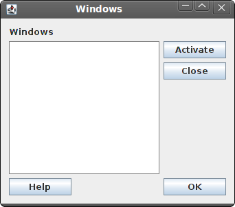
Figure: Windows example
Look at the screenshot of the example. Notice, that components can be grouped into vertical and horizontal sets of components. For example, the label, the area and the Help button components can form a vertical group of components. This is exactly what the GroupLayout manager does. It lays out components by forming vertical and horizontal groups of components. In this part of the JRuby Swing tutorial, we mentioned layout management of components.
Introduction to JRuby Swing
Introduction to JRuby Swing
In this part of the JRuby Swing tutorial, we will introduce the Swing toolkit and create our first programs using the JRuby programming language.The purpose of this tutorial is to get you started with the Swing toolkit with the JRuby language. Images used in this tutorial can be downloaded here. I used some icons from the Tango icons pack of the Gnome project.
About
Swing library is an official Java GUI toolkit for the Java programming language. It is used to create Graphical user interfaces with Java. Swing is an advanced GUI toolkit. It has a rich set of components. From basic ones like buttons, labels, scrollbars to advanced components like trees and tables. Swing itself is written in Java. Swing is available for other languages too. For example JRuby, Jython, Groovy or Scala.JRuby is a Java implementation of the Ruby programming language. JRuby can import any Java class.
There are two basic ways to execute the examples in this tutorial. One way is to install a Ruby NetBeans plugin. It contains JRuby as well. When you create a new Ruby project, be sure to select the JRuby platform.
The other way is to download a release from the jruby.orgwebsite.
$ tar -xzvf jruby-bin-1.5.6.tar.gzInstalling JRuby is very easy. We extract the contents of the compressed archive and move the directory to a selected location. On my system, I have moved the directory to the bin directory of my home directory.
$ mv jruby-1.5.6/ ~/bin
$ ~/bin/jdk1.6.0_21/bin/java -jar ~/bin/jruby-1.5.6/lib/jruby.jar simple.rbWe have installed JRuby in a selected directory. In the lib subdirectory, we will find jruby.jar file, which is used to execute JRuby scripts.
$ cat /usr/local/bin/jrubyOptionally, we can create a bash file which will automatically start our JRuby scripts. We can then put the #!/usr/local/bin/jruby path to our scripts.
#!/bin/bash
~/bin/jdk1.6.0_21/bin/java -jar ~/bin/jruby-1.5.6/lib/jruby.jar $1
Simple example
In our first example, we will show a basic window on the screen.#!/usr/local/bin/jrubyWhile this code is very small, the application window can do quite a lot. It can be resized, maximized, minimized. All the complexity that comes with it has been hidden from the application programmer.
# ZetCode JRuby Swing tutorial
#
# This example shows a simple
# window in the center of the screen.
#
# author: Jan Bodnar
# website: www.zetcode.com
# last modified: December 2010
include Java
import javax.swing.JFrame
class Example < JFrame
def initialize
super "Simple"
self.initUI
end
def initUI
self.setSize 300, 200
self.setDefaultCloseOperation JFrame::EXIT_ON_CLOSE
self.setLocationRelativeTo nil
self.setVisible true
end
end
Example.new
include JavaWe include Java API to JRuby.
import javax.swing.JFrameWe import a
JFrame class. The JFrame is a top-level window with a titlebar and a border. self.initUIWe delegate the creation of the user interface to the
initUI method. self.setSize 300, 200We set the size of the window.
self.setDefaultCloseOperation JFrame::EXIT_ON_CLOSEThis method ensures that the window terminates, if we click on the close button of the titlebar. By default nothing happens.
self.setLocationRelativeTo nilWe center the window on the screen.
self.setVisible trueFinally, the window is showed on the screen.
Tooltip
A tooltip is a small rectangular window, which gives a brief information about an object. It is usually a GUI component. It is part of the help system of the application.#!/usr/local/bin/jrubyIn the example, we set the tooltip for the frame and the button.
# ZetCode JRuby Swing tutorial
#
# This code shows a tooltip on
# a window and a button
#
# author: Jan Bodnar
# website: www.zetcode.com
# last modified: December 2010
include Java
import javax.swing.JButton
import javax.swing.JFrame
import javax.swing.JPanel
class Example < JFrame
def initialize
super "Tooltips"
self.initUI
end
def initUI
panel = JPanel.new
self.getContentPane.add panel
panel.setLayout nil
panel.setToolTipText "A Panel container"
button = JButton.new "Button"
button.setBounds 100, 60, 100, 30
button.setToolTipText "A button component"
panel.add button
self.setDefaultCloseOperation JFrame::EXIT_ON_CLOSE
self.setSize 300, 200
self.setLocationRelativeTo nil
self.setVisible true
end
end
Example.new
panel = JPanel.newWe create a
self.getContentPane.add panel
JPanel component. It is a generic lightweight container. JFrame has an area, where you put the components called the content pane. We put the panel into this pane. panel.setLayout nilBy default, the
JPanel has a FlowLayout manager. The layout manager is used to place widgets onto the containers. If we call setLayout nil we can position our components absolutely. For this, we use the setBounds method. panel.setToolTipText "A Panel container"To enable a tooltip, we call the
setTooltipText method. 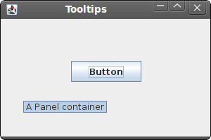
Figure: Tooltip
Quit button
In the last example of this section, we will create a quit button. When we press this button, the application terminates.#!/usr/local/bin/jrubyWe position a
# ZetCode JRuby Swing tutorial
#
# This program creates a quit
# button. When we press the button,
# the application terminates.
#
# author: Jan Bodnar
# website: www.zetcode.com
# last modified: December 2010
include Java
import javax.swing.JButton
import javax.swing.JFrame
import javax.swing.JPanel
import java.lang.System
class Example < JFrame
def initialize
super "Quit button"
self.initUI
end
def initUI
panel = JPanel.new
self.getContentPane.add panel
panel.setLayout nil
qbutton = JButton.new "Quit"
qbutton.setBounds 50, 60, 80, 30
qbutton.add_action_listener do |e|
    System.exit 0
end
panel.add qbutton
self.setDefaultCloseOperation JFrame::EXIT_ON_CLOSE
self.setSize 300, 200
self.setLocationRelativeTo nil
self.setVisible true
end
end
Example.new
JButton on the window. We will add an action listener to this button. qbutton = JButton.new "Quit"Here we create a button. We position it by calling the
qbutton.setBounds 50, 60, 80, 30
setBounds method. qbutton.add_action_listener do |e|We add an action listener to the button. The listener terminates the application.
System.exit 0
end
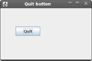
Figure: Quit button
This section was an introduction to the Swing toolkit with the JRuby language. 