Components
In this part of the JRuby Swing programming tutorial, we will cover basic Swing components.Components are basic building blocks of a GUI application. Over the years, several components became a standard in all toolkits on all OS platforms. For example a button, a check box or a scroll bar. Swing has a rich set of components which covers most of the programming needs. More specialized components can be created as custom components.
JCheckBox
TheJCheckBox is a component, that has two states. On and Off. The On state is visualized by a check mark. It is used to denote some boolean property. The JCheckBox component provides a check box with a text label. #!/usr/local/bin/jrubyIn our example, we place a check box on the window. The check box shows/hides the title of the window.
# ZetCode JRuby Swing tutorial
#
# This program uses JCheckBox
# component to show/hide the title
# of the window
#
# author: Jan Bodnar
# website: www.zetcode.com
# last modified: December 2010
include Java
import java.awt.Dimension
import javax.swing.JCheckBox
import javax.swing.Box
import javax.swing.BoxLayout
import javax.swing.JFrame
class Example < JFrame
def initialize
super "JCheckBox example"
self.initUI
end
def initUI
self.setLayout BoxLayout.new getContentPane, BoxLayout::Y_AXIS
self.add Box.createRigidArea Dimension.new 15, 20
cb = JCheckBox.new "Show Title", true
cb.setBounds 50, 60, 80, 30
cb.setFocusable(false)
cb.add_action_listener do |e|
    if self.getTitle.empty?
        self.setTitle "JCheckBox example"
    else
        self.setTitle ""
    end
end
add cb
self.setDefaultCloseOperation JFrame::EXIT_ON_CLOSE
self.setSize 300, 200
self.setLocationRelativeTo nil
self.setVisible true
end
end
Example.new
self.setLayout BoxLayout.new getContentPane, BoxLayout::Y_AXISIn this example, we use a
self.add Box.createRigidArea Dimension.new 15, 20
BoxLayout layout manager. We put some space there, so that the check box is not too close to the corner. cb = JCheckBox.new "Show Title", trueThe
JCheckBox component is created. The first parameter of the constructor is its text label. The second parameter is a boolean value indicating the initial selection state. If true the check box is selected. cb.setFocusable falseWe disable the focus for the check box. A
JCheckBox that has a focus may be selected or unselected with a spacebar. cb.add_action_listener do |e|Inside the action listener, we check if the title is set. If there is a title, we remove it. If there is no title, we set one. This way we toggle the visibility of a title.
if self.getTitle.empty?
self.setTitle "JCheckBox example"
else
self.setTitle ""
end
end
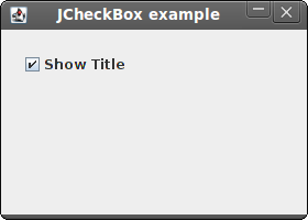
Figure: JCheckBox
JLabel
TheJLabel component is used to display text, image or both. No user interaction is available. #!/usr/local/bin/jrubyOur example shows lyrics of a song in the window. We can use HTML tags in
# ZetCode JRuby Swing tutorial
#
# In this program, we show lyrics of a
# song in a window.
#
# author: Jan Bodnar
# website: www.zetcode.com
# last modified: December 2010
include Java
import java.awt.BorderLayout
import java.awt.Color
import java.awt.Font
import javax.swing.JFrame
import javax.swing.BorderFactory
import javax.swing.JPanel
import javax.swing.JLabel
class Example < JFrame
def initialize
super "Lyrics"
self.initUI
end
def initUI
lyrics = "<html>It's way too late to think of<br>
Someone I would call now<br>
And neon signs got tired<br>
Red eye flights help the stars out<br>
I'm safe in a corner<br>
Just hours before me<br>
<br>
I'm waking with the roaches<br>
The world has surrendered<br>
I'm dating ancient ghosts<br>
The ones I made friends with<br>
The comfort of fireflies<br>
Long gone before daylight<br>
<br>
And if I had one wishful field tonight<br>
I'd ask for the sun to never rise<br>
If God leant his voice for me to speak<br>
I'd say go to bed, world<br>
<br>
I've always been too late<br>
To see what's before me<br>
And I know nothing sweeter than<br>
Champaign from last New Years<br>
Sweet music in my ears<br>
And a night full of no fears<br>
<br>
But if I had one wishful field tonight<br>
I'd ask for the sun to never rise<br>
If God passed a mic to me to speak<br>
I'd say stay in bed, world<br>
Sleep in peace</html>"
panel = JPanel.new
panel.setLayout BorderLayout.new 10, 10
label = JLabel.new lyrics
label.setFont Font.new "Georgia", Font::PLAIN, 14
label.setForeground Color.new 50, 50, 25
panel.add label, BorderLayout::CENTER
panel.setBorder BorderFactory.createEmptyBorder 10, 10, 10, 10
self.add panel
self.pack
self.setDefaultCloseOperation JFrame::EXIT_ON_CLOSE
self.setLocationRelativeTo nil
self.setVisible true
end
end
Example.new
JLabel component. We use the <br> tag to separate lines. lyrics = "<html>It's way too late to think of<br>We define a multi line text.
Someone I would call now<br>
And neon signs got tired<br>
...
label = JLabel.new lyricsHere we create the label component. We set its font to plain Georgia, 14px tall.
label.setFont Font.new "Georgia", Font::PLAIN, 14
panel.add label, BorderLayout::CENTERWe put the label into the center of the panel. We put 10px around the label.
panel.setBorder BorderFactory.createEmptyBorder 10, 10, 10, 10
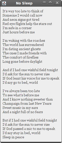
Figure: JLabel component
JSlider
JSlider is a component that lets the user graphically select a value by sliding a knob within a bounded interval. Our example will show a volume control. #!/usr/local/bin/jrubyIn the code example, we show a
# ZetCode JRuby Swing tutorial
#
# In this program we use a JSlider
# component to control volume images.
#
# author: Jan Bodnar
# website: www.zetcode.com
# last modified: December 2010
include Java
import java.awt.Dimension
import java.awt.BorderLayout
import javax.swing.event.ChangeListener
import javax.swing.JFrame
import javax.swing.JSlider
import javax.swing.JLabel
import javax.swing.JPanel
import javax.swing.BorderFactory
import javax.swing.Box
import javax.swing.BoxLayout
import javax.swing.ImageIcon
class ChangeEvent
include ChangeListener
def setLabel label
@label = label
end
def setIcons mute, min, med, max
@mute = mute
@min = min
@med = med
@max = max
end
def stateChanged e
sender = e.getSource
value = sender.getValue
if value == 0
@label.setIcon(@mute)
elsif value > 0 and value <= 30
@label.setIcon(@min)
elsif value > 30 and value < 80
@label.setIcon(@med)
else
@label.setIcon(@max)
end
end
end
class Example < JFrame
def initialize
super "JSlider"
self.initUI
end
def initUI
mute = ImageIcon.new "mute.png"
min = ImageIcon.new "min.png"
med = ImageIcon.new "med.png"
max = ImageIcon.new "max.png"
panel = JPanel.new
panel.setLayout BoxLayout.new panel, BoxLayout::X_AXIS
panel.setBorder BorderFactory.createEmptyBorder 40, 40, 40, 40
self.setLayout BorderLayout.new
panel.add Box.createHorizontalGlue
label = JLabel.new mute, JLabel::CENTER
slider = JSlider.new 0, 150, 0
ce = ChangeEvent.new
ce.setLabel label
ce.setIcons mute, min, med, max
slider.add_change_listener ce
slider.setPreferredSize Dimension.new 150, 30
panel.add slider
panel.add label
panel.add Box.createRigidArea Dimension.new 5, 0
panel.add Box.createHorizontalGlue
self.add panel, BorderLayout::CENTER
self.pack
self.setDefaultCloseOperation JFrame::EXIT_ON_CLOSE
self.setSize 300, 200
self.setLocationRelativeTo nil
self.setVisible true
end
end
Example.new
JSlider and a JLabel. By dragging the slider, we change the icon on the label component. We have four images that represent various states of the sound. mute = ImageIcon.new "mute.png"Here we create an image icon.
panel.setLayout BoxLayout.new panel, BoxLayout::X_AXISPanel component has a horizontal
BoxLayout. panel.setBorder BorderFactory.createEmptyBorder 40, 40, 40, 40We creare a 40px border around the panel.
panel.add Box.createHorizontalGlueWe put resizable space to both sides, left and right. It is to prevent
JSlider from growing to unnatural sizes. label = JLabel.new mute, JLabel::CENTERThis line creates a
JLabel instance with the specified image and horizontal alignment. The label is centered vertically in its display area by default. slider = JSlider.new 0, 150, 0This is a
JSlider constructor. The parameters are minimum value, maximum value and current value. ce = ChangeEvent.newA ChangeEvent object is created. We set a label and icons to this object.
ce.setLabel label
ce.setIcons mute, min, med, max
slider.add_change_listener ceEach time we move the slider, the
stateChanged method of the ChangeEvent object will be called. panel.add Box.createRigidArea Dimension.new 5, 0We place a 5px rigid space between the two components. They are too close to each other, when the slider is at the end position.
class ChangeEventThis is a ChangeEvent class, which implements the
include ChangeListener
ChangeListener. As a consequence, this class must implement a changeEvent method. sender = e.getSourceInside the
value = sender.getValue
changeEvent method, we get the event source. It is the slider, which has generated the event. From the sender, we get the current value. if value == 0If the value is equal to zero, we update the label to have a mute.png image.
@label.setIcon(@mute)
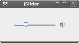
Figure: JSlider
JToggleButton
JToggleButton is a button that has two states. Pressed and not pressed. You toggle between these two states by clicking on it. There are situations where this functionality fits well. #!/usr/local/bin/jrubyIn the code example, we use three toggle buttons to change the color of a rectangular component.
# ZetCode JRuby Swing tutorial
#
# This program uses toggle buttons to
# change the background color of
# a panel.
#
# author: Jan Bodnar
# website: www.zetcode.com
# last modified: December 2010
include Java
import java.awt.Color
import java.awt.Dimension
import java.awt.event.ActionListener
import javax.swing.JToggleButton
import javax.swing.Box
import javax.swing.BoxLayout
import javax.swing.BorderFactory
import javax.swing.JFrame
import javax.swing.JPanel
import javax.swing.border.LineBorder
class Example < JFrame
    include ActionListener
def initialize
super "JToggleButton"
self.initUI
end
def initUI
self.setPreferredSize Dimension.new 280, 200
bottom = JPanel.new
bottom.setLayout BoxLayout.new bottom, BoxLayout::X_AXIS
bottom.setBorder BorderFactory.createEmptyBorder 20, 20, 20, 20
leftPanel = JPanel.new
leftPanel.setLayout BoxLayout.new leftPanel, BoxLayout::Y_AXIS
@display = JPanel.new
@display.setPreferredSize Dimension.new 110, 110
@display.setBorder LineBorder.createGrayLineBorder
@display.setBackground Color.black
bottom.add @display
redButton = JToggleButton.new "red"
redButton.addActionListener self
greenButton = JToggleButton.new "green"
greenButton.addActionListener self
blueButton = JToggleButton.new "blue"
blueButton.addActionListener self
blueButton.setMaximumSize greenButton.getMaximumSize
redButton.setMaximumSize greenButton.getMaximumSize
leftPanel.add redButton
leftPanel.add Box.createRigidArea Dimension.new 25, 7
leftPanel.add greenButton
leftPanel.add Box.createRigidArea Dimension.new 25, 7
leftPanel.add blueButton
bottom.add leftPanel
bottom.add Box.createRigidArea Dimension.new 20, 0
self.add bottom
self.pack
self.setDefaultCloseOperation JFrame::EXIT_ON_CLOSE
self.setSize 300, 200
self.setLocationRelativeTo nil
self.setVisible true
end
def actionPerformed e
color = @display.getBackground
red = color.getRed
green = color.getGreen
blue = color.getBlue
if e.getActionCommand == "red"
    if red == 0
        red = 255
    else
        red = 0
    end
end
if e.getActionCommand == "green"
if green == 0
green = 255
else
green = 0
end
end
if e.getActionCommand == "blue"
if blue == 0
blue = 255
else
blue = 0
end
end
setCol = Color.new red, green, blue
@display.setBackground setCol
end
end
Example.new
class Example < JFrameThe class implements the
include ActionListener
ActionListener. We will do some action in the actionPerformed method of the Example class. redButton = JToggleButton.new "red"We create a
redButton.addActionListener self
JToggleButton component. We add an action listener to the button. The action listener is the Example class. When we click on the redButton, the actionPerformed method of the Example class will be called. blueButton.setMaximumSize greenButton.getMaximumSizeWe make all three buttons of equal size.
redButton.setMaximumSize greenButton.getMaximumSize
color = @display.getBackgroundWe determine the current red, green, blue parts of the display background color.
red = color.getRed
green = color.getGreen
blue = color.getBlue
if e.getActionCommand == "red"We determine, which button was toggled, and update the color part of the RGB value accordingly.
if red == 0
red = 255
else
red = 0
end
end
setCol = Color.new red, green, blueHere a new color is created and the display panel is updated to a new color.
@display.setBackground setCol
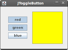
Figure: JToggleButton
JList
JList is a component that displays a list of objects. It allows the user to select one or more items. #!/usr/local/bin/jrubyIn our example, we will display a
# ZetCode JRuby Swing tutorial
#
# In this program, we show all
# available fonts of a system in
# a JList component.
#
# author: Jan Bodnar
# website: www.zetcode.com
# last modified: December 2010
include Java
import java.awt.BorderLayout
import java.awt.Dimension
import java.awt.Font
import java.awt.GraphicsEnvironment
import javax.swing.JFrame
import javax.swing.BorderFactory
import javax.swing.JScrollPane
import javax.swing.JPanel
import javax.swing.JLabel
import javax.swing.JList
class Example < JFrame
def initialize
super "JList"
initUI
end
def initUI
panel = JPanel.new
panel.setLayout BorderLayout.new
panel.setBorder BorderFactory.createEmptyBorder 20, 20, 20, 20
ge = GraphicsEnvironment.getLocalGraphicsEnvironment
fonts = ge.getAvailableFontFamilyNames
list = JList.new fonts
list.add_list_selection_listener do |e|
sender = e.source
if not e.getValueIsAdjusting
name = sender.getSelectedValue
font = Font.new name, Font::PLAIN, 13
@label.setFont font
end
end
pane = JScrollPane.new
pane.getViewport.add list
pane.setPreferredSize Dimension.new 250, 200
panel.add pane
@label = JLabel.new "Aguirre, der Zorn Gottes"
@label.setFont Font.new "Serif", Font::PLAIN, 12
self.add @label, BorderLayout::SOUTH
self.add panel
self.pack
self.setDefaultCloseOperation JFrame::EXIT_ON_CLOSE
self.setLocationRelativeTo nil
self.setVisible true
end
end
Example.new
JList and a JLabel components. The list component contains a list of all available font family names on our system. If we select an item from the list, the label will be displayed in a font, we have chosen. ge = GraphicsEnvironment.getLocalGraphicsEnvironmentHere we obtain all possible font family names on our system.
fonts = ge.getAvailableFontFamilyNames
list = JList.new fontsWe create an instance of the
JList component. It will display all font family names. if not e.getValueIsAdjustingEvents in list selection are grouped. We receive events for both selecting and unselecting. To filter only the selecting events, we use the
getValueIsAdjusting method. name = sender.getSelectedValueWe get the selected item and set a new font for the label.
font = Font.new name, Font::PLAIN, 13
@label.setFont font
pane = JScrollPane.new
pane.getViewport.add list
JList component is not scrollable by default. We put the list into the JScrollPane to make it scrollable. 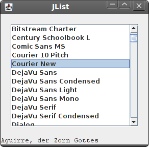
Figure: JList component
In this part of the JRuby Swing tutorial, we have presented several Swing components.

0 comments:
Post a Comment